
Picture a customer entering your retail space, scanning for the department they need, only to wander aimlessly before giving up and leaving. Poor wayfinding costs you sales and damages your brand reputation. Signage influences 58% of shoppers and dramatically reduces time to product. This guide delivers practical, step-by-step strategies for design and facilities managers to create wayfinding systems that enhance navigation, reduce confusion, and boost customer satisfaction in retail and commercial environments.
Table of Contents
- What is wayfinding signage and why does it matter?
- Laying the groundwork: needs assessment and signage objectives
- The core design principles of successful wayfinding signage
- Regulatory and accessibility considerations for signage
- Implementation: strategic placement, installation, and verification
- Common mistakes and troubleshooting wayfinding systems
- Unlock smarter wayfinding with Pik Pik Pow signage solutions
- Frequently asked questions
Key Takeaways
| Point | Details |
|---|---|
| Start with needs assessment | A rigorous preparation phase identifies wayfinding pain points and sets clear objectives for improvement. |
| Prioritise legibility and placement | Use high-contrast, accessible fonts and install signage where users naturally pause or need direction. |
| Include compliance and accessibility | Apply current standards for tactile and Braille signs, ensuring all users can navigate your space easily. |
| Verify with real users | Test signage with trial groups and staff feedback to promptly spot and address navigation snags. |
What is wayfinding signage and why does it matter?
Wayfinding signage encompasses four essential components working together as a cohesive system:
- Identification signs marking specific locations and rooms
- Directional signs guiding visitors along routes
- Informational signs providing context and details
- Regulatory signs communicating rules and safety requirements
The impact on your business is measurable and significant. Nearly 60% of shoppers are influenced by effective signage, making it a critical factor in purchasing decisions. Professional wayfinding systems reduce directional inquiries by 60% and cut navigation errors by 45%, freeing your staff to focus on customer service rather than giving directions.
Navigation time is reduced by 35% when effective wayfinding signage is properly implemented.
These improvements translate directly to better customer experiences and increased dwell time in your space. When visitors can find what they need quickly and confidently, they spend more time browsing and less time feeling frustrated. A well-designed wayfinding signs guide creates an intuitive flow that feels natural rather than forced.
The foundation of any successful system lies in understanding signage design principles that prioritise clarity over decoration. Your signage should answer three questions instantly: Where am I? Where do I need to go? How do I get there?
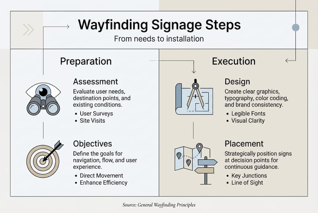
Laying the groundwork: needs assessment and signage objectives
Before designing a single sign, conduct a thorough audit of your space. Walk the customer journey yourself, noting pain points where visitors hesitate or backtrack. Observe peak times when navigation challenges become most apparent. Document space constraints that might limit sign placement or visibility.
Your objectives should be specific and measurable. Rather than vague goals like “improve navigation,” aim to reduce lost visitor incidents by 40% or decrease average time to destination by three minutes. These concrete targets let you evaluate success and justify investment.
Follow this systematic approach to effective wayfinding planning:
- User journey analysis: Map every route visitors take from entry to exit, identifying decision points
- Decision point mapping: Mark locations where people must choose between multiple paths
- Zone identification: Divide your space into logical areas that make sense to visitors
- Accessibility check: Ensure routes accommodate wheelchairs, visual impairments, and mobility aids
- Success metric selection: Choose KPIs like reduced staff queries or faster navigation times
Pro Tip: Involve frontline staff from reception, sales, and customer service in your assessment. They field navigation questions daily and know exactly where confusion occurs most frequently.
Wayfinding signage systems begin with a clear information hierarchy. Primary signs guide to major destinations, secondary signs direct to specific departments, and tertiary signs identify individual rooms or products. This layered approach prevents overwhelming visitors with too much information at once.
Consider specifying signage requirements during initial space planning rather than retrofitting later. Early specification ensures optimal placement and integration with architectural features. Wayfinding research shows that systems designed alongside building layouts perform significantly better than those added as afterthoughts.
The core design principles of successful wayfinding signage
Visual clarity determines whether your signage succeeds or fails. Start with typography: sans-serif fonts like Helvetica or Arial ensure readability from distance. Apply the one-inch rule, providing one inch of letter height for every 10 to 25 feet of viewing distance. A sign meant to be read from 50 feet away needs five-inch letters minimum.
Contrast is non-negotiable. Aim for minimum 70% contrast between text and background, though 7:1 ratios better serve visitors with visual impairments. Dark text on light backgrounds typically outperforms reversed combinations in varied lighting conditions.
Consistency across your system builds intuitive understanding. Use the same iconography, colour coding, and terminology throughout. If you call an area “Customer Services” on one sign, don’t switch to “Help Desk” elsewhere. This consistency extends to placement, with signs positioned 3 to 5 feet before intersections and mounted 48 to 60 inches above finished floor.
| Design Element | Recommended Standard | Purpose |
|---|---|---|
| Font type | Sans-serif (Helvetica, Arial) | Maximum readability |
| Letter height | 1 inch per 10-25 feet viewing distance | Distance visibility |
| Contrast ratio | Minimum 70%, prefer 7:1 | Accessibility compliance |
| Sign placement | 3-5 feet before decision points | Advance warning |
| Mounting height | 48-60 inches AFF | Universal sightline |
Avoid these common design failures that undermine effectiveness:
- Cluttering signs with excessive information or decorative elements
- Using low contrast combinations that disappear in certain lighting
- Employing ambiguous symbols without text labels
- Mixing multiple font families within a single system
- Placing signs too close to decision points for advance planning
Pro Tip: Test your signage artwork under actual lighting conditions before finalising production. What looks perfect on a computer screen may be illegible under fluorescent lights or in shadowed corners.
Your internal signage should complement architectural features rather than compete with them. Consider how signs interact with columns, doorways, and ceiling heights. The best systems feel invisible because they integrate seamlessly into the environment.
Apply site signage best practices by balancing brand identity with functional clarity. Your corporate colours and logo can appear on signs, but never at the expense of readability. Function must always take priority over aesthetics in wayfinding applications.
Regulatory and accessibility considerations for signage
Compliance isn’t optional. Permanent room identification signs must include raised tactile characters and Grade 2 Braille for visitors with visual impairments. These elements follow specific dimensional and placement requirements that vary by jurisdiction but share common principles.
Contrast requirements for accessible signage typically exceed general recommendations. Matte finishes prevent glare that can obscure text for people with certain visual conditions. ADA compliance requires tactile characters, Grade 2 Braille, high contrast, non-glare finish, and proper mounting height.
| Requirement | Standard | Application |
|---|---|---|
| Tactile characters | Raised 1/32 inch minimum | Permanent room signs |
| Braille | Grade 2, below tactile text | All permanent identification |
| Character height | 5/8 to 2 inches | Based on viewing distance |
| Mounting height | 48-60 inches to baseline | Consistent throughout facility |
| Finish | Matte, non-glare | All accessible signage |
| Contrast | 70% minimum | Text to background |
Critical compliance steps include:
- Verifying local building codes and accessibility standards before design
- Consulting with accessibility specialists during planning phases
- Testing prototypes with users who have various disabilities
- Documenting compliance for building inspections and audits
- Scheduling regular reviews as standards evolve
Failing accessibility checks can result in fines, legal challenges, and costly retrofits that disrupt operations.
Understanding signage compliance rules protects your organisation from liability whilst ensuring all visitors can navigate your space independently. Accessibility benefits everyone, not just those with disabilities. Clear, high-contrast signage with multiple information formats serves elderly visitors, people carrying items, and anyone in stressful situations.
Review detailed standards regularly, as requirements update to reflect new research and technology. What met compliance five years ago may fall short of current expectations.
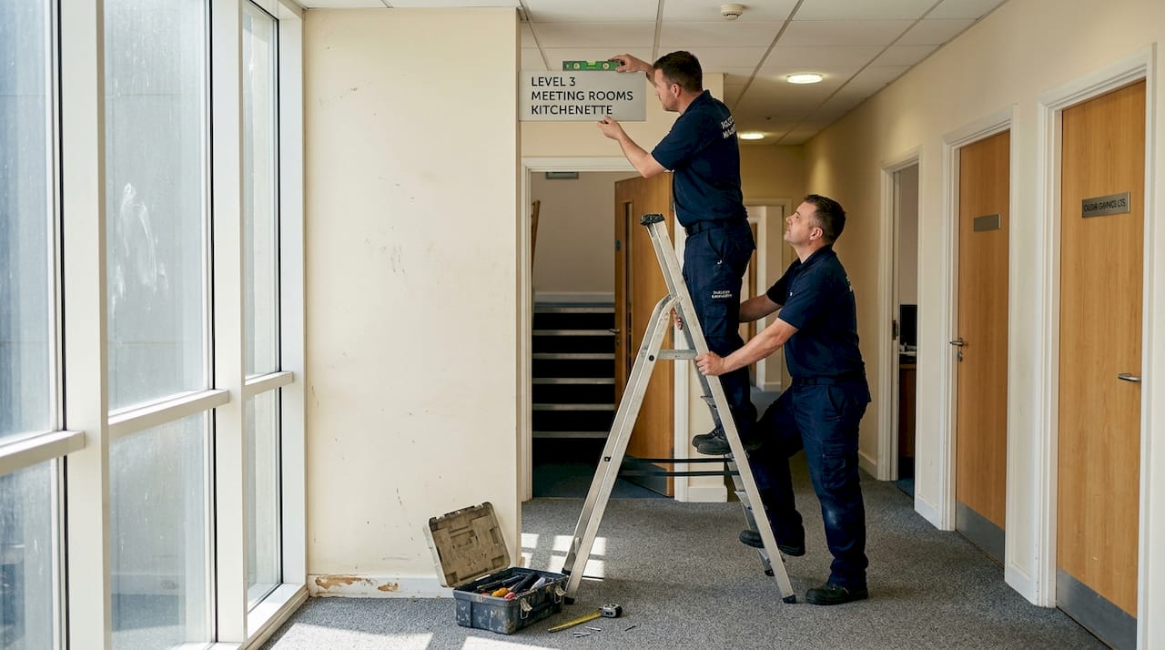
Implementation: strategic placement, installation, and verification
Successful implementation follows a methodical sequence:
- Design approval: Secure stakeholder sign-off on layouts, messaging, and specifications
- Fabrication: Work with qualified manufacturers who understand compliance requirements
- Test mounting: Install temporary versions at proposed locations
- Wayfinding walkthrough: Observe real users navigating with test signage
- Verification: Confirm final installations meet design intent and regulatory standards
Mount signs at key decision points where visitors must choose between paths. Factor in sightlines from various heights, including wheelchair users and children. Ceiling-mounted signs outperform wall-mounted options for evacuation scenarios and high-traffic retail environments where wall space is limited.
Pro Tip: Use temporary placements and observe actual user behaviour before permanent installation. You’ll often discover that theoretical optimal locations don’t work as expected in practice.
The process of creating effective wayfinding signs extends beyond design and installation. Plan for ongoing maintenance, including cleaning schedules, damage inspection, and content updates as your space evolves.
Integrate your physical signage with digital solutions through a comprehensive signage system strategy. Digital displays can provide real-time information whilst traditional signs offer reliable orientation that doesn’t depend on power or connectivity. Signage efficacy studies confirm that hybrid approaches combining both technologies deliver superior results.
Common mistakes and troubleshooting wayfinding systems
Even well-intentioned systems fail when they miss critical details. The most frequent error is omitting signs at hesitation points where visitors naturally pause to orient themselves. These moments of uncertainty are precisely when people need guidance most.
Neglecting regular audits allows your system to degrade over time. Signs become damaged, outdated, or obscured by new fixtures. Schedule quarterly reviews to identify and address these issues before they accumulate.
Prioritising visual style over clarity is a costly mistake. Beautiful signage that visitors can’t read quickly serves no functional purpose. User behaviour should drive placement decisions, with signs positioned at natural decision points and incorporating familiar landmarks.
Five frequent wayfinding mistakes with solutions:
- Insufficient advance warning: Place directional signs far enough before turns that visitors can process information and prepare
- Inconsistent terminology: Standardise all location names and maintain a master list for reference
- Missing confirmation signs: Add reassurance markers along routes so visitors know they’re on track
- Ignoring vertical space: Use overhead signs in crowded areas where wall mounting isn’t practical
- Static systems in dynamic spaces: Plan for flexibility when your layout changes seasonally or for events
Pro Tip: Implement a feedback system after making changes. Track questions at information desks, conduct brief visitor surveys, or use mystery shoppers to identify remaining navigation challenges.
Your customer wayfinding experience should feel effortless. When visitors comment on how easy it was to find things, you’ve succeeded. When they don’t mention navigation at all, you’ve excelled.
Unlock smarter wayfinding with Pik Pik Pow signage solutions
Implementing the strategies in this guide requires expertise in design, fabrication, and installation. Pik Pik Pow supports every phase of your wayfinding project, from initial needs assessment through final verification and beyond.
Our bespoke signage systems combine strategic planning with precision manufacturing to create solutions tailored to your specific space and audience. We understand that effective wayfinding balances functional clarity with brand identity, delivering signs that guide visitors whilst reinforcing your professional image.
Whether you need comprehensive internal wayfinding signage for a complex retail environment or integrated digital signage solutions that adapt to changing information, our team brings decades of experience to your project. We handle compliance requirements, accessibility standards, and installation logistics so you can focus on serving your customers.
Contact our signage specialists to discuss how we can transform navigation in your space with professional wayfinding solutions that work.
Frequently asked questions
What does wayfinding signage include in retail and commercial spaces?
It covers identification, directional, informational, and regulatory signs designed to work as an integrated system for complete navigation coverage.
How do you measure signage effectiveness?
Track reductions in lost-persons queries, measure speed to destination, and review user satisfaction surveys. Professional systems reduce inquiries by 60% and navigation time by 35%.
What are the minimum accessibility requirements for permanent room signs?
Raised tactile letters, Grade 2 Braille, high contrast, matte finish, and proper mounting height between 48 and 60 inches as per current standards.
Are digital signs as effective as traditional wayfinding signage?
Digital and physical signs each offer distinct value. Digital excels for real-time updates whilst traditional remains essential for reliable orientation and accessibility compliance.
Where should wayfinding signs be placed for maximum effectiveness?
Install signs 3 to 5 feet before intersections, at eye level, and at key hesitation points along the user’s journey for optimal advance warning.