

Poor signage costs more than you might expect. When customers cannot find what they are looking for, they leave. When staff spend time directing visitors around a space, productivity drops. In retail and commercial interiors, confusing navigation is a direct drain on revenue and operational efficiency. Effective wayfinding signage solves this by guiding people confidently through your space, reducing friction and improving the overall experience. This guide walks you through every stage of the process, from assessing your space and planning sign hierarchy to selecting materials, designing for accessibility, and maintaining your system over time.
Table of Contents
- Assessing your space and wayfinding needs
- Planning wayfinding sign hierarchy and placement
- Design principles: Visibility, inclusivity, and accessibility
- Selecting between static and digital wayfinding
- Installation, testing, and maintenance essentials
- Next steps: Professional support for your wayfinding signage
- Frequently asked questions
Key Takeaways
| Point | Details |
|---|---|
| Assess space and needs | A methodical site review uncovers navigation and signage priorities before design begins. |
| Follow sign hierarchy | Clearly defined sign types and placement make navigation intuitive and efficient for users. |
| Design for inclusivity | A focus on clear text, icons, shapes, and accessibility ensures everyone can use your wayfinding. |
| Choose the right technology | Decide on static, digital, or hybrid solutions based on budget, flexibility, and site needs. |
| Test and maintain | Regularly review and update signage based on user feedback and changing site requirements. |
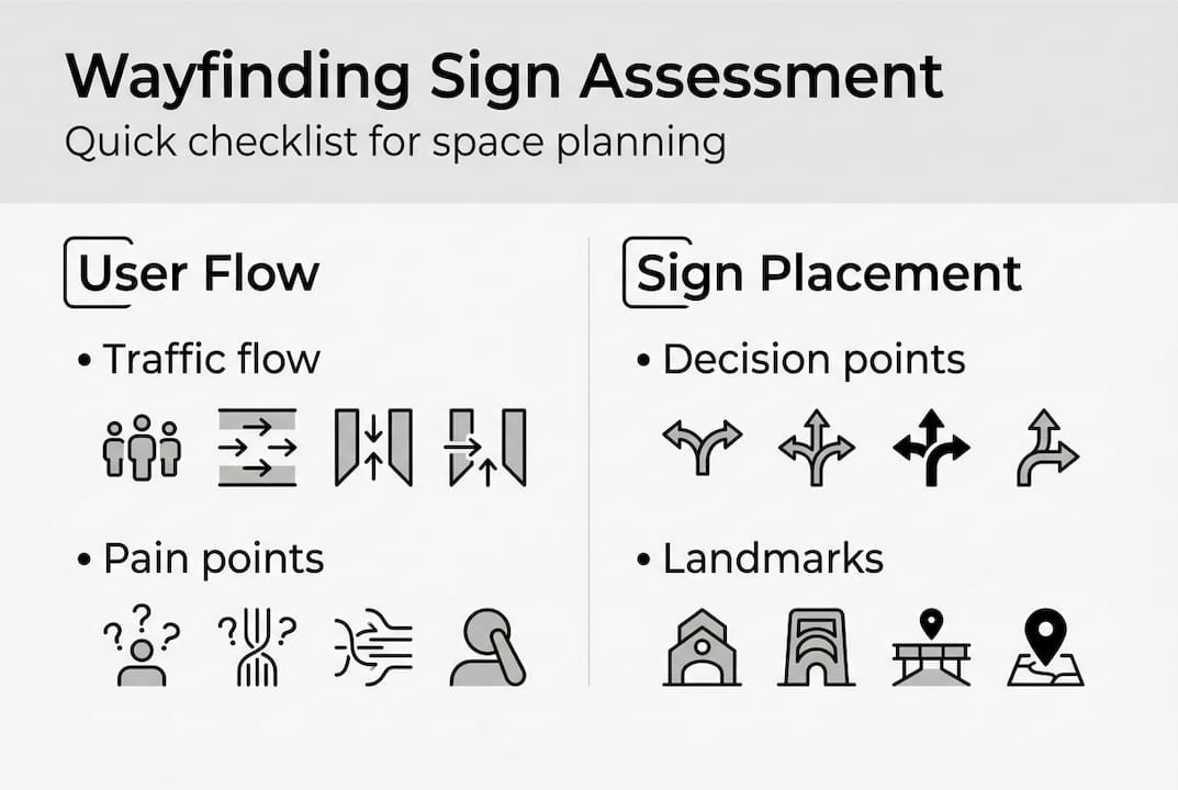
Assessing your space and wayfinding needs
Before you commission a single sign, you need to understand your space thoroughly. Walk the routes your customers or visitors actually take, not the routes you assume they take. Note where people pause, backtrack, or ask for directions. These are your decision points, and they are where signage matters most.
Gather feedback from frontline staff and, where possible, from customers directly. They will quickly identify the areas that cause the most confusion. Also consider the diversity of your audience. Neurodiverse users and tourists demand more thoughtful signage features for inclusivity and legibility, so factor these groups into your assessment from the start.
Key areas to evaluate during your space assessment:
- Primary routes: The main paths people travel from entry to destination
- Decision points: Junctions, lifts, stairwells, and aisle intersections where choices must be made
- High-traffic zones: Areas where congestion or confusion is most likely
- Accessibility requirements: Ramps, accessible entrances, and routes for mobility aid users
- Special user needs: Multilingual visitors, neurodiverse users, and those with visual impairments
| Assessment factor | Questions to ask |
|---|---|
| Traffic flow | Where do people naturally walk first? |
| Pain points | Where do visitors stop or ask for help? |
| Accessibility | Are all routes clearly signed for all users? |
| Existing signage | What is already in place and what is redundant? |
It is worth noting that architecture and natural cues take precedence in good wayfinding design, with signage acting as a last resort rather than the first solution. If your layout is genuinely confusing, signage alone will not fix it. Use your assessment to identify whether physical changes could resolve some issues before adding more signs.
Pro Tip: Create a simple checklist of objectives before briefing any designer or supplier. Include the number of decision points, the user groups you are designing for, and any regulatory requirements specific to your sector.
For complex retail or commercial environments, reviewing internal wayfinding signage examples from similar spaces can help you benchmark what good looks like before you start.
Planning wayfinding sign hierarchy and placement
With your needs and objectives mapped out, planning the sign hierarchy and placement sets up the foundation for effective navigation. Not all signs serve the same purpose, and mixing them up leads to clutter and confusion.
There are four core sign types to plan for:
- Directional signs: Arrows and route indicators guiding people towards a destination
- Identification signs: Labels for rooms, departments, floors, and facilities
- Informational signs: Details about services, opening times, or rules of the space
- Regulatory signs: Safety, fire exit, and compliance notices required by law
Prioritise signs that address the most critical decision points in the user journey. A visitor entering your retail space needs to know immediately where the main departments are. They do not need to see every piece of information at once.
| Sign type | Primary purpose | Typical placement |
|---|---|---|
| Directional | Route guidance | Junctions, corridors, entrances |
| Identification | Location labelling | Room entrances, department headers |
| Informational | Context and detail | Reception areas, waiting zones |
| Regulatory | Compliance | Fire exits, accessible routes |
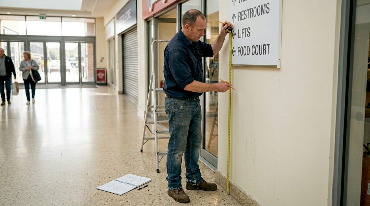
For mounting heights, standard guidance recommends positioning signs between 48 and 60 inches from the floor to ensure visibility for both standing adults and wheelchair users. Sightlines matter too. A sign mounted correctly but obscured by shelving or furniture is useless.
The importance of wayfinding signage is often underestimated until a project is already underway, which is why signage planning timing is critical. Specifying your signage requirements early in a fit-out or refurbishment project avoids costly retrofitting.
Pro Tip: Removing redundant signs highlights the critical navigation points. If you are unsure which signs to cut, try removing half and see which ones people actually miss.
Design principles: Visibility, inclusivity, and accessibility
Having laid out your sign hierarchy and positioning, attention shifts to how signs are designed for maximum usability. Good design is not just about aesthetics. It is about ensuring every person in your space can read, understand, and act on the information quickly.
Start with the basics of visibility. Text must be large enough to read at the relevant viewing distance, and contrast between text and background must be high. Dark text on a light background, or vice versa, is the most reliable approach. Avoid decorative fonts entirely on wayfinding signs.
Key design principles to follow:
- High-contrast text: Minimum 70% contrast ratio between text and background
- Clear, sans-serif fonts: Arial, Helvetica, or similar typefaces for rapid recognition
- Consistent icons: Use the same pictograms across all signs throughout the space
- Shape alongside colour: Colour-blind users need shapes to accompany colour cues, not colour alone
- Tactile elements: Braille and raised lettering for visually impaired users
- Multilingual text or universal symbols: Particularly important in tourist-heavy or international retail environments
Consistency is the single most important design principle in wayfinding. When icons, colours, and layouts change between signs, users lose confidence in the system and begin to distrust the information entirely.
For neurodiverse users, consistency is especially valuable. Predictable layouts and familiar symbols reduce cognitive load and make navigation less stressful. Reviewing indoor signage best practices will give you a solid grounding in what works across different commercial environments.
Selecting between static and digital wayfinding
After mastering design essentials, you must select the right technology mix for your wayfinding needs. Both static and digital signs have a place in modern retail and commercial interiors, and the best solution often combines both.
Static signs are cost-effective and durable; digital signs offer dynamic content and data insights but require more investment; hybrid approaches excel in retail environments where layouts or promotions change regularly.
| Feature | Static signage | Digital signage |
|---|---|---|
| Upfront cost | Lower | Higher |
| Flexibility | Fixed content | Updateable remotely |
| Maintenance | Minimal | Requires software and hardware upkeep |
| Data insights | None | Real-time engagement data |
| Best for | Permanent routes and compliance | Entrances, directories, promotional zones |
Considerations when choosing your approach:
- Budget: Digital screens carry higher installation and ongoing costs
- Frequency of change: If your layout or promotions change often, digital pays for itself quickly
- Data needs: Digital systems can track user interactions and dwell time
- Brand experience: High-end retail environments often benefit from the premium feel of digital directories
For most retail chains and commercial interiors, a hybrid system works best. Use static signs for permanent routes, regulatory notices, and identification. Deploy digital signage solutions at key entry points, directories, and high-decision areas where content needs to change.
Installation, testing, and maintenance essentials
Once the right signage type and design are decided, follow through with methodical installation and ongoing upkeep. Even the best-designed sign fails if it is mounted in the wrong position or allowed to deteriorate over time.
Follow these steps for a reliable installation and maintenance process:
- Install at compliant heights: Follow the 48 to 60 inch mounting standard and check sightlines from multiple angles before fixing permanently
- Test with real users: Walk a diverse group of staff and visitors through the space before launch and note where they hesitate or make wrong turns
- Gather structured feedback: Use a simple observation sheet to record confusion points during testing
- Update when layouts change: Any refurbishment, department move, or regulatory update should trigger a signage review
- Schedule periodic reviews: Set a calendar reminder to assess your signage at least once a year
Properly mounted, tested, and maintained signs ensure ongoing accessibility and navigation simplicity across the life of your space.
Pro Tip: Photograph every sign location immediately after installation. This creates a reference record that makes future updates, replacements, or compliance audits significantly faster.
Studies consistently show that spaces with clear, well-maintained wayfinding see measurable reductions in staff time spent giving directions, which translates directly into operational savings. For guidance on how signage contributes to broader brand impact on site, the advice on site signage for brand impact is worth reviewing as part of your planning process.
Next steps: Professional support for your wayfinding signage
Planning and executing a wayfinding signage project across a retail chain or commercial interior is a significant undertaking. Getting the hierarchy, design, materials, and installation right requires both strategic thinking and technical expertise.
At Pik Pik POW!, we work with project managers and commercial interior teams across the UK to deliver signage systems that are clear, compliant, and built to last. Whether you need a full suite of static signs, a digital signage solution for your entrance and directories, or a hybrid approach across multiple sites, we handle everything from initial consultation and design through to manufacture and installation. Our team understands the specific demands of retail and commercial environments, and we can guide you through compliance requirements, material selection, and long-term maintenance planning. Explore our internal wayfinding signage solutions to see how we can support your next project.
Frequently asked questions
What are the most common mistakes when designing wayfinding signs?
Overloading signs with too much information and using inconsistent visuals across a space are the most frequent errors. As a useful benchmark, removing half of all signs often reveals which ones are genuinely critical to navigation.
How do I ensure my signage is accessible to everyone?
Use high-contrast text, clear sans-serif fonts, and pair shapes with colour cues so that colour-blind users are not excluded. Mount signs between 48 and 60 inches from the floor to accommodate both standing adults and wheelchair users.
Is digital wayfinding always better than static signage?
Not always. Digital signs bring flexibility and data insights, but static signs are more budget-friendly and require less ongoing maintenance. A hybrid setup tends to deliver the best results in retail and commercial environments.
How often should wayfinding signage be reviewed or updated?
Review your signage at least once a year, and immediately after any layout change, rebrand, or regulatory update. Outdated signs create confusion just as quickly as no signs at all.
Can I design wayfinding signage myself or should I use a specialist?
Basic signs can be handled in-house, but specialist input ensures compliance, accessibility, and optimal placement in complex or multi-site environments where the stakes are higher.