
TL;DR:
- Effective safety signage significantly reduces accidents by guiding behaviour and communicating hazards clearly. To maximize impact, signs must be well-designed, maintained, accessible, and integrated into safety culture through regular audits and strategic placement. Properly implemented signage not only ensures legal compliance but also fosters a visible, consistent safety environment that supports emergency preparedness and risk reduction.
Safety signage is routinely dismissed as a compliance formality, something ticked off a checklist and then forgotten. That perception is costly. Well-designed warning signs improve measurable safety outcomes by over 30%, yet many retail and commercial facilities still treat their signs as afterthoughts, relying on faded, poorly placed, or generic displays that fail the people who need them most. This guide cuts through the misconceptions and shows you exactly how effective signage prevents accidents, satisfies legal obligations, and builds a culture where safety is visible, consistent, and genuinely understood.
Table of Contents
- How safety signage prevents accidents and protects people
- Signage as the foundation of a strong safety culture
- The evidence: Measured impact of well-designed signage
- Critical design and deployment factors for maximum effect
- Signage and compliance: Navigating legal requirements
- Clear communication and prevention: Signage as a universal language
- A fresh perspective: What most safety programmes miss about signage
- Take the next step: Enhance safety and compliance with professional signage
- Frequently asked questions
Key Takeaways
| Point | Details |
|---|---|
| Signage prevents accidents | Effective safety signage directly reduces slips, trips, and falls by alerting people to hazards. |
| Supports legal compliance | Meeting signage requirements minimises legal risks and ensures staff and visitor safety. |
| Design details matter | Contrast, pictogram size, placement, and lighting all influence whether a sign is seen and understood. |
| Universal understanding | Standard symbols and colours help everyone instantly grasp vital instructions—even in emergencies. |
| Continual improvement | Regular audits and updates keep signage relevant, visible, and effective across changing conditions. |
How safety signage prevents accidents and protects people
Signage is your first line of defence against preventable incidents. Before a staff member or customer even reaches a hazard, a well-placed sign can redirect their attention, trigger a behavioural change, and stop an accident from happening entirely. That is not theoretical. It is how health and safety signage functions in practice, and the evidence is clear.
Clear visitor signage reduces liability by preventing accidents before they occur, particularly in retail environments where unfamiliar customers are constantly moving through spaces they do not know. A wet floor, a low clearance, a restricted area — without visible warnings, each of these becomes a potential incident.
Effective signage addresses several practical challenges at once:
- Slips, trips, and falls: Wet floor signs, step warnings, and threshold markers give people the split-second awareness they need to adjust.
- Wayfinding and operational flow: Standardised signs direct movement efficiently, reducing congestion and accidental entry into hazardous zones.
- Accessibility for all users: Children, elderly visitors, people with disabilities, and non-native speakers must all be able to understand your signs quickly and without ambiguity.
- Legal risk reduction: Documented, properly maintained signage demonstrates due diligence in the event of an incident or inspection.
“Signage is a visual communicator that makes safety an ingrained part of the environment.” Safety Signs in the Workplace
Pro Tip: Walk your facility as if you are a first-time visitor with no prior knowledge. Ask yourself whether every hazard is clearly communicated, and whether the signage would make sense to someone who does not speak English as their first language.
Accessibility is not a secondary consideration. It is central to whether your signage actually works. Signs that rely solely on text in one language, use poor colour contrast, or are positioned at heights unsuitable for wheelchair users are simply not performing their function.
Signage as the foundation of a strong safety culture
Knowing how signage prevents accidents, it is vital to understand its role in everyday behaviour and preparedness. Signage does not work in isolation. It is most effective when it reinforces the habits, procedures, and values that your safety training already promotes.

When signs are consistently positioned, clearly legible, and regularly updated, they stop being notices and start becoming part of the environment. Staff members stop consciously reading them and begin responding to them automatically. That is exactly what good signage systems integration achieves.
Here is how to build signage into your safety culture effectively:
- Align signs with training content: Every safety procedure your team is trained on should have a corresponding visual reminder in the relevant location. If staff are trained to wear PPE in certain zones, those zones must have PPE reminder signs at the point of entry.
- Position signs at the moment of decision: The most effective signs are placed where behaviour is about to occur, not ten metres before or after the relevant area.
- Support emergency readiness: Fire exit signs, extinguisher locations, first aid stations, and assembly point directions must be visible, unobstructed, and understood by everyone in the building, including temporary staff and contractors.
- Audit regularly for condition and visibility: A sign that has faded, been obscured by shelving, or damaged in a minor incident is worse than no sign at all, because it creates a false sense of coverage.
- Treat signage as part of your safety management system: Record sign locations, installation dates, and inspection results. This creates accountability and simplifies any regulatory review.
“Consistent, well-maintained signage acts as a visual communicator for safe behaviours.” Safety Signs in the Workplace
The facilities that do this well are not spending significantly more. They are being more deliberate about placement, maintenance, and integration.
The evidence: Measured impact of well-designed signage
With a cultural foundation established, let us examine what the research actually shows. The data on signage effectiveness is more specific than most managers expect, and it highlights the difference between a sign that technically exists and one that genuinely performs.
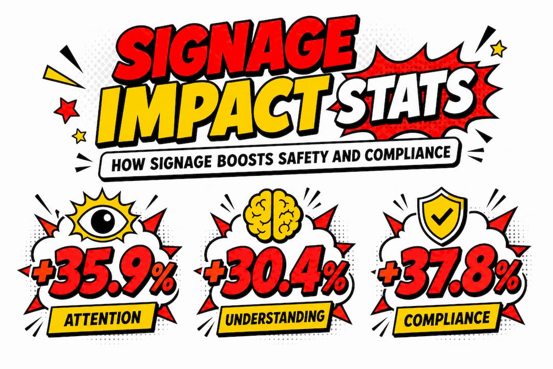
A recent study on warning sign effectiveness found that well-designed signs improve three key outcomes measurably:
| Outcome measured | Improvement recorded |
|---|---|
| Attention capture | +35.9% |
| Comprehension accuracy | +30.4% |
| Behavioural compliance | +37.8% |
These are not marginal gains. A 37.8% improvement in compliance means that more than a third of people who would otherwise have ignored or misunderstood a hazard are now responding correctly. In a busy retail environment or a commercial facility with high footfall, that translates directly to fewer incidents and lower insurance and legal exposure.
The factors driving these results are specific. Larger signs outperform smaller ones. Pictograms significantly increase comprehension, particularly in multilingual or high-stress environments. High colour contrast draws the eye faster than muted or low-contrast designs. And placement matters enormously.
Reviewing signage best practices and applying them to your interior deployment is one of the most practical steps you can take to close the gap between signs that exist and signs that work.
Critical design and deployment factors for maximum effect
Armed with evidence, the next step is understanding the technical choices that determine real-world results. The research is precise about what works and what does not.
Key design parameters for effective safety signs:
- Contrast ratio: High contrast between text, pictogram, and background is non-negotiable. Low contrast is the single most common reason signs go unnoticed.
- Pictogram size: The pictogram should occupy 40 to 50% of the sign’s total area to ensure immediate recognition at a glance.
- Signal word prominence: Words such as Danger, Warning, or Caution must be the most visually dominant text element on the sign.
- Eye-level placement: Signs should be mounted between 150 and 170 centimetres from the floor for optimal visibility across most adult audiences.
- Adequate illumination: The sign must be visible in the ambient lighting conditions of its location, with a minimum of 300 lux recommended for reliability.
The research on sign design factors shows that effectiveness drops sharply when a sign is positioned more than four metres from the intended viewer. This has significant implications for large-format retail environments, warehouses, or wide corridors.
| Design factor | Optimal specification | Common failure mode |
|---|---|---|
| Pictogram area | 40 to 50% of sign surface | Too small, lost in text |
| Viewing distance | Maximum 4 metres | Placed too far from hazard |
| Placement height | 150 to 170 cm from floor | Too high or too low |
| Illumination level | Minimum 300 lux | Obscured by shadow or glare |
| Colour contrast | High contrast, standardised palette | Faded, inconsistent colours |
Consider whether your current signage meets these specifications. Many facilities have signs that were purchased and installed years ago without this level of specification, and they have simply never been reassessed.
Pro Tip: Conduct a walk-through with a lux metre to check whether your signage is adequately lit, particularly in areas where natural light changes seasonally. Pair this with a viewing distance check using a tape measure for any signs in wide spaces.
Good shop sign design and site signage design principles both emphasise that specification matters at every stage, from the initial brief through to installation.
Signage and compliance: Navigating legal requirements
The science of sign design is critical, but legal compliance provides the baseline every organisation must meet. Compliance requirements exist to ensure that signage is not only present, but genuinely functional and recognisable under pressure.
OSHA standards for signage specify design requirements including legibility, signal word usage, and minimum readable distances. In the UK, these are mirrored and in some cases exceeded by local Health and Safety Executive (HSE) regulations.
Key compliance requirements for retail and commercial settings include:
- Standardised signal words: Danger, Warning, and Caution each have defined risk levels they correspond to. Using them interchangeably is non-compliant and potentially misleading.
- Minimum readable distance: Signs must be legible from at least 1.5 metres under normal conditions.
- Specific colour coding: Colours are not decorative. Red indicates prohibition or fire-related information, yellow indicates caution, green indicates safe conditions or exits, and blue indicates mandatory actions.
- Durability requirements: Signs must remain legible and intact under the environmental conditions of their location. A sign that becomes unreadable in three months is not compliant.
- Regular review cycles: Standards evolve, and your signage must evolve with them. A sign that was compliant five years ago may no longer meet current specifications.
Non-compliance carries genuine consequences. Enforcement action, improvement notices, and fines are all possibilities following an HSE inspection. Equally important is the reputational risk. An organisation that fails to maintain basic safety standards loses the confidence of staff, customers, and partners alike.
Reviewing your signage compliance guide is a useful starting point, even for non-construction environments, as many of the underlying standards apply across sectors.
Clear communication and prevention: Signage as a universal language
Beyond compliance, clarity in communication is the final ingredient for signage that truly keeps everyone safe. The best safety signs work regardless of the viewer’s language, literacy level, or prior knowledge of the facility.
Standardised pictograms and colour coding enable immediate understanding and facilitate evacuations, even in high-stress situations where reading is difficult or impossible. This is why internationally recognised symbols such as the running figure for emergency exits or the flame for fire hazards are so valuable. They bypass language entirely.
In practice, your signage should achieve the following without relying on text alone:
- Communicate the nature of the hazard: Is it a slip risk, a chemical risk, an electrical risk? The pictogram should answer this instantly.
- Direct movement and flow: Arrows, exit symbols, and directional signs guide people through unfamiliar spaces quickly and calmly.
- Reinforce mandatory actions: Wearing a hard hat, washing hands, or using protective eyewear must be communicated clearly at the point where the action is required.
- Support emergency evacuation: Assembly points, muster areas, and escape route signs must be visible from multiple angles and at multiple heights to serve all users effectively.
Pro Tip: Use only accredited, standardised symbols from recognised standards bodies. Bespoke or informal graphics may look distinctive, but they undermine the instant recognition that makes safety signage effective under pressure.
A practical guide to the types of construction signage applicable in the UK offers useful reference points for understanding how different sign categories serve different functions, and much of this logic applies directly to retail and commercial environments too.
A fresh perspective: What most safety programmes miss about signage
After exploring principles and law, let us address something that is rarely discussed directly. Most organisations approach signage as a procurement exercise. They identify a requirement, source a sign, install it, and consider the job done. That thinking is where safety programmes quietly fail.
Signage is not a product you buy once. It is an active component of your safety management system, and it requires the same ongoing attention as any other system. Signage alone is not a substitute for hazard control, but it accelerates recognition and supports broader systems when it is properly maintained, audited, and updated.
The facilities that achieve genuinely strong safety records are the ones that treat signage as dynamic. They run formal audits on a schedule, not just after incidents. They collect feedback from staff about which signs are confusing or overlooked. They reassess accessibility when their workforce or customer base changes.
There is also an uncomfortable truth about accessibility. Many managers assume that because their signage is technically compliant, it is accessible. Compliance sets a minimum floor. Real accessibility means your signs are understood by the person with low literacy, the visitor who does not read English, the customer who uses a wheelchair and cannot see the sign mounted at 180 centimetres. These are not edge cases in most retail and commercial environments. They are daily realities.
Durable signage that is properly designed and maintained signals something important to everyone who enters your space. It says that safety is not a formality here. That visible commitment shapes behaviour in ways that no training document alone can achieve.
The cycle of review, feedback, and update is what separates a safety programme that genuinely works from one that looks good on paper. Build that cycle deliberately, and your signage will remain an asset rather than a liability.
Take the next step: Enhance safety and compliance with professional signage
Ready to put these principles to work for your organisation? Effective safety signage requires more than choosing the right products. It requires a considered approach to design, placement, durability, and ongoing management.
At Pik Pik POW!, we work with safety managers and facility administrators across retail, commercial, and construction environments to deliver signage that genuinely performs. Our professional signage systems are designed to integrate with your existing safety management processes, ensuring consistency and compliance across your entire site. We also offer digital signage solutions for environments where messages need to change quickly or adapt to shifting conditions. For facilities managing multiple departments or complex layouts, our internal and wayfinding signage service helps create clear, accessible navigation that supports both daily operations and emergency response. Get in touch with our team to discuss your requirements and find out how we can help you build a safer, more compliant environment.
Frequently asked questions
What is the legal minimum standard for safety signage in commercial buildings?
Safety signage must comply with design and placement standards, including legibility, signal words, and minimum distances, as set by OSHA or the relevant local authority such as the HSE in the UK. These requirements apply regardless of building type or size.
How often should safety signage be audited or replaced?
Signage should be formally reviewed at least annually and immediately following any significant change to the workplace layout, activities, or workforce composition. Maintaining signage condition is as important as its initial installation and is a recognised element of good safety practice.
Which features make a safety sign most effective?
Design factors such as contrast, pictogram size covering 40 to 50% of the sign area, eye-level placement between 150 and 170 centimetres, and sufficient illumination of at least 300 lux all significantly improve attention, comprehension, and compliance outcomes.
Why is colour coding important for safety signage?
Colour coding allows immediate hazard recognition across language and literacy barriers, making it possible for anyone entering your facility to understand critical safety information without needing to read text. This is particularly important during emergencies when reading speed and comprehension are reduced.