

TL;DR:
- Space planning signage creates an integrated system that guides navigation and supports space use within buildings. Its design must adhere to UK standards like BS 8300:2018, focusing on placement, contrast, and tactile features for accessibility and compliance. Proper early planning ensures consistent, effective signage that enhances user experience and regulatory compliance.
Space planning signage is defined as a coordinated system of signs designed to support navigation, accessibility, and the functional use of space within a built environment. The industry term for this discipline is “wayfinding signage,” though space planning signs extend beyond simple directions to encompass the full relationship between a building’s layout and its communication system. For designers, architects, and facility managers, getting this right means satisfying both user experience demands and legal obligations under the Equality Act 2010 and BS 8300:2018. A poorly planned signage system creates confusion, raises compliance risks, and undermines the spatial design it is meant to support.
What is space planning signage and how does it work?
Space planning signage is a system of visual, tactile, and spatial cues that guides people through a built environment while reinforcing how a space is organised and used. It is not a collection of individual signs. It is an integrated wayfinding strategy combining signage, spatial layout, and environmental cues to support user confidence and reduce stress in complex environments such as airports, hospitals, and large commercial offices.

The distinction matters because treating signs as isolated graphic elements leads to inconsistency, visual clutter, and compliance failures. Effective space planning signage begins with understanding how people move through a space and where they make navigation decisions. That intelligence then drives sign placement, hierarchy, and content, rather than the other way around.
What are the key components and types of space planning signage?
Space planning signs fall into four functional categories, each serving a distinct role within the overall system.
| Sign type | Primary function | Design considerations |
|---|---|---|
| Directional | Guides movement toward destinations | Arrow orientation, decision-point placement, clear hierarchy |
| Informational | Communicates room names, floor numbers, and facility details | Legibility at distance, consistent typography |
| Regulatory | Conveys rules, restrictions, and safety instructions | High contrast, standardised symbols, legal compliance |
| Identification | Labels specific rooms, zones, or assets | Tactile and Braille elements per BS 8300:2018 |
Identification signs carry the most regulatory weight in UK buildings. Tactile and Braille requirements under BS 8300:2018 apply to key points and permanent rooms, specifying raised text depth of 0.8–1.5 mm and character heights between 15–50 mm. These are not optional refinements. They are legal requirements that affect material selection, fabrication method, and installation planning from the outset.
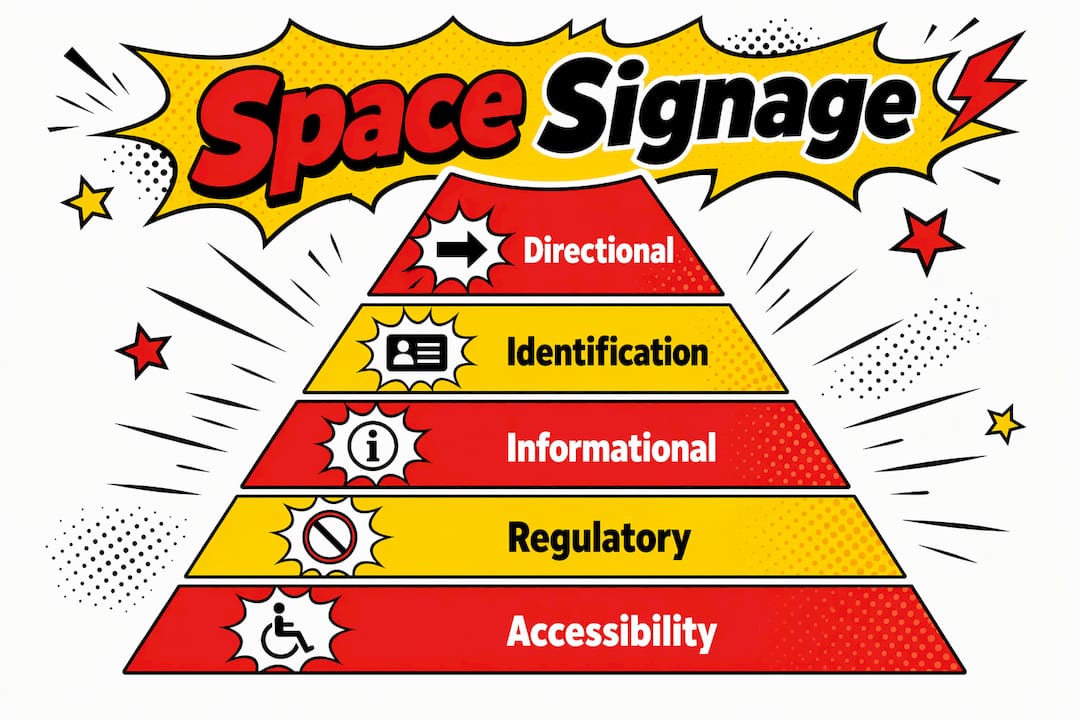
Directional signs demand the most careful placement work. A directional sign positioned after a decision point is functionally useless, regardless of how well it is designed. Informational and regulatory signs, by contrast, are often underestimated in their contribution to spatial clarity. A well-placed floor directory reduces the number of directional signs needed downstream.
Pro Tip: In mixed-use buildings such as retail and office developments, prioritise identification and directional signs first. Regulatory signs can be layered in once the primary navigation logic is confirmed, reducing the risk of visual clutter at key junctions.
How do regulations and accessibility standards influence signage design in the UK?
UK signage design is shaped by two primary frameworks: the Equality Act 2010 and BS 8300:2018. The Equality Act places a legal duty on building owners and operators to make reasonable adjustments for disabled users. BS 8300:2018 translates that duty into specific technical requirements for signage.
The mounting height rules are precise. Tactile door sign centres must sit between 1,400 mm and 1,600 mm from the floor, with a minimum clearance of 100 mm from door frames. Raised characters must be positioned away from door hardware and door arcs to prevent confusion during emergency evacuation. These specifications directly affect where signs can be fixed and what substrate thickness is viable.
Colour contrast is equally regulated. BS 8300:2018 requires a minimum 30-point Light Reflectance Value (LRV) contrast between text and background. LRV is a measure of how much light a surface reflects, expressed on a scale of 0 (pure black) to 100 (pure white). A 30-point difference is the minimum threshold for legibility for visually impaired users.
| Requirement | BS 8300:2018 specification |
|---|---|
| Tactile sign centre height | 1,400–1,600 mm from floor |
| Clearance from door frame | Minimum 100 mm |
| Raised text depth | 0.8–1.5 mm |
| Character height range | 15–50 mm |
| LRV contrast (text vs background) | Minimum 30 points |
Most LRV compliance failures occur because contrast requirements were not considered during the material selection phase. Specifying a wall finish and a sign substrate independently, then checking contrast afterwards, is the most common and costly mistake in UK signage projects. Designers who build LRV into their material schedules from day one avoid expensive late-stage substitutions and enforcement risk. You can find a fuller breakdown of UK obligations in Pikpikpow’s architectural signage checklist.
What is the role of signage within wayfinding and space planning systems?
Signage within a space planning context functions as an operational framework, not a decorative layer. Signage systems create scalable, coherent sign families, hierarchies, and schedules that manage sprawling facility signage without losing consistency. That distinction, between a system and a collection of signs, is what separates projects that hold together over time from those that accumulate visual noise.
The most effective wayfinding strategies are grounded in behavioural psychology. Experts from Wayfinder Ltd and ABG Design advocate analysing real movement patterns to refine signage placement and eliminate visual noise. Navigation strategies informed by actual user behaviour consistently outperform those based solely on graphic design assumptions. This means conducting movement studies, identifying genuine decision points, and placing signs where people actually pause to orient themselves, not where a floor plan suggests they should.
Sign hierarchy is the structural backbone of any effective system. A clear hierarchy means users encounter the right level of information at the right moment. Campus-level orientation comes first, then building identification, then floor directories, then room identification. Collapsing these levels, or skipping them, forces users to process too much information at once.
The benefits of treating signage as a system rather than individual elements include:
- Prevention of “project drift,” where signs accumulate inconsistently over time as a facility grows
- Consistent visual language across all zones, reducing cognitive load for users
- Scalability, so new wings or floors can be signed without redesigning the entire scheme
- Easier maintenance scheduling, because sign families share materials and fixings
- Reduced risk of signage compliance failures when standards are built into the system specification
Pro Tip: Involve your signage consultant or supplier at the space planning stage, not after construction drawings are complete. Sign placement decisions affect wall finishes, lighting positions, and structural fixings. Late involvement means compromise.
How can designers and facility managers implement space planning signage effectively?
Effective implementation follows a structured sequence. Skipping steps creates the gaps that lead to compliance failures and user confusion.
Conduct a site audit. Walk the building as a first-time visitor. Map every decision point where a user must choose a direction. Note existing architectural cues such as sightlines, lighting, and floor finishes that already guide movement.
Define the signage hierarchy. Establish the levels of information the system must communicate, from campus orientation down to individual room identification. Assign a sign type to each level before specifying any individual sign.
Integrate signage into the architectural specification. Coordinate sign positions with wall finishes, lighting design, and structural elements. Specify LRV values for sign substrates and wall backgrounds at the same time as other material selections.
Select materials for the environment and the standard. External signs require weather-resistant substrates. Internal signs in healthcare or education settings must meet hygiene and durability requirements. All identification signs in UK public buildings must meet BS 8300:2018 tactile and Braille specifications. Pikpikpow’s guide on wayfinding in fit-outs covers material selection in detail for commercial interiors.
Plan for maintenance and change. Modular sign systems with replaceable inserts cost more upfront but reduce the expense of re-signing when room functions change. Specify fixings and substrates that allow panel replacement without wall damage.
Common pitfalls to avoid include placing directional signs after decision points, specifying sign colours without checking LRV contrast against the finished wall, failing to include tactile elements on permanent room signs, and treating signage as a final-stage procurement item rather than a design discipline. A common design failure is prioritising aesthetics over user navigation needs, which causes signage clutter and visitor hesitation. Map decision points first. Aesthetics follow function.
Key takeaways
Space planning signage works when it is designed as a system, grounded in user behaviour, and specified to meet BS 8300:2018 from the first material decision.
| Point | Details |
|---|---|
| Define signage as a system | Treat all signs as part of a coordinated hierarchy, not as individual graphic elements. |
| Apply BS 8300:2018 from the start | Specify LRV contrast and tactile requirements during material selection, not at the end. |
| Ground placement in behaviour | Map real decision points before positioning any sign, using movement analysis. |
| Integrate early with architecture | Coordinate sign positions with wall finishes, lighting, and fixings at the design stage. |
| Plan for scalability | Use modular sign families so the system can grow without losing visual consistency. |
Signage as a navigation tool, not an afterthought
Working across commercial interiors, retail, and construction projects, we see the same mistake repeated: signage is treated as a procurement task rather than a design discipline. The brief goes out after the fit-out is nearly complete, the wall finishes are fixed, and the lighting is installed. At that point, the signage consultant is solving problems rather than preventing them.
The projects that work well share one characteristic. The signage system was defined alongside the space plan, not after it. Decision points were mapped before partition walls were finalised. LRV values were agreed before wall paint was specified. Tactile sign positions were coordinated with door hardware schedules. That sequence costs nothing extra. It simply requires treating signage as part of the design, which it always was.
The other pattern we notice is an over-investment in individual sign aesthetics at the expense of system logic. A beautifully crafted sign in the wrong location, or at the wrong level of the hierarchy, fails the user completely. The most effective space planning signs are often the least visually striking, because they communicate exactly what is needed at exactly the right moment, then get out of the way.
Our honest view is that the Equality Act 2010 and BS 8300:2018 have done designers a favour. They force the conversation about contrast, mounting height, and tactile provision into the early design stages, where those decisions are cheap to make. Compliance is not a constraint on good design. It is a framework that produces better outcomes for every user.
— PikPikPOW!
Pikpikpow signage solutions for space planning projects
Pikpikpow works with designers, architects, and facility managers across the UK to produce signage systems that meet both functional and regulatory demands.

From internal wayfinding signage to full signage systems for commercial and public buildings, Pikpikpow combines design expertise with precision manufacturing to deliver sign families that hold together across entire facilities. Every project is specified to BS 8300:2018 requirements, with LRV contrast, tactile provision, and mounting heights built into the production schedule from the start. If you are at the space planning stage and need a signage consultant who understands both the design and the compliance demands, contact Pikpikpow to discuss your project.
FAQ
What is space planning signage?
Space planning signage is a coordinated system of directional, informational, regulatory, and identification signs designed to support navigation and spatial functionality within a built environment. It is the practical application of wayfinding principles to a specific building or site.
Which UK standards apply to space planning signs?
The Equality Act 2010 and BS 8300:2018 are the primary frameworks. BS 8300:2018 specifies tactile sign mounting heights of 1,400–1,600 mm, raised text depth of 0.8–1.5 mm, and a minimum 30-point LRV contrast between text and background.
Why does signage hierarchy matter in space planning?
Signage hierarchy ensures users receive the right level of information at each decision point, from campus orientation down to room identification. Without hierarchy, signs compete for attention and increase cognitive load, causing hesitation and confusion.
When should signage be integrated into a space planning project?
Signage should be integrated at the space planning stage, before wall finishes, lighting, and structural fixings are finalised. Late involvement forces compromise on placement, contrast, and tactile provision, increasing both cost and compliance risk.
What is LRV contrast and why does it matter for signage?
Light Reflectance Value (LRV) contrast measures the difference in light reflectance between a sign’s text and its background. BS 8300:2018 requires a minimum 30-point LRV difference to ensure legibility for visually impaired users in UK buildings.