

TL;DR:
- Effective gym signage creates a cohesive, accessible communication system that guides and motivates members while reinforcing brand identity. Proper design involves dividing the facility into zones, establishing a signage hierarchy, and ensuring consistency in wording and visual elements to support safety and user experience. Regular audits, adherence to accessibility standards, and strategic use of digital signage enhance member engagement and facility safety.
Effective gym signage is a cohesive system of consistent, clear, and accessible signs that guide, inform, and motivate members while reinforcing your brand identity. Knowing how to design gym signage properly means treating every sign in your facility as part of a single, coordinated communication system rather than a collection of individual notices. Done well, facility signage reduces member confusion, supports safety compliance, and projects a professional image that builds trust from the moment someone walks through your door. Brands like Skelcore and Visionbox have published detailed playbooks on this subject, and the principles they outline apply directly to gyms of every size.
How to design gym signage: planning zones and structure
The first step in designing effective gym signage is mapping your facility into clear functional zones. Strength, cardio, recovery, stretching, and changing areas each serve a different purpose and benefit from a distinct visual identity. Skelcore recommends assigning one colour palette and one typographic style per zone to prevent the patchwork appearance that confuses members and undermines your brand. This approach means a member moving from the cardio area to the free weights section immediately understands the transition without needing to read a word.
Once your zones are defined, build a signage hierarchy within each one. A well-structured hierarchy separates five distinct sign types:
- Zone identification signs — large, prominent markers that name the area
- Equipment ID labels — smaller tags identifying individual machines or stations
- Instructional panels — step-by-step usage guides positioned at eye level near equipment
- Safety warnings — visually distinct alerts placed at genuine risk points such as moving parts or loading zones
- Return and storage labels — clear prompts directing members to replace weights, mats, or accessories
Separating these signage jobs prevents information overload and helps members process what they need quickly. A member scanning for a safety warning should not have to filter through instructional text to find it.
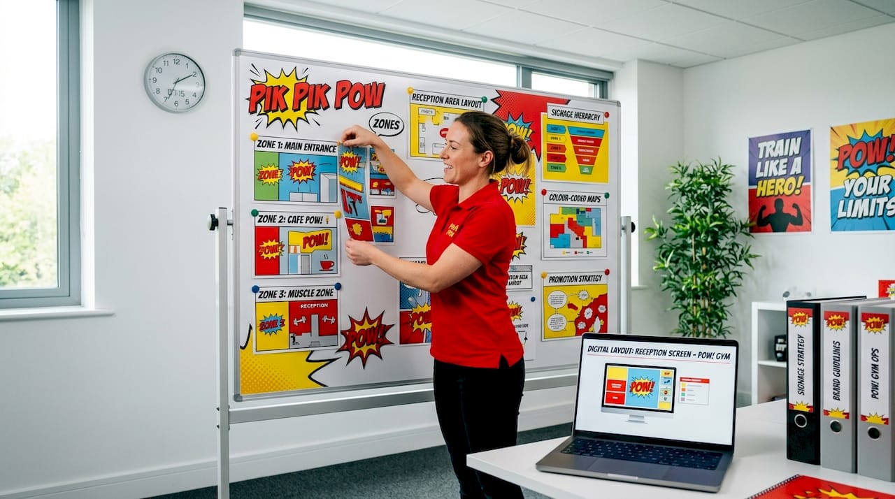
Pro Tip: Create a simple one-page signage map before ordering anything. Assign each sign type a colour code and size range. This single document prevents inconsistency across your whole facility and saves costly reprints.
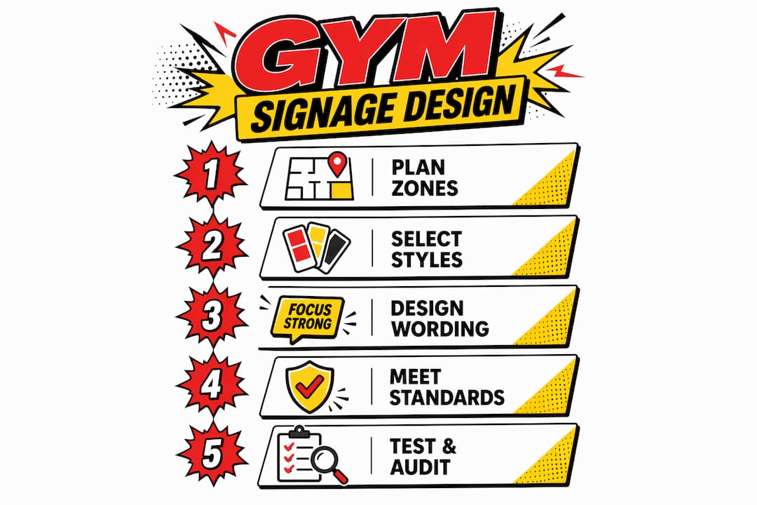
What are the best practices for wording and visual design?
Wording is where most gym signage fails. Long sentences, passive phrasing, and inconsistent terminology all slow members down at the exact moment they need quick, clear information. Short, action-based labels such as “Start Here,” “Adjust Seat,” or “Return Plates” are far easier to scan while moving than full instructional sentences. The rule is simple: if a member needs to stop walking to read a sign, the wording needs shortening.
Visual consistency is equally critical. Members notice inconsistency subconsciously, and even subtle mismatches in font weight or icon style increase mental load and reduce how effectively signs communicate. Apply these principles across every sign in your facility:
- Use no more than two typefaces across all signage. One for headings, one for body text.
- Choose a single icon library and use it exclusively. Mixing icon styles from different sources creates visual noise.
- Maintain a minimum contrast ratio of 4.5:1 between text and background for legibility under gym lighting conditions.
- Position signs at decision points: entrances to zones, beside equipment, and at junctions where members choose a direction.
- Keep instructional panels to five steps or fewer. If a machine requires more explanation, a QR code linking to a video is a better solution.
Tone of voice matters too. If your brand is motivational and energetic, your signage wording should reflect that. “Crush It” works for a high-intensity training gym. It does not work for a rehabilitation-focused facility. Aligning tone across all signs creates a coherent brand experience that members feel even when they are not consciously reading.
Pro Tip: Test your wording on someone unfamiliar with the equipment. If they hesitate or ask a follow-up question, the sign needs revision before it goes on the wall.
Does gym signage need to meet accessibility and legal standards?
Accessibility in gym signage is not optional. ADA standards require that accessible routes connect building entrances, locker rooms, and all exercise equipment areas, with clear floor space maintained throughout. Signage must support this network, not obstruct it. A sign mounted at the wrong height or positioned to block a turning radius creates a legal liability as well as a practical barrier for members using wheelchairs or mobility aids.
For UK-based facilities, the Equality Act 2010 sets equivalent obligations. The practical requirements for signage include:
- Braille or tactile text on permanent room identification signs
- Mounting heights between 1,200mm and 1,500mm from floor level for wall-mounted signs
- Non-glare finishes to support members with visual impairments
- High contrast between sign text and background, consistent with accessible design standards
- Clear floor space of at least 760mm by 1,220mm in front of any sign requiring close reading
Safety and emergency signage carries its own compliance requirements. Illuminated EXIT signs must remain unobstructed, use the correct lettering dimensions, and be placed according to building code specifications. In addition to EXIT signs, your facility needs clearly marked first aid points, AED locations, fire extinguisher positions, and hygiene reminder signs in changing areas and toilets. You can find a detailed breakdown of what indoor compliance signage covers in Pikpikpow’s indoor signage checklist.
Accessible signage must be viewed as a network, not a series of individual signs. Every sign in the chain must connect to the next to allow independent navigation for all members.
Pro Tip: Schedule a formal signage audit every 12 months and after any layout change. New equipment, relocated zones, or refurbished areas can break the accessibility network without anyone noticing until a complaint is raised.
How does digital signage improve member engagement?
Digital signage transforms static communication into a live content channel. Visionbox recommends positioning screens for maximum visibility, building simple content management processes that any staff member can operate, and scheduling content to match peak attendance times. A screen showing class promotions at 6am when commuters arrive serves a different purpose than one displaying recovery tips at midday when the gym is quieter.
A practical content strategy for gym digital signage covers four categories:
- Operational information — class timetables, facility announcements, equipment out-of-service notices
- Safety and instructional content — short video demonstrations of correct form, hygiene reminders, emergency procedure summaries
- Motivational content — member milestones, challenge leaderboards, motivational quotes aligned to your brand voice
- Promotional content — membership upgrades, personal training offers, retail products, upcoming events
The key risk with digital signage is screen fatigue. Digital signage must be treated as a content system with scheduled updates and clear ownership, otherwise screens become background noise that members stop registering entirely. Assign one staff member responsibility for content updates and set a minimum refresh cycle of two weeks for promotional content.
Social media integration adds another layer of engagement. Displaying a live feed of member posts using your gym’s hashtag creates community visibility and encourages participation. Gamification through leaderboards or challenge tracking on digital screens has a measurable effect on member motivation and retention. Pikpikpow’s digital signage solutions page covers the hardware and software options suited to fitness environments.
Pro Tip: Avoid running digital screens on a single looping playlist for more than two weeks. Members who visit three or four times a week will memorise the content and begin ignoring the screens entirely.
What are the most common gym signage problems and how do you fix them?
The most frequent signage problem in gyms is inconsistency. Fonts change between zones, icon styles differ between equipment labels, and wording shifts from imperative to passive without reason. The result is a facility that feels assembled rather than designed, which reduces member confidence in the space. The fix is a signage style guide: a single reference document that specifies approved fonts, colours, icon sets, and wording conventions for every sign type.
Clutter is the second major problem. Safety labels placed near genuine risk areas lose their impact when surrounded by instructional text and promotional notices. When every surface carries a sign, members learn to ignore all of them. Audit your facility for sign density and remove anything that duplicates information available elsewhere or serves no active navigational or safety purpose.
Post-installation testing is the step most gym owners skip. Observing member interactions after new signage goes up reveals hesitation points, ignored signs, and placement errors that no amount of planning anticipates. Watch where new members pause, where they look confused, and where they ask staff for directions. Each of those moments identifies a signage gap.
Pro Tip: Ask front-desk staff to log the three most common member questions each week. Recurring questions about equipment location or usage almost always indicate a missing or unclear sign.
Key takeaways
Effective gym signage requires a planned hierarchy, consistent visual identity, and regular auditing to support navigation, safety, and member engagement across every zone.
| Point | Details |
|---|---|
| Zone-based planning | Divide your facility into functional zones and apply one consistent colour and style per zone. |
| Signage hierarchy | Separate zone ID, equipment labels, instructions, safety warnings, and storage signs to reduce information overload. |
| Accessibility compliance | Meet Equality Act and ADA standards with correct mounting heights, contrast ratios, and accessible route continuity. |
| Digital content strategy | Treat digital screens as a live content system with scheduled updates and clear staff ownership to avoid screen fatigue. |
| Post-installation testing | Observe member behaviour after installation and use staff feedback to identify and resolve signage gaps. |
What we have learned from designing gym signage systems
At Pikpikpow, the most consistent lesson we take from gym signage projects is that the facilities with the best signage never started with the signs. They started with a plan. The gym owners who came to us with a zone map, a style guide, and a clear hierarchy in place produced signage systems that worked from day one. Those who came with a list of individual signs to replace ended up in a cycle of piecemeal fixes that never quite resolved the underlying inconsistency.
The second thing worth saying plainly: accessibility is not a box-ticking exercise. We have seen facilities invest heavily in branded zone signage and then mount it at the wrong height, use a gloss finish under direct lighting, or place it in a position that blocks a turning radius. The sign looks good in a photograph and fails in practice. Accessibility requirements exist because they reflect how real people actually use a space, and getting them right improves the experience for every member, not just those with disabilities.
On digital signage, our honest view is that most gyms underestimate the content commitment. A screen on the wall is not a set-and-forget solution. It requires the same editorial discipline as a social media channel. The gyms that get real value from digital signage treat it as a communication tool with a content calendar, not a television that happens to show their logo.
Finally, the balance between branding and function is a genuine tension. Strong brand expression in signage is worth pursuing, but never at the cost of legibility or clarity. A beautifully designed sign that members cannot read quickly is a decoration, not a sign. Function comes first. Brand expression works within those constraints, not around them.
— PikPikPOW!
Get professional gym signage designed and built to last
Pikpikpow designs and manufactures bespoke gym signage systems for fitness facilities across the UK, from zoned wayfinding and equipment labels through to accessible safety signage and digital signage screens. Every project starts with a consultation to understand your facility layout, brand identity, and compliance requirements. Our team handles design, production, and installation, so you receive a complete signage system that is durable, legible, and built to meet current accessibility standards. If you are planning a new gym fit-out or refreshing an existing facility, our indoor signage guide is a practical starting point. Get in touch with Pikpikpow for a quote tailored to your space.
FAQ
What should gym signage include?
Gym signage should include zone identification markers, equipment labels, instructional panels, safety warnings, emergency and first aid signs, and return or storage prompts. Accessibility signs and hygiene reminders in changing areas are also required for compliance.
How many sign types does a gym need?
A well-structured gym signage system uses at least five distinct sign types: zone ID, equipment labels, instructional panels, safety warnings, and storage labels. Larger facilities also benefit from directional wayfinding signs near entrances and corridor junctions.
What size should gym signs be?
Sign size depends on viewing distance and function. Zone identification signs are typically large format, readable from across the floor. Equipment labels and instructional panels are smaller, designed for close reading at the point of use. Wall-mounted accessible signs should be positioned between 1,200mm and 1,500mm from floor level.
How often should gym signage be reviewed?
Gym signage should be audited at least once per year and after any layout change, equipment addition, or refurbishment. Regular auditing identifies placement errors, damaged signs, and gaps caused by facility changes before they affect member experience.
Is digital signage worth the investment for a gym?
Digital signage delivers strong value when managed as a content system with scheduled updates. Visionbox data shows that screens positioned for visibility and updated regularly improve member engagement with class schedules, safety information, and promotional content. Without a content plan, screens quickly become background noise.