

TL;DR:
- Effective architectural signage combines brand identity, practicality, and environmental fit to influence perceptions and guide users.
- Strategically designed signage enhances visibility, safety, and user experience across retail, commercial, construction, and digital environments.
Signage is often the first thing people encounter when approaching a building, entering a retail space, or navigating a large commercial site. In competitive UK markets, where footfall is hard won and brand perception is formed in seconds, architectural signage is not merely decorative. It is a functional, strategic asset. This article explores real-world examples across retail, commercial interiors, construction, and digital environments, giving you the practical inspiration and design direction you need to make confident signage decisions for your own space or client projects.
Table of Contents
- What defines effective architectural signage?
- Retail signage: Making your brand unmissable
- Wayfinding and interior signage for commercial spaces
- Construction and exterior site signage: Safety meets branding
- Digital architectural signage: Innovation in action
- Our perspective: Signage deserves more strategic attention than most businesses give it
- Work with Pik Pik POW! on your next signage project
- Frequently asked questions
Key Takeaways
| Point | Details |
|---|---|
| Clarity is key | The most effective architectural signage balances brand style with easy navigation and compliance. |
| Sector shapes solutions | Different settings—retail, commercial, construction—demand tailored signage strategies. |
| Integrated design works best | Signage performs optimally when materials, lighting, and branding are considered from the outset. |
| Digital evolves possibilities | Modern signage using digital platforms allows for flexible, real-time communication in any space. |
What defines effective architectural signage?
Now that we’ve set the stage, let’s examine the essential ingredients for architectural signage that not only looks impressive but drives real business outcomes.
Effective architectural signage sits at the intersection of brand identity, practical function, and physical environment. It must work for the space it occupies, not against it. Integrating signage and architecture enhances both visibility and user experience, which is why every element from font choice to mounting method deserves deliberate thought.
Strong architectural signage typically delivers on several core criteria:
- Brand alignment: Colours, typography, and materials should reflect your brand guidelines consistently across all signage touchpoints.
- Legibility at distance: Whether mounted on a high-street fascia or at the entrance of a business park, your signage must be readable from the relevant viewing distance without effort.
- Material durability: Exterior signs face UV exposure, wind, rain, and temperature variation. Choosing weatherproof aluminium, acrylic, or composite materials ensures longevity.
- Illumination strategy: Halo-lit lettering, LED-backlit panels, and internally illuminated lightboxes all serve different contexts. Retail environments often benefit from consistent illumination for evening trading.
- Accessibility and compliance: Signage must meet relevant UK regulations, including the Equality Act 2010, which requires that signs are accessible to people with visual impairments where applicable.
- Site-specific customisation: A sign that works for a high-end boutique will not suit a construction hoarding or a hospital wayfinding system. Context shapes every decision.
“Well-designed signage does not just tell people where to go. It tells them who you are before they’ve even walked through the door.”
Pro Tip: When briefing a signage designer, provide your brand guidelines document and photographs of the proposed installation site at multiple times of day. Lighting conditions change dramatically, and what reads clearly at noon can become illegible in the evening glare or low winter sun.
The best architectural signage balances innovation with clarity. It is tempting to pursue striking, unconventional forms, but if a visitor cannot quickly extract the information they need, the sign has failed its primary purpose.
Retail signage: Making your brand unmissable
With the principles clear, let’s put them into context, starting with stunning and strategic retail signage.
Retail environments are where architectural signage often has the most immediate commercial impact. A well-executed shopfront sign can increase footfall directly. Shop design strategies confirm that best practices in shop signage centre around high-impact branding and cohesive aesthetic integration, meaning the sign must look like it belongs to the building and the brand simultaneously.
Here are the main signage types you should consider for retail contexts:
- Illuminated fascia signs: These are the large, illuminated signs mounted across the top of a shopfront. They are highly visible at night and in poor weather, making them ideal for high streets, retail parks, and shopping centres. Materials commonly used include aluminium trays with LED modules or acrylic faces.
- Projecting signs (also known as blade signs): These extend perpendicular to the building facade, making them visible to pedestrians walking along the street rather than approaching directly. A well-designed projecting sign can increase walk-by visibility significantly.
- Window graphics: Applied vinyl graphics on glazing can communicate promotions, brand messages, or wayfinding cues without obstructing natural light. Frosted manifestation film is also required on large glass panels for safety compliance.
- Internal point-of-sale (POS) signage: Inside the store, architectural signage extends to category navigation, department headers, and promotional display systems. These should align with the external brand treatment to create a seamless customer journey.
- Enhancing business visibility through these signage layers means each element contributes to a cumulative brand experience.
| Example | Purpose | Design notes |
|---|---|---|
| Illuminated tray fascia sign | Brand visibility, day and night | Flat-faced or push-through lettering; LED modules behind translucent acrylic |
| Projecting blade sign | Pedestrian visibility from footpath | Double-sided with reinforced brackets; weatherproof coating |
| Window manifestation vinyl | Privacy, safety compliance, branding | 10% or 50% opacity film; logo and brand colour blocking |
| Internal LED lightbox panels | In-store navigation and promotions | Slim-profile aluminium frames; fabric or acrylic faces for easy graphic swaps |
| Freestanding display totem | Product focus, seasonal campaigns | Modular panels with interchangeable graphics |
A particularly effective retail example is a multi-site clothing retailer that unifies its branded fascia across every high-street location using the same illuminated tray system with consistent colour temperature LEDs. The result is instant recognition regardless of location, which builds consumer trust over time and reinforces brand equity at every touchpoint.
Wayfinding and interior signage for commercial spaces
Beyond the shopfront, architectural signage plays a pivotal role inside large commercial environments.
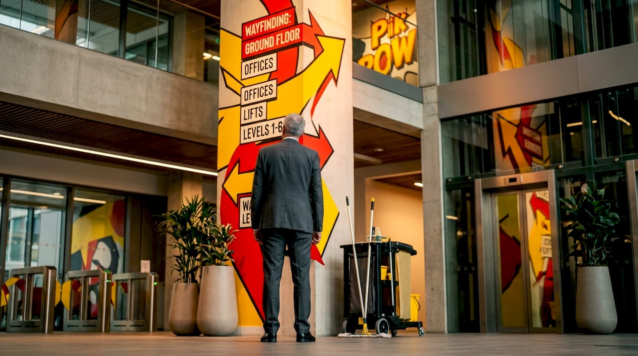
Interior wayfinding signage is far more than arrows on walls. In large office buildings, hospitals, universities, and retail complexes, wayfinding signage solutions support seamless user journeys and reinforce brand presence throughout the built environment. When wayfinding is designed well, people move through a space with confidence and without needing to ask for directions.
Key considerations for effective commercial wayfinding include:
- Directory totem signs at building entrances: A floor-standing totem or wall-mounted directory gives visitors an immediate orientation point. These are typically branded to match the building’s corporate identity and list all tenants, floors, or departments.
- Consistent iconography and colour-coding: Large sites benefit from a colour-coded floor or zone system that is introduced at entry points and then reinforced throughout. For example, a hospital might use blue for outpatient services, green for wards, and red for emergency access routes.
- Accessible signage at the correct height: UK best practice recommends that key informational signs are positioned between 1,400mm and 1,700mm from floor level to ensure accessibility for wheelchair users and people of shorter stature.
- Material choices that reinforce environment: Brushed stainless steel or anodised aluminium suits corporate environments. Warm timber veneers or painted MDF with routed lettering feel more appropriate in boutique hospitality or co-working spaces.
- Staff and visitor experience: Well-designed interior signage reduces reception desk enquiries and staff interruptions. One commercial property management company found that implementing a clear wayfinding system across a multi-tenant office building reduced visitor enquiries at reception by over 40%.
Pro Tip: For large or evolving commercial spaces, consider modular signage systems where panel inserts can be updated without replacing the entire sign. This is particularly valuable in buildings with changing tenants or frequent departmental reorganisation, as it reduces long-term costs considerably.
Colour-coding combined with clear typography also reduces cognitive load for visitors. When someone enters an unfamiliar building, the fewer decisions they need to make to reach their destination, the better their experience of that space and, by extension, your organisation.
Construction and exterior site signage: Safety meets branding
Moving outside, let’s see how signage unites safety and branding in the construction sector.
Construction sites present a unique challenge: signage must communicate critical safety information clearly while also representing the developer’s or contractor’s brand professionally. Construction signage examples show that combining safety messaging with brand elements can increase impact on construction sites, delivering a dual function that neither purely safety nor purely brand-focused signs achieve alone.
The main types of exterior construction site signage include:
- Hoarding graphics: Large-format printed or digitally applied graphics on site hoarding boards. These are often the most visible brand presence a developer has during a construction project, communicating what is being built, the expected completion, and contact details.
- Mandatory safety boards: Health and safety law requires specific signage on UK construction sites, including information about principal contractors, site rules, emergency contacts, and hazard warnings.
- Branded perimeter fencing: Mesh banners or printed PVC panels attached to Heras fencing provide both security visibility and brand continuity around the site perimeter.
- Project information boards: These larger display boards show CGI renders, project milestones, and developer information, often positioned at entrance points where passing public can read them.
Here is a numbered process for implementing cohesive construction site signage:
- Brief a signage specialist early. Ideally, signage should be scoped during pre-construction planning, not added as an afterthought once the hoarding is already up.
- Audit mandatory requirements first. Ensure all legally required safety signs are specified and compliant with the Health and Safety (Safety Signs and Signals) Regulations 1996.
- Develop a brand treatment for the hoarding. Work with your brand team or signage partner to create hoarding artwork that represents the project quality and developer reputation.
- Consider signage for project impact at key phases such as groundworks, structural completion, and practical completion, updating graphics to reflect progress.
- Plan for durability. Exterior construction signage must withstand weather over months or years. Specify UV-resistant inks, robust substrates, and secure fixing methods from the outset.
| Approach | Primary focus | Advantages | Limitations |
|---|---|---|---|
| Safety-first signage | Hazard communication, compliance | Meets legal requirements, reduces liability | Limited brand differentiation |
| Brand-forward hoarding | Developer marketing, public engagement | Builds anticipation, reinforces brand | Must still meet all safety requirements |
| Integrated approach | Both safety and branding combined | Maximum impact, fully compliant | Requires more detailed planning and budget |
“A construction site’s hoarding is often the first piece of marketing the public sees for a new development. Treating it as an afterthought wastes one of the most cost-effective advertising opportunities available.”
The integrated approach is almost always the right choice for larger developers and contractors who understand the value of consistent brand presentation throughout a project lifecycle.
Digital architectural signage: Innovation in action
Finally, let’s leap into the digital transformation accelerating architectural signage.
Digital signage solutions are transforming spaces with real-time, adaptable content and enhanced engagement. Where traditional static signs require physical replacement to update messaging, digital architectural signage allows content to be changed instantly, remotely, and at scale.
Practical applications include:
- Interactive building directories: Touchscreen totems at building entrances allow visitors to search for tenants, get floor-by-floor directions, and access building information without staff intervention.
- Promotional screens in retail and hospitality: High-brightness LCD or LED screens mounted in windows or on walls display time-sensitive promotions, menu updates, or brand video content. These are particularly effective for food and beverage operators, where daily specials or seasonal offers change frequently.
- Dynamic wayfinding maps: In airports, hospitals, and large shopping centres, animated wayfinding maps guide users through complex environments in a far more intuitive way than static signage allows.
- Content management at scale: A multi-site retail business can manage promotional content across dozens of locations from a single platform, ensuring brand consistency and timely messaging without the print and logistics costs of traditional POS systems.
Research indicates that digital signage captures significantly more attention than static alternatives. Studies show that dynamic content attracts approximately 400% more views than static displays, making the investment case for digital architectural signage particularly strong in high-footfall environments.
Key considerations when introducing digital signage into an existing space include integration with the building’s existing infrastructure, content management training for staff, and ensuring the screens meet minimum brightness specifications for the ambient light levels of their location. For heritage buildings, careful placement and enclosure design are required to ensure the technology does not conflict with protected architectural features.
Our perspective: Signage deserves more strategic attention than most businesses give it
After working with businesses across retail, construction, and commercial interiors, we have observed a consistent pattern: signage is frequently treated as a procurement decision rather than a strategic one. Businesses focus on cost per square metre of material rather than the return generated by a well-positioned, well-designed sign.
The reality is that architectural signage is a long-duration marketing asset. A quality exterior fascia sign, correctly manufactured and installed, will represent your brand for ten to fifteen years. Amortised over that period, the cost is negligible compared to the impression it creates for every single person who passes your premises.
What is often underestimated is the cumulative effect of signage consistency. A business that maintains the same quality and design standard across its exterior signage, interior wayfinding, and digital displays communicates professionalism passively, to every visitor, every day. That is not something you can replicate with a one-off campaign.
We would also challenge the assumption that digital signage is only relevant for large organisations. A single, well-placed digital screen in a small retail or hospitality setting can deliver significant commercial uplift if the content is managed thoughtfully. The barrier to entry is lower than most business owners assume, and the flexibility it offers is genuinely valuable as your business evolves.
Invest in signage strategically. Brief your signage partner with business objectives, not just dimensions. The difference in outcome is substantial.
Work with Pik Pik POW! on your next signage project
If the examples in this article have given you a clearer picture of what is possible, we would be glad to help you turn that vision into reality.
At Pik Pik POW! we design and manufacture bespoke architectural signage for businesses across retail, commercial interiors, construction, and the TV and film industry. Whether you need an illuminated fascia for a new shopfront, a complete wayfinding system for a commercial building, or branded hoarding graphics for a development site, our team combines design expertise with precision manufacturing to deliver results that perform. Get in touch with us to discuss your project requirements and receive a tailored consultation from our experienced signage team.
Frequently asked questions
What is the most effective type of architectural signage for retail shops?
Illuminated fascia and projecting signs offer the strongest impact and help attract footfall in busy retail environments, as best practices in shop signage centre around high-impact branding and cohesive visual integration with the shopfront.
How does architectural signage enhance wayfinding?
By providing clear, consistent visual cues at key decision points, architectural signage streamlines navigation for staff and visitors. Wayfinding signage supports seamless user journeys while simultaneously reinforcing the brand presence of the organisation.
Can digital signage be integrated into historic buildings?
Yes, but it requires sensitive placement and custom enclosure design to respect protected or heritage features while improving usability and visitor experience within the space.
What are common mistakes to avoid with construction signage?
Avoid using generic or non-compliant signs; effective construction signage must combine safety information with clear branding, as combining safety messaging with brand elements delivers maximum impact and keeps your site legally compliant.