

TL;DR:
- Effective shopfront branding combines signage, lighting, and visual identity to attract passersby and communicate brand message clearly. Proper compliance with legal and lease restrictions ensures successful installation and maintains brand consistency across all exterior elements. Regular maintenance and strategic design help retailers create impactful storefronts that enhance recognition and customer engagement.
Shopfront branding is the strategic design and use of your store’s exterior to capture attention, convey your brand message clearly, and increase footfall. In retail and commercial settings, your shopfront is your most visible marketing asset. It works around the clock, communicating your identity to every person who passes by. This guide to shopfront branding covers the core design principles, UK regulatory requirements, a practical implementation process, and the most common mistakes to avoid. Whether you manage one location or a portfolio of sites, getting your exterior right is one of the highest-return decisions you can make.
What essential elements create effective shopfront branding?
Effective shopfront branding combines signage, lighting, window displays, and consistent visual identity into a single, readable message. Each element must work together. When one is weak, the whole exterior suffers.

Signage design: size, typography, and colour
Signage legibility starts with letter size. Industry guidance in 2026 recommends one inch of letter height per 30–50 feet of viewing distance. For a sign read from 150 feet away, letters should be 3–5 inches tall, placed 30–60 inches from floor level. That rule is more specific than most business owners realise, and ignoring it is the single most common cause of unreadable fascia signs.
Colour contrast is equally critical. High-contrast pairings such as dark text on a light background, or white lettering on a deep colour, maximise legibility at speed. Your brand colours should appear consistently across your fascia sign, window graphics, and any projecting signs. Brand consistency across channels builds recognition faster than any single design choice.
Lighting and window displays
Exterior lighting sets mood beyond simply improving night visibility. Warm tones signal a traditional or welcoming atmosphere. Cool, bright tones communicate a modern, minimalist brand. Choosing the wrong tone for your brand personality sends a confusing message before a customer even reads your sign.
Window displays deserve the same attention as your fascia. Higher store exterior transparency correlates directly with increased consumer entry. Positioning product displays within 6–10 feet of the shopfront, and keeping entrances uncluttered, turns passing foot traffic into actual visits. A dark or overcrowded window does the opposite.
Pro Tip: Test your window display from the pavement at walking pace. If you cannot read the key message within three seconds, simplify it.
The table below shows the main signage types used in shopfront branding and their primary strategic purpose.
| Signage type | Primary use | Best for |
|---|---|---|
| Fascia sign | Brand name and identity | All retail and commercial premises |
| Illuminated box sign | Night visibility and brand presence | Hospitality, convenience, and food retail |
| Projecting sign | Perpendicular visibility along the street | Narrow high streets and pedestrian zones |
| Window graphics | Promotions, privacy, and brand reinforcement | Fashion, beauty, and professional services |
| A-board | Temporary offers and footfall direction | Cafés, restaurants, and event-led retail |
How to align your shopfront branding with legal and lease requirements
UK shopfront signage is governed by the Town and Country Planning (Control of Advertisements) Regulations 2007. These regulations define which signs require advertisement consent from your local planning authority and which qualify for deemed consent. Deemed consent covers many standard fascia signs, but size limits, illumination levels, and placement rules apply. Exceeding them without consent can result in enforcement notices and costly removal.
Conservation areas and listed buildings carry additional restrictions. In conservation areas, traditional painted hanging signs on simple brackets and hand-painted fascias are preferred. Illuminated and projecting signs are often restricted or refused entirely. The guidance is clear: shopfront design must respect the character of the building and use sympathetic materials. Garish colours or modern aluminium trims are routinely rejected in historic environments.
Your commercial lease adds another layer of control. Leasing agreements often include stricter signage clauses than national planning law. Landlords may restrict materials, illumination styles, or mounting methods even when the local authority would permit them. Reviewing your lease before commissioning any signage work is not optional. It prevents expensive rework and avoids disputes that can damage your tenancy.
Follow these steps to manage the regulatory process correctly:
- Review your commercial lease for signage clauses, including permitted materials, illumination, and approval processes.
- Check your local planning authority’s website for specific advertisement consent policies and any conservation area guidance.
- Confirm whether your sign qualifies for deemed consent under the 2007 Regulations or requires a formal application.
- Submit an advertisement consent application if required, including drawings, dimensions, and material specifications.
- Obtain written landlord approval before installation, even if planning consent has been granted.
Pro Tip: Approach your landlord at the design stage, not after you have commissioned artwork. Early dialogue prevents misaligned expectations and speeds up written approval.
Step-by-step method to design and implement your shopfront branding
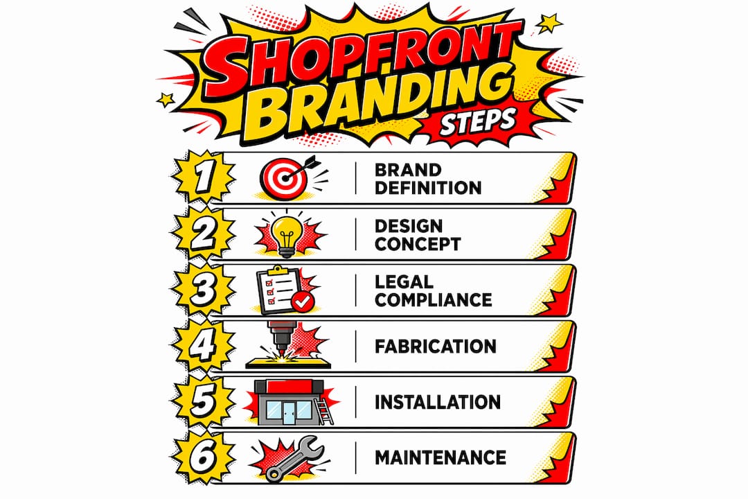
A clear process produces better results than ad hoc decisions. The steps below take you from brand definition through to installation and ongoing maintenance.
- Define your customer and brand personality. Identify who you are trying to attract and what feeling your exterior should create. A children’s toy shop and a law firm require completely different visual approaches.
- Develop a signage hierarchy. Effective signage hierarchy places primary branding first, supporting information second, and a single clear call to action third. Never try to communicate everything at once.
- Size your lettering for viewing distance. Apply the one-inch-per-30-to-50-feet rule to your specific location. Measure the distance from the kerb or the point where pedestrians first see your sign.
- Plan placement for maximum visibility. Eye-level signs, well-lit entrances, and shopfront signage positioned at decision points all increase the chance of a customer stopping.
- Coordinate with your wider brand identity. Your exterior colours, fonts, and logo must match your website, packaging, and interior signage. Inconsistency undermines trust.
- Schedule maintenance and seasonal refreshes. Faded vinyl, broken illumination, and peeling paint all signal neglect. Plan a review every six months and update window displays to reflect seasons and promotions.
- Check safety and accessibility. Projecting signs must meet minimum height clearances. Entrances must be accessible under the Equality Act 2010. Both are legal requirements, not optional extras.
| Step | Key action | Check |
|---|---|---|
| Brand definition | Agree customer profile and brand personality | Written brief signed off |
| Signage hierarchy | Primary brand, supporting info, one call to action | Single message per sign |
| Letter sizing | Apply 1 inch per 30–50 feet rule | Confirmed at design stage |
| Placement | Eye level, lit entrance, decision points | Site survey completed |
| Consistency | Match exterior to wider brand assets | Cross-channel audit done |
| Maintenance | Six-monthly review, seasonal window refresh | Schedule in calendar |
| Compliance | Lease approval, advertisement consent | Written confirmation held |
Pro Tip: Commission a professional site survey before finalising your design. Sight lines, neighbouring signage, and street furniture all affect what actually works in your specific location.
What common shopfront branding mistakes cost you customers?
Most shopfront branding failures come down to a small number of repeated errors. Recognising them early saves money and protects your brand reputation.
- Overloading signage with multiple messages. Cognitive overload reduces message processing by passersby. One sign should carry one message. Use narrowcasting principles: reserve your fascia for brand identity and your window displays or A-boards for specific, singular promotions.
- Poor legibility from font choice or size. Decorative or script fonts may reflect your brand personality, but they fail at distance. Always test legibility at the actual viewing distance before production.
- Neglecting lighting. A sign that is unreadable after dark loses half its working hours. Lighting also signals that your business is active and welcoming, which matters even during the day.
- Ignoring lease restrictions. Installing signage without landlord approval is one of the most expensive mistakes a retail business owner can make. Removal, reinstatement, and legal costs add up quickly.
- Cluttered or dark window displays. Reduced transparency discourages entry. Keep displays edited, well-lit, and changed regularly. A static window display from three months ago tells customers nothing new.
- Inconsistent brand elements. Mismatched colours, different logo versions, or conflicting typography across your exterior signage and other brand touchpoints erode the credibility you are trying to build.
Pro Tip: Show your proposed design to five people who represent your target customer before you commit to production. Their immediate reactions reveal legibility and clarity issues that you will miss after staring at the artwork for weeks.
Key takeaways
Effective shopfront branding requires clear signage hierarchy, correct letter sizing, regulatory compliance, and consistent visual identity across every exterior element.
| Point | Details |
|---|---|
| Letter sizing matters | Use one inch of letter height per 30–50 feet of viewing distance for readable fascia signs. |
| Hierarchy beats volume | Limit each sign to one primary message: brand identity, supporting detail, or a single call to action. |
| Lighting communicates brand | Warm or cool tones signal brand personality as much as they improve visibility after dark. |
| Lease comes before planning | Review commercial lease signage clauses before applying for advertisement consent or commissioning artwork. |
| Consistency builds recognition | Match exterior colours, fonts, and logos to your wider brand assets across every touchpoint. |
What we have learned from years of shopfront work
Shopfront branding is a communication exercise, not a decoration project. That distinction matters more than most business owners realise when they first come to us at Pikpikpow.
The most common mistake we see is businesses treating their exterior as a canvas for everything they want to say. The result is a fascia that says nothing clearly. Your shopfront exterior functions as the first conversation with a passing customer. That conversation needs to be short, clear, and confident. It does not need to cover your full product range, your history, or your values. It needs to answer one question: “Is this worth stopping for?”
We have also seen businesses invest heavily in beautiful signage and then neglect it. A premium illuminated sign with a failed lamp module, or a vinyl graphic peeling at the corner, communicates the opposite of quality. Maintenance is part of the brand. Seasonal refreshes are not a luxury. They signal that your business is active, current, and worth visiting again.
Regulatory engagement is the area where we see the most avoidable pain. Businesses that treat planning and lease approval as an afterthought end up with signs they cannot legally install, or installations they are forced to remove. The businesses that get it right start the conversation with their landlord and their local planning authority at the design stage, not after the artwork is finalised.
Trust customer feedback more than your own instincts on legibility. You are too close to your own brand to judge it objectively from the pavement.
— PikPikPOW!
How Pikpikpow can support your shopfront branding project
Pikpikpow works with retail and commercial businesses across the UK to design, manufacture, and install shopfront signage that is built to perform.
From fascia signs and illuminated box signs to window graphics and full exterior branding packages, every project is handled in-house from design through to installation. Pikpikpow’s team brings both design expertise and manufacturing precision to each brief, which means your signage arrives on time, on brand, and compliant with planning requirements. Explore the full range of signage systems available, or get in touch to discuss your specific shopfront requirements with the team.
FAQ
What is shopfront branding?
Shopfront branding is the strategic use of your store’s exterior, including signage, lighting, window displays, and colour, to communicate your brand identity and attract customers. It functions as a permanent, public-facing marketing tool.
Do I need planning permission for shopfront signage in the UK?
Most standard fascia signs qualify for deemed consent under the Town and Country Planning (Control of Advertisements) Regulations 2007, but size, illumination, and location all affect eligibility. Conservation areas and listed buildings require formal advertisement consent in most cases.
How large should letters be on a shopfront sign?
Industry guidance recommends one inch of letter height per 30–50 feet of viewing distance. For a sign read from 150 feet, letters should be 3–5 inches tall and placed 30–60 inches from floor level.
Can my landlord restrict my shopfront signage?
Yes. Commercial leases often impose stricter signage restrictions than planning law, covering materials, illumination, and mounting methods. Always review your lease and obtain written landlord approval before installation.
How often should I update my shopfront branding?
A full brand review every two to three years is reasonable for most retailers. Window displays and promotional signage should be refreshed seasonally, and a maintenance check every six months keeps your exterior looking professional and your lighting fully operational.