

TL;DR:
- A school interior signage checklist ensures signs meet accessibility, clarity, and design standards to aid navigation. Regular audits and strict management of temporary notices help maintain compliance and reduce cognitive load for students and visitors. Using appropriate materials like photopolymer and digital displays supports long-lasting, ADA-compliant wayfinding in educational environments.
A school interior signage checklist is a structured planning and assessment tool that confirms every interior sign meets accessibility, clarity, and design requirements to guide students, staff, and visitors effectively. Getting this right matters far beyond aesthetics. Poor signage creates confusion at critical decision points, creates compliance gaps under ADA standards, and can actively disadvantage pupils with sensory or mobility needs. This guide covers the full scope of interior signs for schools, from room identification and wayfinding through to materials, temporary notices, and ongoing audit processes, giving you a practical framework for 2026 implementation.
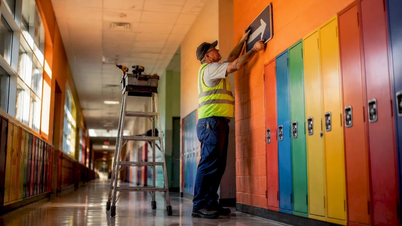
1. What belongs on a school interior signage checklist
A complete school interior signage checklist covers four core sign categories: room identification, directional and wayfinding, informational, and regulatory. Each category has distinct placement rules, design requirements, and compliance obligations. Miss one category and you create gaps that affect accessibility for the most vulnerable users in your building.
Room identification signs must sit on the latch side of doors, include raised tactile characters, and carry Grade 2 Braille below raised text in line with ADA §703.3 and §703.4. Directional signs must appear before decision points, not after, so visitors can process information before they reach a junction. Informational signs cover notice boards, timetables, and emergency procedures. Regulatory signs include fire exit routes, health and safety notices, and restricted area markers.
Your checklist should also confirm that mounting heights sit between 48–60 inches from the finished floor, that contrast ratios meet accessibility standards, and that audio or digital alternatives exist where required. Tools such as OxMaint provide structured digital audit workflows that help facility managers document compliance against each of these criteria systematically.
2. Key components of an effective signage checklist
An effective checklist for school signage goes beyond a simple tick-box exercise. Each item must specify the standard being met, the location being assessed, and the evidence required to confirm compliance.
The core components to include are:
- Room ID signs: Latch-side placement confirmed, tactile characters between 5/8 and 2 inches in height, Grade 2 Braille positioned below raised text, mounting height 48–60 inches from finished floor
- Directional and wayfinding signs: Positioned before intersections and decision points, consistent arrow conventions, legible at the relevant viewing distance
- Design consistency: Colour palette, typeface, and symbol system aligned to school branding across all sign types
- Accessibility features: High contrast colour combinations, non-reflective surfaces, audio or digital alternatives at key locations
- Regulatory and safety signs: Fire exit routes, emergency assembly points, restricted access markers all present and unobstructed
- Condition assessment: No fading, damage, or obstruction on any sign; fixings secure and flush
A structured wayfinding programme for schools typically runs 12–20 weeks from initial audit through to installation. That timeline accounts for design, fabrication, phasing, and accessibility review. Build this into your project plan from the outset rather than treating it as a final-stage task.
Pro Tip: Before committing to full production, install mock-ups of key sign types in situ. Test them at different times of day and with different lighting conditions to catch visibility or clutter issues before fabrication costs are locked in.
3. How to conduct a thorough signage audit
A facility signage audit works best when you approach the building as a first-time visitor with no prior knowledge of the layout. That perspective reveals gaps that familiarity hides from regular staff.
Follow these steps for a thorough audit:
- Walk primary routes first. Start at the main entrance and follow the routes a new visitor, pupil, or delivery driver would take. Note every point where you needed to search for a sign.
- Document every sign. Photograph each sign with its location noted. Record sign type, condition, mounting height, and whether it meets current branding standards.
- Assess ADA compliance at each sign. Check latch-side placement for room ID signs, Braille quality, tactile character height, and mounting position.
- Identify ask-points. These are locations where people stop to ask for directions, typically reception desks, stairwells, and corridor junctions. A high volume of questions at any point signals a wayfinding gap.
- Assess branding consistency. Note any signs that use outdated logos, incorrect typefaces, or off-brand colours.
- Prioritise remediation. Assign each gap a priority: high for safety and compliance failures, medium for branding inconsistencies and readability issues.
Pro Tip: Run your audit along physical routes rather than room by room. A route-based workflow captures real-world wayfinding gaps that a static room inventory misses entirely.
4. Best practices for signage design and readability
Signage design in schools follows a clear technical logic. The goal is fast, accurate comprehension for every user, including those with visual impairments, learning differences, or limited English.
The key design principles are:
- Letter sizing: Use one inch of letter height per ten feet of viewing distance as a baseline. A sign read from 30 feet needs letters at least 3 inches tall.
- Typeface: Use a sans-serif font such as Arial, Helvetica, or Johnston. Avoid all-capitals text for body copy as it reduces reading speed.
- Contrast: Dark text on a light background, or light text on a dark background. Avoid mid-tone combinations that fail in low light.
- Information density: One primary message per sign. Cluttered signs slow comprehension and increase the chance of misreading.
- Tactile features: Embossed text and Grade 2 Braille are non-negotiable for room ID signs under ADA standards.
- Placement height: The standard eye-level band for most users is 48–60 inches from the finished floor.
The table below compares the two most common sign placement approaches:
| Approach | Placement logic | Best use case |
|---|---|---|
| Decision-point placement | Signs installed before junctions and intersections | Directional and wayfinding signs |
| Destination placement | Signs installed at the room or facility itself | Room ID and regulatory signs |
Wayfinding is most effective when signs appear before the decision point, giving users time to process the information before they need to act. Placing a directional sign after a junction is a common and costly error.
Digital integration adds a further layer of usability. QR codes on static signs can link to interactive maps, timetables, or translated content. Interactive kiosks at reception and main corridors handle dynamic information without requiring reprinting.
5. Managing temporary signage and sensory-inclusive considerations
Temporary signage is the most common source of wayfinding breakdown in schools. Event notices, room change announcements, and construction warnings accumulate quickly and, without a clear policy, they end up obscuring permanent signs.
Temporary notices placed near key signs create visual clutter that increases cognitive load, particularly for pupils with sensory processing differences. The Scottish Government’s sensory-inclusive learning guidance is explicit on this point: temporary signage must be controlled in location, size, and duration.
A practical policy for temporary signage should include:
- Designated posting zones: Define specific boards or wall areas for temporary notices. These must not overlap with permanent wayfinding or room ID signs.
- Size limits: Set a maximum format for temporary notices, such as A4, to prevent large-format posters from dominating corridors.
- Duration limits: Require all temporary notices to carry a removal date. Assign a member of staff to check and remove expired notices weekly.
- Template standards: Provide a standard template for temporary notices that uses the school’s typeface and colour palette. This maintains visual consistency even for ad hoc communications.
- Non-reflective surfaces: All permanent signs should use non-reflective finishes. Temporary notices printed on gloss paper can create glare that reduces legibility.
Consistency in sign placement and style reduces cognitive load and supports sensory-inclusive learning environments. Pupils and visitors who rely on visual cues for navigation benefit directly from a disciplined approach to temporary signage management.
6. Comparing signage materials and technology options
The material you choose for school interior signs affects durability, compliance, maintenance cost, and appearance. Each option suits different sign types and budget levels.
| Material | Key features | Best use |
|---|---|---|
| Acrylic | Durable, clean finish, available in many colours | Room ID signs, directory boards |
| Aluminium | Highly durable, weather-resistant, professional appearance | Corridor wayfinding, regulatory signs |
| Vinyl graphics | Cost-effective, flexible, easy to update | Temporary zones, wall graphics, floor markings |
| Photopolymer | ADA tactile and Braille compliant, precise character formation | Room ID signs requiring full ADA compliance |
| Digital displays | Dynamic content, no reprinting required, interactive capability | Reception kiosks, main corridor wayfinding |
Signage materials range from acrylic and aluminium to photopolymer with Braille, and each serves a distinct function. Photopolymer is the standard choice for ADA-compliant tactile signs because it produces consistent raised characters and Braille dots that meet the dimensional tolerances required by ADA §703.
Digital signage options, including interactive kiosks and corridor displays, allow content updates without reprinting. This is particularly useful for schools with changing room allocations or frequent event programmes. The trade-off is higher upfront cost and an ongoing maintenance requirement. For most schools, a hybrid approach works best: permanent compliant signs in acrylic or photopolymer for fixed locations, with digital displays at high-traffic information points such as reception and main entrances. You can find educational wayfinding examples that illustrate how these material combinations work in practice.
Key takeaways
Effective school interior signage requires ADA-compliant materials, route-based audits, controlled temporary signage, and consistent design across all sign types to support every user in the building.
| Point | Details |
|---|---|
| ADA compliance is non-negotiable | Room ID signs need latch-side placement, tactile characters, and Grade 2 Braille at 48–60 inches mounting height. |
| Audit by route, not by room | Walking primary visitor routes reveals real wayfinding gaps that a room-by-room inventory misses. |
| Control temporary signage strictly | Unmanaged temporary notices near permanent signs increase cognitive load and create compliance risks. |
| Match material to sign function | Use photopolymer for tactile ADA signs, acrylic or aluminium for permanent wayfinding, and digital for dynamic content. |
| Plan for 12–20 weeks | A full signage programme from audit to installation takes 12–20 weeks; build this into your project schedule. |
What we have learned from school signage projects
School signage is not a one-time installation. That is the single most important lesson from working on educational environments. Administrators often treat a signage refresh as a project with a clear end date. In practice, ADA compliance requires ongoing inspection, not a certificate of completion filed away after installation.
The most common failures we see are not dramatic. They are small and cumulative. A room ID sign installed on the wrong side of a door frame. A tactile sign mounted at 65 inches because the installer measured from the top of the sign rather than the centreline of the characters. A directional sign placed six inches past the junction it was meant to serve. Individually, each error is minor. Together, they create a building that fails the people who need clear signage most.
The other pattern worth naming is the temporary notice problem. Schools accumulate paper. Without a written policy and a named person responsible for enforcement, corridors fill up with A3 posters taped over fire exit signs and event flyers obscuring room numbers. This is not a design failure. It is a governance failure, and no amount of quality signage solves it without a clear internal protocol.
The administrators who get this right do two things consistently. They involve a range of stakeholders in the planning stage, including pupils, support staff, and visitors with accessibility needs. And they schedule a formal signage review at least once per academic year, treating it with the same seriousness as a fire safety inspection. Signage that works well is invisible. People simply find where they need to go. That outcome requires deliberate, ongoing effort.
— Pikpikpow
Pikpikpow’s signage systems for schools
Pikpikpow works with schools and educational facilities across the UK to plan, design, and install interior signage that meets accessibility standards and holds up to daily use.
Our internal and wayfinding signage range covers room identification signs, directional systems, regulatory notices, and digital display integration. Every solution is designed with ADA compliance and sensory-inclusive principles built in from the start, not added as an afterthought. We also provide full design and installation support, so you are not left managing multiple suppliers across a complex project. If you are planning a signage audit or a full interior refresh, our signage systems page sets out the full range of options available for educational environments.
FAQ
What is a school interior signage checklist?
A school interior signage checklist is a structured document used by administrators and facility managers to confirm that all interior signs meet accessibility, design, and compliance requirements. It covers room identification, directional signs, regulatory notices, and informational displays.
What are the ADA requirements for school room ID signs?
Room ID signs must be placed on the latch side of the door, include raised tactile characters between 5/8 and 2 inches in height, carry Grade 2 Braille below the raised text, and be mounted with the centreline of characters at 48–60 inches from the finished floor.
How often should a school signage audit be carried out?
A signage audit should be carried out at least once per academic year, with additional checks following any building works, room reallocations, or changes to accessibility requirements. ADA compliance requires ongoing inspection rather than a single post-installation review.
How do you manage temporary signage in schools?
Temporary signage should be restricted to designated posting zones away from permanent wayfinding and room ID signs. Set size and duration limits, require a removal date on every notice, and assign a named member of staff to enforce the policy weekly.
What materials are best for ADA-compliant school signs?
Photopolymer is the standard material for ADA-compliant tactile and Braille room ID signs because it produces consistent raised characters that meet dimensional tolerances. Acrylic and aluminium suit permanent directional and informational signs, while digital displays work well for high-traffic information points.