
Stepping into a busy retail space, a customer’s first impressions are shaped not just by products, but by the signs guiding their journey. For Marketing Managers in large British retail chains, getting corporate signage right means far more than compliance—it builds brand visibility and directly impacts how customers engage with your store. Explore how unified, consistent visual systems can turn high-footfall environments into brand-boosting, customer-friendly destinations.
Table of Contents
- Defining Corporate Signage And Its Purpose
- Types Of Signage In High-Footfall Workspaces
- Design Elements That Maximise Brand Visibility
- Compliance, Safety And Accessibility Standards
- Avoiding Common Pitfalls In Corporate Signage
Key Takeaways
| Point | Details |
|---|---|
| Purpose of Corporate Signage | Corporate signage serves as a vital tool for brand reinforcement, navigation, information delivery, customer experience enhancement, and differentiation from competitors. |
| Designing for Visibility | Prioritising colour contrast, typography, layout, and strategic placement maximises brand visibility and effectiveness in communicating messages. |
| Consistency is Key | Maintaining a unified signage strategy across all locations fosters brand recognition and trust, ensuring customers have a consistent experience. |
| Compliance and Accessibility | Adhering to legal requirements for safety and accessibility is critical to protecting both customers and your business from liability risks. |
Defining Corporate Signage and Its Purpose
Corporate signage is far more than decorative wall art or directional pointers. It’s a strategic business tool that communicates your brand identity, guides customer behaviour, and shapes how people experience your retail space.
At its core, corporate signage encompasses any visual communication system your business uses to reinforce brand presence and assist navigation. From storefront fascia to internal wayfinding, shelf signage to entrance displays, these elements work together as a unified communication strategy.
The primary purposes of corporate signage include:
- Brand reinforcement: Consistent visual identity across all customer touchpoints
- Wayfinding and navigation: Guiding customers efficiently through your retail environment
- Information delivery: Communicating product details, promotions, and policies
- Customer experience enhancement: Creating a professional, organised shopping environment
- Differentiation: Standing out visually from competing retailers
Why Purpose Matters More Than Aesthetics
You might assume the primary goal of signage is to look good. That’s only half the equation. Effective corporate signage must serve a functional purpose aligned with business objectives.
Corporate brand identity requires consistent visual systems across all spaces where customers interact with your business. The best signage combines aesthetic appeal with clear functional outcomes.
Consider navigation. In large retail chains with multiple departments, unclear wayfinding frustrates customers and reduces dwell time. Strategic signage dramatically improves customer experience and encourages exploration of more store areas.
Promotion visibility matters equally. A poorly positioned or designed sale sign reaches far fewer customers than one strategically placed at customer eye level with clear visual hierarchy.
Design Consistency and Brand Control
One critical element often overlooked by retail managers is consistency across locations. When you operate multiple stores, each branch represents your brand. Inconsistent signage—different fonts, colours, or messaging—confuses customers and weakens brand recall.
Proper signage standards, like those detailed in brand identity guidelines, ensure every store communicates the same message. This consistency builds customer trust and professional credibility.
Key consistency factors include:
- Standardised fonts and typography
- Colour palette alignment with brand guidelines
- Logo placement and sizing specifications
- Messaging tone and language conventions
- Material quality and finish standards
The Business Impact Connection
Corporate signage directly influences customer behaviour and sales performance. Research demonstrates that clear, attractive signage increases product visibility and impulse purchases.
For retail chains specifically, signage affects store perception. Outdated, unclear, or inconsistent signage suggests poor management and discourages shopping. Conversely, modern, well-designed signage elevates perceived value and brand prestige.
Effective corporate signage communicates your brand standards while serving specific business functions like navigation, promotion, and customer experience enhancement.
Pro tip: Audit your current signage across all store locations to identify consistency gaps, outdated materials, or functional failures before planning any new installations.
Types of Signage in High-Footfall Workspaces
High-footfall retail environments demand multiple signage types working together. Each serves a distinct purpose, from directing customer flow to communicating safety requirements and promotional messages.
Understanding which signage types work best in your space is crucial for maximising brand impact whilst maintaining a professional, organised environment.
Directional and Wayfinding Signage
Wayfinding signage helps customers navigate your retail space efficiently. In large retail chains with multiple departments, unclear navigation frustrates shoppers and reduces time spent exploring.
Effective wayfinding includes:
- Department indicators and aisle markers
- Floor level identifiers in multi-storey stores
- Clear directional arrows and instructions
- Prominently positioned at decision points
Proper wayfinding systems reduce customer confusion and encourage deeper store exploration, directly boosting sales across multiple departments.

Promotional and Information Signage
Retail chains rely heavily on promotional signage to drive sales. These signs communicate current offers, new products, and seasonal campaigns to capture customer attention immediately upon entry.
Point-of-sale displays highlight impulse purchases at checkout areas. Window displays and entrance banners create visual interest from the street, drawing customers inside.
Promotional signage requires:
- Clear, attention-grabbing design
- Easy-to-read pricing and offer details
- Strategic placement at high-traffic zones
- Regular updates to maintain freshness
Safety and Compliance Signage
Retail spaces require safety signage standards for legal compliance. These signs communicate hazards, emergency procedures, and mandatory regulations.
Common types include:
- Emergency exit markers
- Fire safety and assembly point signs
- Hazard warnings and prohibition signs
- Floor protection and slip hazard indicators
These aren’t optional decorative elements—they’re legal requirements protecting customers and staff whilst reducing your liability exposure.
Brand and Corporate Identity Signage
Fascia signage represents your corporate identity from the street. This is often customers’ first visual contact with your brand, shaping initial perceptions before they enter.
Internal corporate signage includes:
- Entrance feature walls displaying company values
- Department headers reinforcing brand colours
- Company logos and brand statements
- Consistent typography reflecting brand guidelines
Brand signage works continuously to reinforce corporate identity across every customer interaction.
Shelf and Product Identification Signage
Product signage helps customers locate items quickly whilst enabling cross-selling opportunities. Clear shelf labels reduce staff queries and improve shopping efficiency.
This category encompasses:
- Price labels and product information cards
- Special offer stickers and promotional banners
- Category headers and section dividers
- Stock status indicators
Well-designed shelf signage improves customer satisfaction and supports inventory management.
Here is a summary of how different signage types contribute to business objectives:
| Signage Type | Primary Function | Business Impact |
|---|---|---|
| Wayfinding & Directional | Guide customer movement | Increases dwell time and satisfaction |
| Promotional & Information | Highlight offers and news | Drives sales and impulse purchases |
| Safety & Compliance | Mitigate risks | Reduces liability, fulfils regulation |
| Brand & Corporate Identity | Reinforce brand values | Boosts recognition and credibility |
| Shelf & Product Identification | Clarify product choices | Reduces staff queries, speeds purchase |
Different signage types serve specific functions—wayfinding, promotion, safety, and brand reinforcement all contribute to overall customer experience and business objectives.
Pro tip: Conduct a signage audit across your stores, categorising each sign by type and purpose, then assess whether it’s achieving its intended function or becoming visual clutter.
Design Elements That Maximise Brand Visibility
Your signage only works if people actually notice it. In busy retail environments with competing visual stimuli, deliberate design choices determine whether your brand cuts through the noise or gets overlooked entirely.
Maximising brand visibility means strategically combining colour, typography, layout, and positioning to create unmissable visual communication.
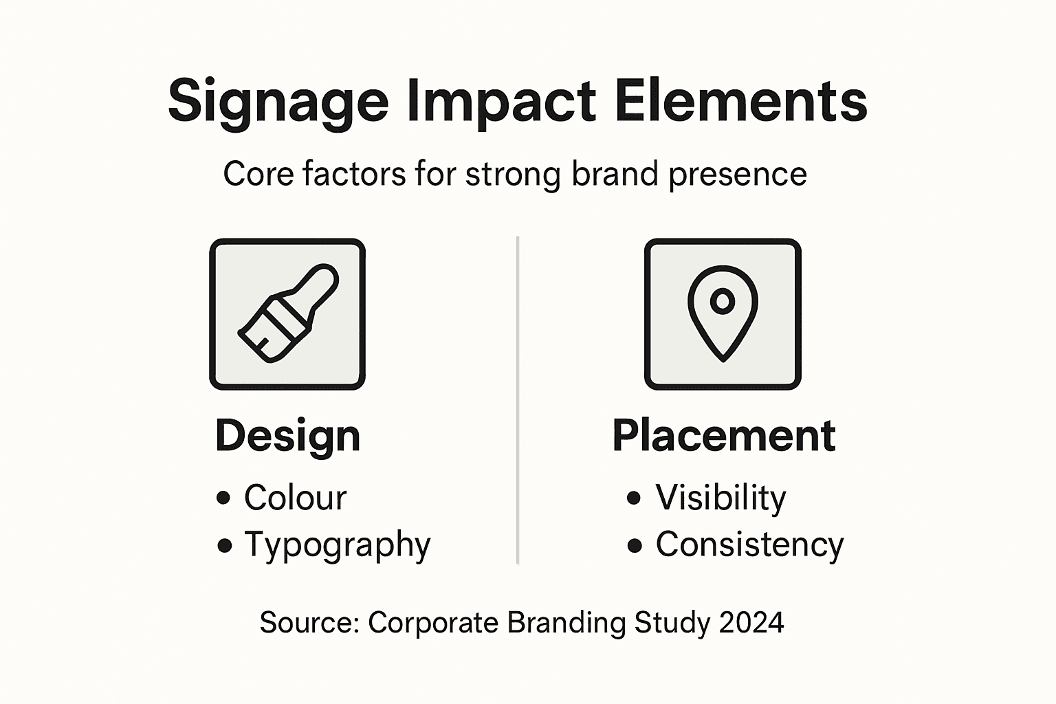
Colour Selection and Contrast
Colour is your most powerful visibility tool. High contrast between text and background dramatically improves readability from distance. A sign with poor contrast becomes invisible to customers moving through your store quickly.
Effective colour strategies include:
- Using brand colours that reflect corporate identity
- Ensuring sufficient contrast ratios for visibility
- Limiting colour palette to 2-3 primary colours
- Testing visibility from customer viewpoints and distances
Colour psychology also influences perception. Warm colours attract attention, whilst cool colours suggest trust and professionalism. Your colour choices communicate brand personality before customers even read your message.
Typography and Readability
Font selection directly impacts message clarity. Sans-serif typefaces work best for signage due to superior readability at distance and various sizes. Serif fonts, whilst elegant, become illegible on small signs or from far away.
Consider these factors:
- Font size relative to viewing distance
- Letter spacing improving readability
- Consistent typeface across all signage
- Avoiding decorative fonts that sacrifice clarity
Typography also reinforces brand identity. Design standards emphasise consistent typeface application as essential for brand recognition across multiple touchpoints.
Strategic Placement and Positioning
Where you position signage matters as much as how it looks. Eye-level placement ensures maximum visibility. Signage positioned too high or too low gets ignored, regardless of design quality.
Placement strategy should include:
- Customer sightline analysis at key decision points
- Positioning above competing visual clutter
- Clear separation from surrounding elements
- Accessibility compliance for all customer groups
In retail chains, consistent placement across stores strengthens brand recognition. Customers learn where to look for information because signage appears in predictable locations.
Layout and Visual Hierarchy
Visual hierarchy guides customer attention. Large headlines draw eyes first, followed by supporting information. Poor hierarchy creates confusion—customers don’t know what matters.
Effective layout includes:
- Primary message prominently featured
- Supporting details in smaller sizes
- Adequate white space preventing visual clutter
- Logical reading flow from top to bottom
Design principles prioritising user understanding create signage that communicates instantly without requiring effort from busy shoppers.
Materials and Finish Quality
Material selection impacts visibility and brand perception. High-quality materials reflect light professionally, improving readability. Worn, faded, or cheap-looking signage damages brand credibility regardless of design.
Material considerations include:
- Weather resistance for outdoor signage
- Reflective properties enhancing visibility
- Durability preventing degradation
- Premium finishes elevating perceived brand value
Visibility maximisation combines colour contrast, readable typography, strategic placement, and quality materials into a cohesive system that commands customer attention.
Pro tip: Photograph your signage from customer eye level at various distances and lighting conditions, then assess whether the design remains clearly visible and readable in real-world retail conditions.
Compliance, Safety and Accessibility Standards
Signage isn’t just about brand visibility. In the UK, corporate signage must comply with legal requirements protecting customer safety and ensuring accessibility for disabled people. Ignoring these standards exposes your business to liability and excludes significant customer segments.
Compliance, safety, and accessibility aren’t optional extras—they’re fundamental requirements for responsible corporate signage.
Legal Compliance Requirements
UK businesses face multiple signage regulations depending on location type and purpose. Health and Safety at Work legislation requires clear, visible safety signage in retail environments. Fire safety regulations mandate emergency exit signage and evacuation route markers.
Key compliance areas include:
- Emergency exit signage with illumination
- Fire assembly point markers
- Health and safety warning signs
- Hazard communication signage
- Statutory notices and regulatory information
Non-compliance creates legal exposure. Local authorities conduct inspections, and failure to display required signage results in enforcement action or fines. Beyond penalties, poor safety signage puts customers and staff at risk.
Accessibility and Inclusive Design
Accessibility standards ensure signage works for everyone, including disabled customers. Inclusive design isn’t about compliance checkboxes—it’s about creating retail experiences where all customers feel welcome.
Accessibility considerations include:
- Sufficient colour contrast for visually impaired customers
- Large enough text sizes for readability
- Tactile elements for blind and partially sighted users
- Clear, simple language avoiding jargon
- Appropriate positioning within reach of wheelchair users
Universal accessibility design approaches create signage systems benefiting everyone. Good accessibility actually improves usability for customers without disabilities too—larger fonts help older customers, clear language helps stressed shoppers.
International Standards and UK Trade
If your retail chain operates across Europe or trades with European partners, you face additional requirements. Accessibility legislation now mandates inclusive design for products and services affecting many corporate signage systems.
UK businesses exporting signage solutions or operating European locations must understand:
- Universal design principles
- Accessible communication standards
- Multi-language requirements
- Regional signage regulations
Practical Compliance Implementation
Implementing compliance requires systematic approach. Start by auditing existing signage against current regulations. Identify gaps where required signage is missing or non-compliant.
Compliance checklist:
- Verify all mandatory signage is installed and visible
- Test colour contrast ratios meet accessibility standards
- Ensure text sizes are readable from appropriate distances
- Check electrical safety on illuminated signage
- Confirm placement complies with accessibility legislation
- Document compliance records for audits
Regular maintenance prevents compliance drift. Faded signs become illegible. Damaged signage fails to communicate effectively. Schedule quarterly inspections across all locations.
Working with Specialists
Compliance requirements are complex and evolving. Partnering with experienced signage specialists ensures your designs meet all current regulations. They understand accessibility standards, safety requirements, and best practices for inclusive design.
Compliance, safety, and accessibility aren’t bureaucratic burdens—they’re investments in creating retail spaces that work for everyone whilst protecting your business legally.
Pro tip: Request compliance verification from your signage provider before installation, ensuring your designs meet current Health and Safety regulations, accessibility standards, and any industry-specific requirements for your retail sector.
Avoiding Common Pitfalls in Corporate Signage
Most corporate signage underperforms not because of ambitious goals, but because of preventable mistakes. Understanding common pitfalls helps you avoid costly errors that damage brand perception, reduce effectiveness, and create compliance issues.
The difference between successful and failed signage often comes down to planning and execution details.
Signage Overload and Visual Clutter
Sign saturation is perhaps the most common pitfall. Retail managers believe more signs mean better communication. In reality, excessive signage overwhelms customers, creates confusion, and makes individual signs invisible through sheer visual noise.
When customers see too many competing signs, they stop reading any of them. This is called “banner blindness”—your eyes learn to ignore visual elements automatically.
Common overstuffing problems:
- Multiple promotional signs in single viewpoint
- Inconsistent messaging across departments
- Outdated signs left in place alongside new ones
- Cluttered shelf displays with overlapping signage
The solution is ruthless curation. Every sign must earn its space by serving a specific, necessary function. Remove or consolidate signs that duplicate information.
Poor Placement and Visibility
Signage positioned where customers don’t naturally look becomes invisible. Eye-level placement is critical—typically between 1.4 and 1.6 metres from ground level in retail environments.
Placement mistakes include:
- Signage too high or too low for natural sightlines
- Placement behind other displays blocking visibility
- Inconsistent location across multiple store locations
- Neglecting customer flow patterns when positioning signs
Observe actual customer behaviour. Walk your store at customer eye level, noting natural sightlines and decision points. Position signage where customers naturally pause or make choices.
Illegibility and Poor Readability
Signs that customers cannot read from normal viewing distances fail completely. Insufficient contrast, tiny fonts, and poor typeface choices make signage ineffective regardless of design quality.
Readability failures include:
- Text too small for viewing distance
- Insufficient colour contrast reducing legibility
- Decorative fonts prioritising aesthetics over clarity
- Light coloured text on light backgrounds
- Cluttered layouts confusing visual hierarchy
Clear, legible signage requires testing from realistic customer distances. If customers must strain to read your message, you’ve failed the basic function.
Inconsistency Across Locations
Retail chains with multiple stores often develop signage inconsistency over time. Different locations use different fonts, colours, messaging, and materials, fragmenting brand identity.
Inconsistency problems:
- Varying brand colour applications
- Different typography across stores
- Inconsistent wayfinding systems
- Department headers using different styles
- Mixed signage materials and finishes
Consistency requires documented standards and enforcement. When new signage is needed, reference existing brand guidelines rather than creating improvised solutions.
Neglecting Maintenance
Faded, damaged, and dirty signage communicates neglect. Maintenance failure turns brand assets into brand liabilities. Customers interpret worn signage as poor store management.
Maintenance oversights include:
- Faded colours from sun exposure
- Accumulated dirt obscuring messages
- Physical damage from customer interaction
- Missing or broken illumination elements
- Outdated information still displayed
Schedule quarterly inspections across all locations. Document condition issues and schedule timely repairs or replacements. Prevention costs far less than brand damage from neglected signage.
The table below compares common corporate signage pitfalls and their likely consequences:
| Common Pitfall | Example Scenario | Negative Outcome |
|---|---|---|
| Visual clutter | Too many signs in one area | Customers ignore all signage |
| Poor placement | Sign above customer eye level | Key messages go unseen |
| Illegibility | Small text, weak contrast | Customers cannot read information |
| Inconsistency | Different fonts across locations | Brand trust and recall weakened |
| Neglected maintenance | Faded or damaged signage | Customers perceive poor management |
Planning Failures
Specifying signage early in retail redesigns prevents costly modifications. Many retailers bolt on signage after construction, resulting in poor integration and additional expenses.
Planning pitfalls:
- Signage designed after store layout completed
- Insufficient budget allocated for proper execution
- Lack of compliance review before installation
- Ignoring accessibility requirements
- No clear strategy for sign categories and purposes
Common signage pitfalls—overload, poor placement, illegibility, and inconsistency—are preventable through systematic planning and ongoing maintenance discipline.
Pro tip: Create a signage audit template documenting each sign’s location, purpose, condition, and effectiveness, then conduct quarterly reviews to identify and address problems before they impact customer experience.
Elevate Your Corporate Brand Impact with Expert Signage Solutions
The article highlights a common challenge faced by many corporate businesses: achieving consistent, effective signage that not only reinforces brand identity but also improves navigation, compliance, and customer experience. You may be struggling with visual clutter, inconsistent design across locations, or signage that fails to communicate clearly and comply with UK accessibility standards. These issues can dilute your brand impact and reduce customer confidence.
Pik Pik POW! specialises in creating bespoke indoor signage solutions tailored to your exact business needs. Our expertise ensures your corporate signage is both visually striking and functionally effective, helping you reinforce brand values, improve wayfinding, and meet all safety and accessibility requirements. By focusing on design consistency, durable materials, and strategic placement, we help your brand stand out in busy retail environments and high-footfall workspaces.
Discover how our tailored Interior Signage Archives – Pik Pik Pow offerings can bring clarity and cohesion to your corporate environments.
Ready to transform your corporate signage into a powerful brand asset Do not wait for inconsistent or outdated signs to undermine your professional image Visit Pik Pik POW! today for a personalised consultation and start driving measurable brand impact through perfectly designed and positioned signage solutions. Explore our Shop Signage Archives – Pik Pik Pow for complementary options and see how seamless brand communication can become your reality.
Frequently Asked Questions
What is corporate signage and its main purpose?
Corporate signage refers to any visual communication system used by businesses to strengthen brand identity, assist navigation, and enhance customer experience within retail spaces. Its main purposes include brand reinforcement, customer wayfinding, information delivery, and differentiation from competitors.
How can effective corporate signage improve customer experience?
Effective corporate signage enhances customer experience by providing clear navigation, delivering relevant information about products and promotions, and creating a well-organised shopping environment that invites exploration and engagement.
What types of signage are essential for high-traffic retail spaces?
Essential signage types for high-traffic retail spaces include wayfinding and directional signage, promotional and information signage, safety and compliance signage, brand and corporate identity signage, as well as shelf and product identification signage.
Why is consistency important in corporate signage across multiple locations?
Consistency in corporate signage across multiple locations helps reinforce brand identity and build customer trust. Inconsistent signage can confuse customers and weaken brand recognition, while standardised designs create a unified shopping experience across all stores.