

Choosing the right signage is never just about compliance or ticking a box. In the world of UK commercial interiors, signage is a visual language that guides, informs, and reassures everyone who enters your space. When every sign—directional, regulatory, or branded—works as part of an organised system of visual communication, the result is effortless navigation and a stronger brand impression for clients and visitors alike.
Table of Contents
- Signage In Commercial Interiors Defined
- Types Of Interior Signage And Their Functions
- Signage Design: Branding And User Experience
- Legal, Safety And Accessibility Requirements
- Common Signage Pitfalls And How To Avoid Them
Key Takeaways
| Point | Details |
|---|---|
| Effective Signage Systems | Organised systems of signage are essential for navigation, brand reinforcement, and regulatory compliance in commercial interiors. |
| Incorporating Signage Early | Specify signage during the design phase to prevent costly rework and ensure cohesive design elements. |
| User Experience Focus | Prioritise intuitive signage design that enhances clarity and accessibility for all users. |
| Legal Compliance is Crucial | Adhere to legal standards for safety and accessibility to avoid liability and ensure user safety. |
Signage in Commercial Interiors Defined
Signage in commercial interiors is far more than decorative wall text. It’s an organised system of visual communication that guides people through spaces, reinforces brand identity, and ensures safety compliance—all whilst maintaining design cohesion.
At its core, commercial interior signage encompasses directional signs, regulatory signs, informational signs, and branding elements working together as one unified system. Think of it like the nervous system of a building: it helps occupants and visitors navigate, understand rules, find key locations, and absorb your brand message.
The distinction matters for your projects. Effective signage in commercial spaces serves three critical functions:
- Navigation and wayfinding – guiding visitors to meeting rooms, toilets, emergency exits, or service areas without confusion
- Brand reinforcement – ensuring visual communication systems consistently reflect organisational identity across all touchpoints
- Regulatory compliance – displaying required safety information, accessibility notices, and emergency procedures in line with Building Regulations and health and safety standards
Unlike retail signage that drives purchases, commercial interior signage prioritises functionality and professionalism. A sleek directional sign in a corporate reception communicates something entirely different from a shop window display.
Your role as an interior designer or project manager is to orchestrate these elements early. Specifying signage during the design phase rather than retrofitting it later prevents costly rework, ensures spatial harmony, and guarantees compliance.
The difference between excellent and mediocre commercial interiors often comes down to whether signage was treated as an afterthought or as an integral design component. Spaces with cohesive, well-planned signage feel intentional and professional. Spaces without it feel chaotic.
Commercial interior signage works best when integrated into your overall design strategy from day one, not added as an afterthought during final stages.
Key types you’ll encounter include:
- Wayfinding systems – floor plans, directional arrows, distance markers, and point-of-interest indicators
- Identity signage – company logos, department names, and brand-consistent graphics
- Regulatory signage – fire safety notices, emergency exit markers, accessible facilities indicators
- Informational displays – opening hours, contact details, building directories, procedure notices
When you’re briefing your signage partner, clarity around your brief is essential. Are you reinforcing corporate identity? Solving navigation problems? Meeting specific compliance requirements? Most projects need all three, but understanding your priorities helps determine material selection, positioning, and scale.
Pro tip: Photograph existing spaces and annotate them with sticky notes marking where confusion happens or where signage is missing—this visual briefing dramatically improves signage placement decisions.
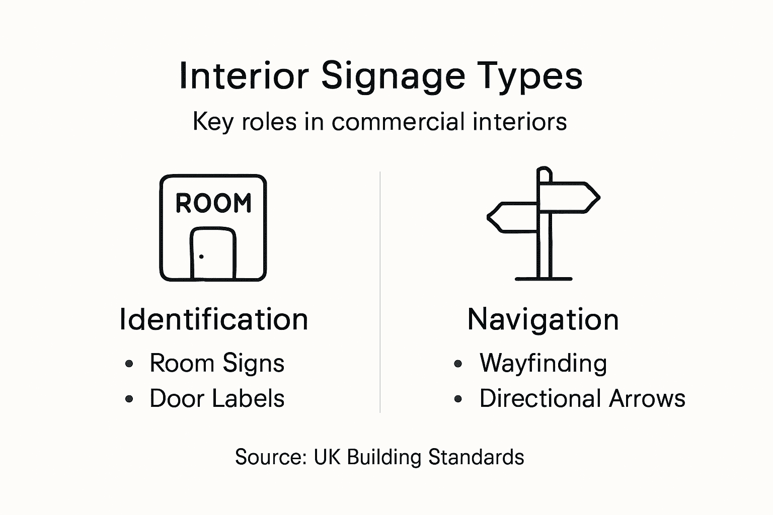
Types of Interior Signage and Their Functions
Commercial interiors demand different signage types, each serving a specific purpose. Understanding these distinctions helps you specify the right solution for each location within a project.
Directional signage guides people through buildings efficiently. These are your wayfinding heroes—arrows, floor indicators, distance markers, and point-of-interest signs that reduce confusion and frustration. Without them, visitors waste time searching for meeting rooms, toilet facilities, or emergency exits.

Room identification signage labels spaces clearly. Door signs, department markers, and office number plates fall here. They’re often subtle but absolutely necessary for professional environments where visitors need to find specific locations without asking staff repeatedly.
Regulatory and safety signage ensures legal compliance. This category includes fire safety notices, emergency exit markers, accessible facilities indicators, and health and safety warnings. These aren’t optional—Building Regulations and health and safety legislation require them.
Reception and welcome signage creates first impressions. Company logos, welcome messages, and corporate branding elements displayed at entry points communicate professionalism and reinforce identity immediately.
Information boards and displays communicate operational details. Opening hours, contact information, procedure notices, and announcement boards belong here. Digital displays increasingly replace static versions, offering flexibility for changing messages.
The following table summarises the main types of interior signage and how they add value to commercial spaces:
| Signage Type | Primary Role | Typical Business Impact |
|---|---|---|
| Directional/Wayfinding | Guides navigation | Reduces visitor confusion |
| Room Identification | Labels spaces | Enhances professional credibility |
| Regulatory/Safety | Ensures legal compliance | Minimises liability and risks |
| Reception/Branding | Creates first impressions | Strengthens brand perception |
| Information Displays | Provides key operational details | Improves user satisfaction |
Here’s how each type functions in a typical commercial space:
- Wayfinding – reduces visitor confusion, decreases staff interruptions, improves building flow
- Identity – reinforces brand recognition, creates visual consistency, builds professional credibility
- Safety – meets legal requirements, protects occupants, guides emergency response
- Information – clarifies procedures, manages expectations, communicates operational details
Each signage type solves a different problem. Mixing them up—or worse, omitting critical types—creates friction in your spaces.
Wayfinding systems deserve special attention because they’re often the most visible and heavily used. A poorly designed wayfinding strategy creates bottlenecks, frustration, and negative impressions. A well-planned one becomes invisible—people find what they need effortlessly.
When specifying signage types for your project, ask: What problems do users face? Where do they get lost? What do they need to know? What compliance requirements apply? These questions determine which signage types matter most.
Material and scale differ too. A reception sign might be large, illuminated, and prominent. A regulatory sign might be small, mounted discreetly near the relevant hazard. A directional sign must be visible from distance and positioned logically along user pathways.
Pro tip: Walk your project spaces as a first-time visitor with your eyes closed, then open them and note every moment you felt uncertain—those moments reveal exactly where you need directional, identification, or information signage.
Signage Design: Branding and User Experience
Signage design isn’t merely functional—it’s your opportunity to reinforce brand identity and create seamless user experiences. The most effective commercial interiors treat signage as a design element, not an afterthought.
Visual consistency across all signage strengthens brand recognition. When logos, colour palettes, and typefaces align throughout your space, visitors absorb your brand identity almost subconsciously. They associate the visual language with professionalism and intentionality.
Consider how consistent branding elements like logos, colours, and typefaces create a recognisable visual language throughout interiors. This approach transforms signage from isolated components into a cohesive system that improves both navigation clarity and brand engagement simultaneously.
User experience hinges on intuitive wayfinding. People should move through your space without confusion, making decisions at decision points rather than searching for directions. Well-designed signage removes friction from navigation.
Here’s how design impacts user experience:
- Clarity – typefaces must be legible from intended viewing distances
- Hierarchy – important information stands out visually; secondary details don’t distract
- Positioning – signs appear before users need them, not after they’ve passed the relevant area
- Colour psychology – colours guide emotion and attention; warm tones welcome, cool tones calm
- Material selection – finishes communicate quality and reinforce brand perception
Bad signage design creates cognitive load. Users must stop, squint, reread, and decide. Good signage design becomes invisible—information flows naturally, and users never think about it.
Effective signage design aligns three elements: brand identity, functional clarity, and the user’s mental model of how spaces work.
Impactful signage design requires understanding your specific audience. A corporate office serves different users than a healthcare facility or university. Your design decisions—typography choices, material finishes, information density—should reflect who’s navigating your space and what they need.
Colour and contrast deserve attention. High contrast between text and background improves accessibility and visibility. Colour coding can guide users—perhaps green for emergency exits, blue for administrative areas. However, consistency matters more than aesthetic preference.
Type selection is critical. Sans-serif typefaces typically offer better legibility in commercial settings. Avoid trendy fonts that sacrifice readability for style. Your signage will remain for years; fashionable typography becomes dated quickly.
Material choices communicate brand values. Polished metal feels premium. Matte finishes feel modern and sophisticated. Budget materials look budget-conscious. Your material selections reinforce or undermine your brand promise.
Pro tip: Test your signage designs in the actual space under real lighting conditions before production—overhead lighting, natural light, and reflective surfaces reveal legibility issues invisible in mockups.
Legal, Safety and Accessibility Requirements
Ignoring legal and accessibility requirements isn’t an option in UK commercial interiors. Non-compliance exposes your clients to liability, creates safety risks, and violates the Equality Act 2010. Your signage must meet multiple regulatory standards simultaneously.
Fire safety signage is mandatory. BS 5499 British Standard governs all safety signs including fire exit markers, emergency procedure notices, and hazard warnings. These signs must be legible, correctly positioned, and use standardised colours and symbols—not optional variations.
Building Regulations require specific signage in defined locations. Emergency exit signs must be illuminated and visible from any point in a space. Fire assembly points need clear identification. Accessible toilet facilities must be marked. These aren’t suggestions; they’re legal requirements.
Accessibility legislation demands inclusive signage design. The Equality Act 2010 requires businesses to make reasonable adjustments for disabled users. For signage, this means:
- High contrast between text and background (minimum 3:1 ratio for general signage)
- Tactile elements on critical signs like door identification and room numbers
- Braille labels where appropriate, particularly in healthcare and public-facing commercial spaces
- Clear typography using sans-serif fonts, adequate spacing, and appropriate sizing
- Colour coding that doesn’t rely solely on colour to convey meaning
Accessible signage for users with visual impairments ensures independent navigation and legal compliance with accessibility standards. This isn’t about creating separate systems—it’s about designing inclusively from the start.
Hazard and warning signage follows strict guidelines. Yellow and black striped borders, specific pictograms, and standardised text sizes aren’t artistic choices. They’re legal requirements ensuring everyone recognises warnings instantly.
Compliance isn’t negotiable. It’s not something to add at project end—it shapes your signage strategy from conception.
Accessibility considerations include:
- Mounting heights – signs placed within reach for wheelchair users, visible to people of all heights
- Wayfinding clarity – directional signs use standardised symbols and language
- Information density – avoiding overcrowded signs that overwhelm users
- Lighting – ensuring signs are readable under actual space lighting conditions
Audit existing spaces thoroughly. Note missing safety signage, illegible signs, or accessibility gaps. These become your compliance checklist. Document everything photographically for your brief.
Work with your signage partner early. Compliance requirements should influence material selection, positioning, and sizing decisions. Late additions never integrate as seamlessly and often cost more to retrofit.
Liability risk is real. If someone has an accident in an area with missing emergency signage, your client faces serious consequences. Proper signage is risk management, not just regulatory box-ticking.
Pro tip: Create a compliance checklist during design phases listing every required sign type, location, sizing requirement, and accessibility feature—review it with your client and signage partner before production begins.
Common Signage Pitfalls and How to Avoid Them
Most failed signage projects share predictable problems. Understanding these pitfalls helps you design systems that actually work rather than discovering issues after installation.
Information overload is perhaps the most common mistake. Cramming too much text onto a single sign creates cognitive load. Users stop reading halfway through, miss critical details, and feel confused.
Excessive information causing confusion particularly impacts vulnerable groups and everyday users alike. Simplify ruthlessly. Each sign should convey one primary message plus essential supporting details only.
Poor contrast undermines legibility. Black text on dark grey? Unreadable. Gold lettering on cream background? Invisible under certain lighting. Contrast isn’t aesthetic preference—it’s functional necessity affecting everyone, especially people with visual impairments.
Test contrast ratios during design. Aim for minimum 3:1 ratio; 4.5:1 or higher is better. View mockups under actual lighting conditions, not just on screens.
Inconsistent design fragments your wayfinding system. If directional signs use different colours, typefaces, or styles, users lose confidence. They stop trusting the signage because it feels ad-hoc rather than intentional.
Establish design rules before production. Document typeface choices, colour palettes, sizing hierarchies, and icon styles. Apply these consistently across every sign.
Common pitfalls to actively avoid:
- Poor positioning – signs mounted too high, too low, or obscured by furniture and obstacles
- Illegible typefaces – decorative fonts that sacrifice readability for aesthetic appeal
- Unclear hierarchy – secondary information visually competing with primary content
- Inadequate maintenance – faded, damaged, or outdated signage damaging credibility
- Ignoring user perspective – signs readable from staff position but invisible from visitor viewpoint
Signage failures usually aren’t design failures—they’re specification failures. Someone didn’t think through positioning, didn’t audit the space, or didn’t establish maintenance protocols.
Inconsistent design and poor positioning compromise signage effectiveness significantly. Regular audits catch problems early. Walk your spaces monthly noting damaged signs, unclear positioning, or users struggling to find locations.
Dont specify signage late in projects. Materials, positioning, and integration suffer when signage is retrofitted. Early involvement allows signage to shape spatial planning rather than fit awkwardly into finished designs.
Involve your signage partner from concept stages. They’ll identify positioning challenges, suggest material improvements, and flag compliance gaps before costly production.
Maintenance gets forgotten. Your specification should include maintenance schedules. Who cleans signs? Who replaces damaged elements? Unclear responsibility means neglected signage.
For quick reference, here is a comparison of common signage design issues with their practical consequences:
| Common Pitfall | Typical Consequence | Practical Prevention |
|---|---|---|
| Information overload | Users miss vital messages | Limit each sign to one key point |
| Poor contrast | Reduced readability for everyone | Test for high-contrast ratios |
| Inconsistent design | Loss of confidence in signage | Standardise fonts and colours |
| Poor positioning | Signage overlooked by visitors | Site surveys for optimal height |
| Neglected maintenance | Damaged/unreadable signs | Schedule regular inspections |
Pro tip: Create a maintenance log template for your client documenting each sign’s location, material, last inspection date, and any damage noted—assign responsibility clearly and review quarterly.
Transform Your Commercial Interiors with Expert Signage Solutions
The challenge in commercial interior projects often lies in integrating clear, compliant and brand-consistent signage from the outset. Poor wayfinding, overlooked legal requirements and inconsistent design can leave visitors frustrated and damage professional credibility. Our bespoke signage solutions at Pik Pik POW! tackle these pain points head-on by combining precise manufacturing with strong design expertise to deliver impactful, durable signage tailored for your space.
Explore our Interior Signage Archives – Pik Pik Pow to see how we create fully compliant, visually cohesive signage systems that solve navigation problems and reinforce brand identity seamlessly. Don’t let signage be an afterthought. Visit https://pikpikpow.co.uk now to partner with a UK-based team that elevates your commercial interiors with expert design and quality craftsmanship. Start transforming your space with signage that works perfectly — act today for a space that feels intentional, professional and welcoming.
Frequently Asked Questions
What are the different types of signage used in commercial interiors?
Commercial interiors typically use directional signage, room identification signage, regulatory and safety signage, reception and welcome signage, and information boards. Each type serves a specific purpose, such as guiding navigation or ensuring legal compliance.
How does effective signage enhance brand identity in commercial spaces?
Effective signage maintains visual consistency across a commercial space, reinforcing brand identity through logos, colours, and typographic choices. When these elements align throughout the environment, they enhance professionalism and increase brand recognition among visitors.
What legal requirements must be considered when designing signage for commercial interiors?
Signage must adhere to various legal and safety regulations, including the Building Regulations and the Equality Act 2010. This entails ensuring that safety signage is clearly visible, compliant with accessibility standards, and includes high contrast, tactile elements, and Braille where necessary.
How can I avoid common pitfalls when specifying signage for commercial projects?
To avoid common pitfalls, limit the amount of information on each sign, ensure good contrast for legibility, maintain design consistency, consider proper positioning, and establish a maintenance plan for regular inspections of signage effectiveness.
Recommended
- Role of Design in Signage Solutions – Impact on UK Retail
- News and Updates: Get the Latest Updates and Information – Pik Pik Pow
- Role of Design in Signage: Boosting UK Brand Impact
- How to Design Signage for UK Retail Chains Effectively
- Commercial Wall Cladding: Hygiene and Compliance Impact
- The Impact of Material Choices on Indoor Air Quality (IAQ) – CEU Builder