TL;DR:
- Signage in TV and film is a crucial storytelling tool that enhances credibility and guides audience perception. Proper design, testing, and integration of signage ensure readability, authenticity, and narrative coherence, preventing costly errors during production. Treating signage as an essential visual element from pre-production improves overall production value and audience engagement.
Signage is one of the most underestimated tools in a TV or film production. Most directors and set designers treat it as background dressing, something to fill a wall or reinforce a location. The reality is very different. Why signage matters in TV comes down to how audiences process visual environments. Viewers do not consciously catalogue every sign they see, but their brains absorb context, authority, and tone from those signs continuously. Get the signage wrong and the world you have built loses credibility. Get it right and it does storytelling work that no line of dialogue can replicate.
Table of Contents
- Key takeaways
- Why signage matters in TV: the visual storytelling role
- Design principles for effective TV signage
- Static, digital, and lower-thirds: choosing the right signage type
- Integrating signage into set design for maximum authenticity
- Our perspective on signage and production value
- Expert signage solutions for TV and film productions
- FAQ
Key takeaways
| Point | Details |
|---|---|
| Signage drives narrative credibility | Well-designed on-set signage reinforces setting, character, and plot without a single word of dialogue. |
| Legibility standards are non-negotiable | WCAG contrast ratios and correct type sizing are necessary for on-screen signage to read clearly on camera. |
| Signage type affects production workflow | Static printed signs, digital displays, and lower-thirds each have distinct production requirements and storytelling roles. |
| Real-world testing is critical | Signage must be checked on actual camera setups and viewing distances before filming begins. |
| Collaboration avoids costly errors | Prop masters, graphic designers, and directors must align on signage early to avoid post-production fixes. |
Why signage matters in TV: the visual storytelling role
Signage on a TV set is not decoration. It is a narrative anchor. When a viewer sees a handwritten chalkboard menu in a café scene, they are receiving information about the establishment’s character, price point, and atmosphere before a single actor speaks. When they see a clean, sans-serif directional sign in a hospital corridor, it communicates institutional authority and clinical order. Signage and typography contribute silently but powerfully to character perception and institutional credibility in narrative contexts.
This is what production professionals call environmental storytelling. Every visual element in a frame communicates something to the audience. Signage is one of the most direct forms of that communication because it contains explicit language, imagery, or both. It tells viewers where they are, what kind of world they are in, and often what to feel about it.
“A TV screen should be treated as a punctuation mark within a larger composition, held visually by supporting shapes, textures, rhythm, and shadows.” This principle applies equally to every sign on a set. Each piece of signage should serve the composition, not compete with it.
There is also a spatial logic to signage. In large or complex sets, signs guide the viewer’s eye and create a sense of physical depth. Designing TV backgrounds as complete visual systems reduces distraction and improves narrative integration. The signs become part of the rhythm of the environment rather than interruptions within it.
Key principles for signage as environmental storytelling:
- Use signage to reflect the social and economic status of the setting (worn, hand-painted signs versus precision-cut vinyl lettering)
- Ensure signage density matches the location type: sparse in private or institutional spaces, dense in commercial or urban settings
- Align signage tone with the emotional register of the scene: clinical and neutral for tension, warm and informal for comfort
- Avoid visual clutter by limiting the number of legible signs within any single camera frame
Design principles for effective TV signage
Typography is where most productions make their first mistake. Choosing a font because it “looks right” is not enough. The typeface must hold up under camera compression, motion, and variable lighting. Broadcast typography should have an x-height of 5% of frame height for lower-thirds, with variable fonts offering weight and optical size axes performing best under motion and small-screen viewing conditions.
Here are the core design standards every production should apply:
- Contrast ratio. The minimum WCAG AA contrast for critical on-screen text is 4.5:1, with 7:1 recommended in dim or complex environments. Small UI elements on large screens require close to 10:1 to maintain legibility.
- Type size. For on-set signage captured on camera, 18 to 24px at 72ppi is the baseline. Anything smaller becomes illegible after compression.
- Font choice and narrative tone. Humanist sans-serif typefaces (such as Gill Sans or Frutiger) convey warmth and approachability. Geometric sans-serif fonts signal precision and modernity. Serif fonts suggest tradition and authority. Each choice communicates something to the viewer before they read a word.
- Motion and blur. High-detail or ornate typefaces break apart under camera motion or during handheld sequences. Test all signage during a camera move, not only in static frames.
- Reflections and backgrounds. Glossy sign surfaces create lens flare and reflections. Complex backgrounds behind transparent or backlit signs reduce legibility dramatically.
- Licensing. On-screen font licensing for TV props and post-production graphics differs from standard desktop licences. Failing to secure broadcast rights for a font used on a prop or lower-third can result in legal exposure after broadcast.
Pro Tip: Always request a broadcast or media licence for any typeface used on signage that will appear on camera, including prop documents, digital displays, and set dressing. Your props budget is far easier to manage than a post-broadcast licensing dispute.
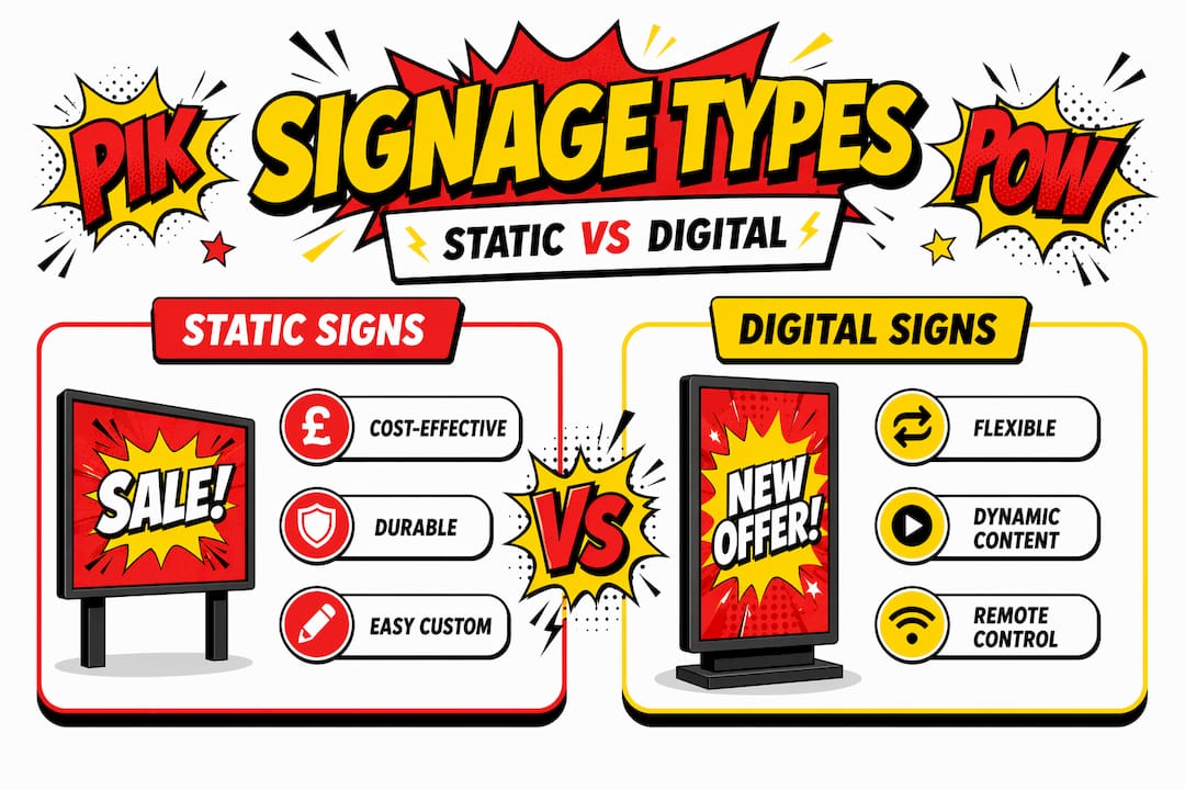
Static, digital, and lower-thirds: choosing the right signage type
Not all signage on a TV set serves the same function or presents the same production challenges. Understanding the differences helps you make faster, better decisions during pre-production.
| Signage type | Best use | Key advantage | Key limitation |
|---|---|---|---|
| Static printed signs | Set dressing, location branding, prop documents | No power requirements; durable; easy to customise | Cannot be updated between takes without replacement |
| Digital signage displays | Tech-heavy sets, control rooms, retail environments | Content can change between scenes; visually dynamic | Requires power management, moire risk on camera |
| Lower-thirds | Broadcast and live programming | Rapid identity and context delivery to viewers | Requires post or live graphics workflow integration |
Static printed signs are the workhorse of set design. They are cost-effective, durable, and completely customisable to the narrative. A print-run of bespoke signage for a fictional brand or institution can establish an entire world’s visual identity across multiple episodes.
Digital signage solutions introduce flexibility that static printing cannot match. A control room display can show different data states between scenes. A fictional retail environment can update its promotional offers to reflect a time skip. However, digital screens carry technical risks on camera: moiré patterns occur when screen pixel grids interact with camera sensor grids, and dynamic backlight and motion smoothing features in modern televisions may reduce text sharpness and contrast during capture.
Lower-thirds are a distinct category. In broadcast contexts, they deliver viewer-facing information: names, titles, locations, breaking news labels. In narrative television, they appear as part of the fictional world, particularly in shows that incorporate documentary or news broadcast aesthetics. Effective lower-thirds must be readable in under one second to maintain viewer engagement, making simple typography and high contrast the only viable approach.
Key considerations when selecting signage type:
- Static signs suit period dramas, location shoots, and any set requiring long-term stability
- Digital displays suit contemporary settings and productions with scene-to-scene content changes
- Lower-thirds require integration with the broadcast or editing pipeline from pre-production onwards
Integrating signage into set design for maximum authenticity
Knowing which signage type to use is only half the task. How you integrate it into the physical set and the filming workflow determines whether it reads as genuine or draws the viewer’s attention for the wrong reasons.
The first step is camera angle testing. UI elements appear smaller on real screens than on design monitors, and the same principle applies to any signage viewed through a lens. Position signage at the planned camera distance and check legibility through the actual viewfinder before committing to a final design or print.
Lighting coordination is equally critical. A sign that reads clearly under general set lighting may wash out completely under a key light, or create unwanted shadows when positioned near a practical lamp. Prop masters and gaffers should review signage placement jointly before the set is dressed for camera.
Consistency between verbal and visual signage improves audience confidence and reduces cognitive load in complex environments. If a character references a location by name, the signage for that location should match exactly. Discrepancies pull attentive viewers out of the story immediately.
Signage can also be used deliberately to mark character or plot progression. A hospital ward sign that is pristine in episode one and visibly deteriorating by episode six communicates institutional decline without a single line of exposition. Simplified, lower-fidelity interfaces often read more clearly on camera than detailed, high-fidelity designs, so less detail often serves the story better than more.
Pro Tip: Build a QA checklist for every piece of signage before the shooting day. Include camera-distance legibility, contrast under set lighting, reflection risk on glossy surfaces, and font licence confirmation. Catching a problem in pre-production costs almost nothing. Fixing it in post-production costs considerably more.
Your checklist should cover:
- Legibility check at planned shooting distance through the camera lens
- Contrast verification under set lighting conditions, not studio overhead lighting
- Reflection assessment for any backlit, gloss-laminated, or screen-based signage
- Font and artwork licensing confirmation for any signage that will be visible on broadcast
- Cross-reference with script to confirm all text content matches narrative requirements
Our perspective on signage and production value
In my experience working with TV and film production teams, signage is almost always the last thing discussed and the first thing that causes problems on set. I have seen entire shoot days disrupted because a printed sign was illegible at camera distance, or a digital display created moiré that nobody spotted until the rushes were reviewed.
What I have learned is that the productions that treat signage as a design asset from pre-production onwards consistently deliver stronger visual results. They brief their signage supplier at the same time as the set builder, not the week before shooting. They test, revise, and test again.
The misconception I hear most often is that signage detail does not matter because “viewers will not notice.” That is precisely wrong. Viewers will not consciously notice well-executed signage. They absolutely will notice when it is wrong. A font that does not match the period, a sign with an implausible logo, or text that is too small to read all register as something being off, even if the viewer cannot articulate exactly what.
What I find most worth communicating is this: signage design for TV shows is not a reduced version of commercial signage. It operates under entirely different constraints. Camera compression, variable lighting, and broadcast encoding all affect how a sign reads on screen. You need suppliers and designers who understand those constraints, not just ones who can produce a visually attractive result on a monitor.
— PikPikPOW!
Expert signage solutions for TV and film productions
At Pikpikpow, we work directly with TV and film production teams to deliver signage that holds up under camera, under light, and under the scrutiny of an engaged audience. From bespoke static set dressing to full digital signage systems built for dynamic on-set use, our team understands the specific demands of broadcast and narrative production. We handle design, manufacturing, and finish selection with camera performance in mind, not just visual appeal in isolation. If you are in pre-production and need signage that will serve your story as well as your set, explore our range of production-ready signage systems or get in touch with our team directly to discuss your project requirements.
FAQ
Why does signage matter in TV and film production?
Signage communicates setting, tone, and character context to viewers without dialogue, making it a core storytelling tool rather than background decoration. Poorly designed or illegible signage undermines narrative credibility and pulls audiences out of the story.
What contrast ratio should on-set signage meet?
The WCAG AA minimum is 4.5:1 for critical text, with 7:1 recommended in complex or low-light environments. For small UI elements on large screens, aim for 10:1 to maintain on-camera legibility.
What is the difference between static and digital signage on a TV set?
Static printed signs are durable and cost-effective for long-term set dressing, while digital displays allow content to change between scenes. Digital signage carries additional technical risks including moiré patterns and contrast reduction from screen processing settings.
Do font licences matter for on-set signage?
Yes. Fonts used on props, displays, or lower-thirds that appear on broadcast require a specific media or broadcast licence. Standard desktop or web licences do not cover television broadcast use, and the oversight can create legal complications after a programme airs.
How should signage be tested before a shoot?
Check all signage through the actual camera lens at the planned shooting distance, under set lighting conditions rather than overhead studio lights. QA cycles must include real-world screen tests to catch contrast and legibility issues that only appear on broadcast-grade hardware.