

TL;DR:
- Branded graphics, including logos, colors, and typography, serve as visual recognition signals that build trust and recall. Consistent visual identity boosts revenue by an average of 23% and reduces media waste, strengthening brand equity over time. Managing these assets with clear guidelines and regular audits prevents brand drift and maximizes their long-term commercial value.
Branded graphics are the visual assets a business uses consistently across all touchpoints to communicate its identity, values, and quality at a glance. They include logos, colour systems, typography, icons, signage, and print materials. When applied with discipline, these assets do something no amount of copy can replicate: they let customers recognise and trust you before they read a single word. Understanding why branded graphics matter is the foundation of any serious marketing strategy, and the evidence for their commercial impact is substantial.
Why branded graphics matter for recognition and recall
Distinctive visual brand assets serve as mental shortcuts, improving brand recognition without requiring any conscious effort from the customer. This is the core finding from Jenni Romaniuk’s research at the Ehrenberg-Bass Institute, and it reframes how you should think about design investment. Your graphics are not decoration. They are memory triggers.
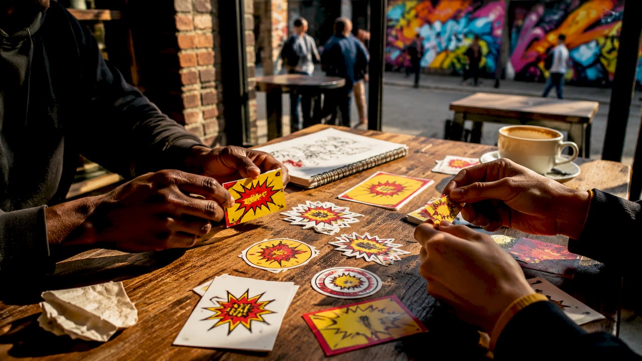
Buyers rely on repeated visual cues rather than evaluating every brand message from scratch. This means the more consistently you deploy your visual identity, the less cognitive work a customer must do to choose you. That reduction in effort directly increases the likelihood of purchase, particularly in low-attention buying environments like retail shelves, vehicle fleets, or building hoardings.
The visual cues that do the heaviest lifting include:
- Colour systems: A specific shade of red, green, or blue becomes ownable through repetition. Think of how instantly you identify certain brands from colour alone, even without a logo present.
- Logo shape and proportion: The silhouette of a logo registers faster than its text. Consistent sizing and clear space rules protect this recognition signal.
- Icon and illustration style: A unified icon set used across signage, print, and digital materials reinforces a coherent visual world.
- Typography hierarchy: Consistent headline and body typefaces create a recognisable visual rhythm across all materials.
Repetition across channels is what converts these individual cues into genuine brand recall. A shopfront fascia, a vehicle wrap, a printed brochure, and a social media post that all share the same colour, typeface, and logo treatment compound each other’s effect. Each exposure adds to the memory structure rather than starting from scratch.
What is the measurable business impact of brand consistency?
Consistent brand presentation raises revenue by an average of 23%, with top-performing businesses gaining up to 33%. That figure, from Lucidpress and Marq’s 2021 State of Brand Consistency research, is not a marginal gain. It represents the difference between a business that grows steadily and one that plateaus despite heavy marketing spend.
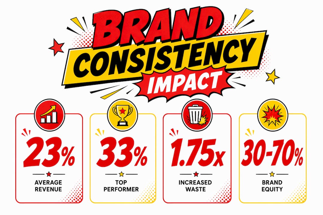
The cost of inconsistency is equally concrete. Inconsistent branding leads to 1.75 times higher media waste to achieve equivalent growth. In practical terms, this means you are spending more on advertising and getting less back, simply because your visual assets are not reinforcing each other. Every time a customer sees a different version of your logo, a mismatched colour, or an off-brand typeface, the memory structure you have built weakens slightly.
The long-term stakes are even higher. Brand equity accounts for 30 to 70% of enterprise value in major companies, driven by consistent branded visuals, according to Interbrand and Brand Finance research. This positions your graphic identity not as a marketing cost but as a balance-sheet asset.
The table below summarises the key commercial metrics linked to branded graphic consistency:
| Metric | Impact |
|---|---|
| Revenue uplift from consistent branding | Average 23%, up to 33% for top performers |
| Media waste from inconsistent branding | 1.75x higher spend required for equivalent growth |
| Brand equity as share of enterprise value | 30% to 70% in major companies |
| Donation uplift from consistent visual branding | 33% increase in nonprofit sector |
Pro Tip: Treat your branded graphic assets as a financial investment with measurable returns, not a one-off design cost. Document the ROI of each campaign that uses consistent visuals versus those that do not, and use that data to justify design budget to stakeholders.
How do branded graphics build customer trust?
Professional graphic design and consistency increase customer trust by signalling credibility and competence, according to 2026 marketing analysis by Red Arrow Marketing. This is the trust proxy mechanism: customers cannot inspect your operations, your staff, or your product quality before they engage with you. Your visual presentation is the evidence they use to make a judgement.
Poor design sends specific negative signals. Misaligned logos, inconsistent colours on signage versus print, or low-resolution graphics on a shopfront all communicate the same thing: this business does not pay attention to detail. Customers transfer that inference directly to your product or service quality. The reverse is equally true. Polished, consistent branded graphics across your architectural signage and printed materials signal that you operate with care and professionalism.
The trust effect extends beyond first impressions. Consistent professional visual branding raises nonprofit donations by 33%, a finding that illustrates how deeply visual credibility influences willingness to commit money. If donors respond to design quality, so do paying customers.
Consider these practical trust signals that branded graphics either strengthen or undermine:
- Shopfront and fascia signage: The first physical touchpoint for most customers. Faded, damaged, or inconsistent signage immediately reduces perceived quality.
- Vehicle graphics: A branded fleet communicates scale and professionalism. Inconsistent or outdated vehicle graphics suggest a business that has not invested in its own presentation.
- Printed materials: Brochures, business cards, and point-of-sale materials that match your digital and physical signage reinforce a coherent, trustworthy identity.
- Environmental and wayfinding graphics: Interior branded graphics tell customers you have thought about their experience, not just your own marketing.
Design quality multiplies or divides the effectiveness of all your other marketing investments by influencing perceived competence. A well-targeted advertising campaign delivered through poorly designed materials will underperform. The same campaign with consistent, professional graphics will outperform. The graphics are the multiplier.
How to create and manage branded graphics effectively
The most common reason businesses fail to realise the benefits of branding design is not a lack of initial investment. It is brand drift. Brand drift occurs when subtle inconsistencies accumulate across channels and over time, gradually weakening the recognition and trust signals your graphics are supposed to deliver.
Preventing brand drift requires strict governance on logo spacing, colour variations, and typography styles. This is not about being rigid for its own sake. It is about protecting the memory structures you have built with your customers. The following steps give you a practical framework:
- Define your graphic asset system in writing. Specify your primary and secondary colour values in Pantone, CMYK, RGB, and hex. Define minimum logo sizes, clear space rules, and prohibited uses. Write this down in a brand guidelines document that every supplier and internal team member can access.
- Limit your asset set deliberately. Limiting graphic asset sets to one colour system, one icon set, and one illustration style maximises recognition and reduces production costs. More assets mean more opportunities for inconsistency and more design time per project.
- Audit your existing materials. Review your signage, print, digital, and vehicle graphics against your guidelines. Identify where inconsistencies exist and prioritise corrections by customer visibility. Your shopfront and vehicle fleet are seen by the most people and should be addressed first.
- Brief suppliers with your guidelines, not just your logo. A signage company, a printer, and a web developer all need the same brand guidelines document. Providing only a logo file and expecting consistent output is the single most common cause of brand drift in multi-channel execution.
- Review and update on a schedule. Brand guidelines are not permanent. Review them annually and update materials when your identity evolves, rather than allowing old and new versions to coexist in the market.
Pro Tip: When briefing a signage or print supplier, always supply your brand guidelines alongside your artwork files. A supplier working from guidelines alone will produce more consistent results than one working from a reference image or a previous job.
70% of organisations with brand guidelines fail to enforce them, losing the ROI that consistency would otherwise deliver. Having guidelines is only the first step. Enforcing them across every physical and digital touchpoint is where the commercial benefit is actually realised. For businesses with branding in construction spaces or multi-site retail, this enforcement challenge is particularly significant and worth addressing with a formal approval process for all new branded materials.
Key takeaways
Branded graphics are a measurable commercial asset: consistent visual identity directly drives revenue growth, reduces media waste, and builds the customer trust that converts attention into sales.
| Point | Details |
|---|---|
| Recognition through repetition | Consistent visual cues build memory structures that reduce customer effort and increase purchase likelihood. |
| Revenue impact is documented | Consistent brand presentation delivers an average 23% revenue uplift, rising to 33% for top performers. |
| Trust is signalled visually | Professional, consistent graphics communicate competence before a customer reads or hears anything about your business. |
| Brand drift is the primary risk | Inconsistencies across channels weaken recognition and cost 1.75x more in media spend to overcome. |
| Governance protects your investment | Defined rules for colour, logo spacing, and typography are what turn design spend into long-term brand equity. |
Our view on branded graphics from Pikpikpow
After working with businesses across retail, construction, commercial interiors, and the TV and film industry, we have seen one pattern repeat itself consistently. The businesses that treat their graphics as a governed system rather than a collection of individual jobs get significantly better results from every marketing pound they spend.
What surprises many of our clients is how much of their brand equity is already embedded in their existing visual assets, and how much of it is being quietly eroded by inconsistent execution. A shopfront that does not match the vehicle fleet. A printed brochure using a slightly different shade of the brand colour. These are not cosmetic issues. They are recognition failures that accumulate over time.
The digital environment has raised the stakes considerably. Customers now encounter your brand across more touchpoints than ever before, from social media to physical signage to vehicle graphics to merchandise. Each touchpoint is an opportunity to reinforce or undermine the memory structure you are trying to build. The businesses that win are the ones that treat every physical and digital surface as part of a single, governed visual system.
Our practical advice: start with your highest-visibility assets. Get your shopfront, your vehicle graphics, and your core print materials aligned first. Then work outward. You do not need to redesign everything at once. You need to stop adding inconsistency and start compounding recognition.
— Pikpikpow
How Pikpikpow can support your branded graphic needs
If you are ready to put the principles in this article into practice, Pikpikpow works with businesses across the UK to deliver branded signage and print that performs consistently across every touchpoint.
From signage systems that unify your physical brand presence across a site or multiple locations, to digital signage solutions that keep your visual identity dynamic and current, we combine design expertise with precision manufacturing to produce materials that hold their quality over time. We also offer vehicle graphics and printing services to cover every channel where your brand needs to show up consistently. Contact Pikpikpow to discuss how we can help you build a visual identity that compounds in value.
FAQ
What are branded graphics?
Branded graphics are the visual assets a business deploys consistently across all channels, including logos, colour systems, typography, icons, signage, and print materials. They function as recognition signals that allow customers to identify and trust a business without conscious evaluation.
How much revenue can consistent branding add?
Consistent brand presentation raises revenue by an average of 23%, with top performers gaining up to 33%, according to Lucidpress and Marq’s 2021 State of Brand Consistency research. This makes graphic consistency one of the highest-return marketing investments available to most businesses.
Why do inconsistent graphics cost more in marketing spend?
Inconsistent branding leads to 1.75 times higher media waste to achieve equivalent growth, because each inconsistency weakens the memory structures customers use to recognise and choose a brand. You end up paying more to achieve the same level of awareness that consistent graphics would have built for less.
How do branded graphics affect customer trust?
Professional, consistent graphics signal credibility and competence before a customer engages with your product or service. Poor or inconsistent design communicates inattention to detail, which customers transfer directly to their perception of your quality and reliability.
How do I prevent brand drift across multiple channels?
Define your graphic asset system in a written brand guidelines document covering colour values, logo spacing, typography, and icon styles. Brief every supplier and internal team member from the same document, and audit your materials regularly against those standards to catch inconsistencies before they accumulate.