

Good wayfinding signage is the difference between a gym that members navigate confidently on day one and a facility where people wander, interrupt staff, and quietly cancel their memberships. At its core, gym wayfinding is a structured system of visual cues, directional signs, zone graphics, and safety notices that guides users through your facility safely and intuitively. Get it right and you reduce staff interruptions, meet UK legal requirements, and reinforce your brand at every turn.
Here is what effective gym wayfinding signage covers:
- Member confidence: Clear directional signs and zone identification reduce confusion from the moment someone walks through the door.
- Operational efficiency: Effective wayfinding signage reduces the need for staff intervention, freeing your team for higher-value tasks.
- Safety and compliance: Fire exit signs, emergency evacuation routes, and equipment instructions are legally required in UK sports facilities.
- Brand consistency: Signage that carries your colours, materials, and graphics reinforces your identity throughout the space.
- Accessibility: Inclusive design ensures all members, regardless of ability, can navigate your facility independently.
Table of Contents
- What are the core principles of effective gym wayfinding signage?
- What types of wayfinding signage does your gym actually need?
- What are the legal and safety requirements for gym signage in the UK?
- How do you integrate brand identity into your gym’s wayfinding design?
- How often should you review and update your gym’s signage?
- Where should you place signs in each zone of your gym?
- Pikpikpow designs gym signage that works from day one
- Key takeaways
What are the core principles of effective gym wayfinding signage?
Good gym navigation signage starts with legibility. Sans-serif typefaces such as Helvetica or Arial at an appropriately large cap height for directional signs keep text readable at distance, even under the bright, even lighting that reduces accident risk in busy fitness environments. High contrast between text and background, typically dark text on a light ground or white on a deep colour, is non-negotiable for quick reading mid-workout.
Consistency matters just as much as individual legibility. Every sign in your facility should share the same typeface, colour palette, icon set, and mounting style. When members see a consistent visual language, they build a mental map of your space quickly, without consciously reading every sign they pass.
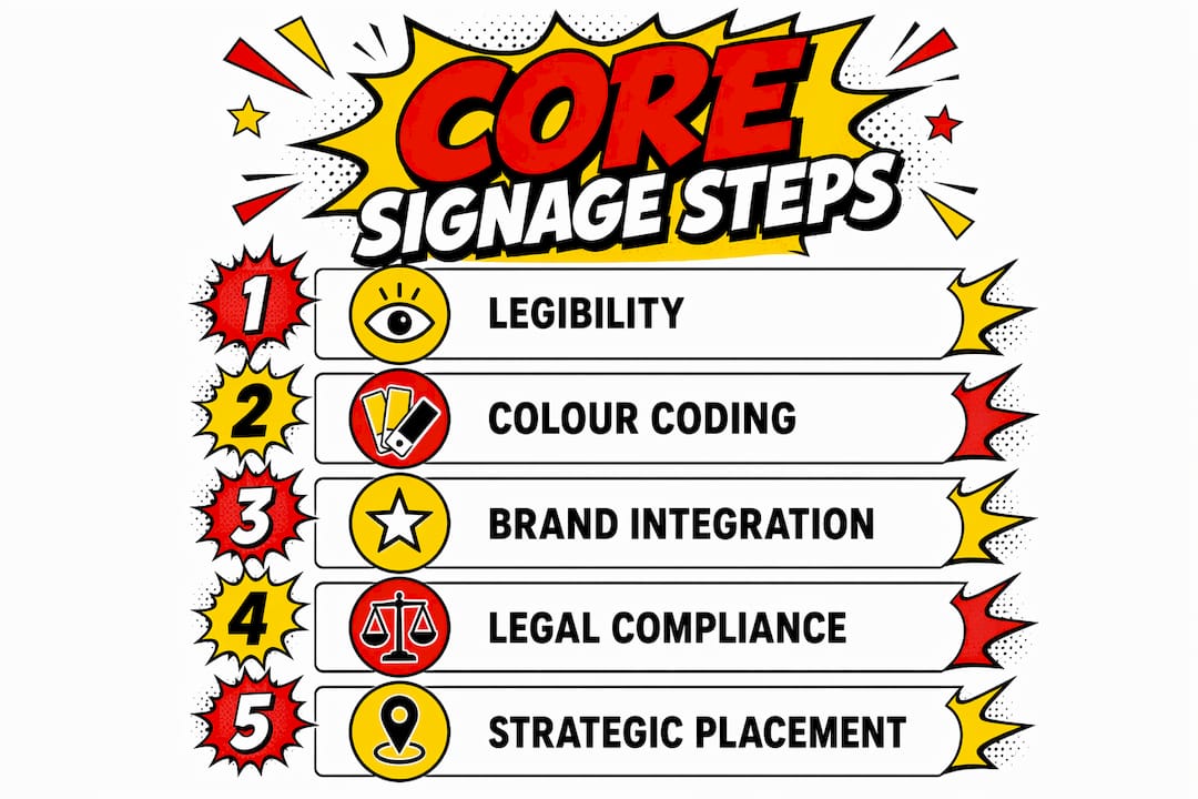
Key principles to apply across your signage system:
- Legibility: Use clear, high-contrast fonts at appropriate sizes for viewing distances in each zone.
- Consistency: Maintain a single visual style, including colours, icons, and materials, throughout the facility.
- Strategic placement: Position signs at decision points, entrances to zones, and corridor junctions before members need to make a turn.
- Accessibility: Follow Sport England’s guidance on tactile signage, Braille, and colourblind-friendly colour combinations.
- Colour-coded zones: Assign a distinct colour to each area, such as cardio, weights, and studios, so members navigate by colour as much as by text.
- Unobstructed sightlines: Place signs where equipment, pillars, or structural features will not block them, and consider sight distances when choosing sign sizes.
Pro Tip: Design your colour-coding system before you finalise your interior palette. Trying to retrofit zone colours onto an existing scheme almost always produces clashes that undermine legibility.
What types of wayfinding signage does your gym actually need?
A complete fitness centre wayfinding system draws on several distinct sign categories, each serving a specific purpose. Relying on one type alone leaves gaps that frustrate members and create compliance risks.
- Directional signs: Overhead or wall-mounted arrows pointing to specific zones, changing rooms, reception, and exits. These are the workhorses of gym navigation signage and should appear at every decision point along the main circulation routes.
- Informational signs and floor plans: Mounted maps near entrances and lift lobbies give new members an immediate overview of the layout. A well-placed floor plan at reception can eliminate the most common “where is the pool?” conversation entirely.
- Zone identification graphics: Large-format wall graphics or suspended panels that label each area, such as “Free Weights,” “Cardio,” or “Studio 1.” Colour-coded zone graphics help members navigate intuitively without reading every word.
- Safety and compliance signs: Fire exit signs, assembly point directions, equipment usage instructions, and first-aid locations. These are mandatory under UK legislation and must conform to BS EN ISO 7010 pictogram standards.
- Equipment instruction panels: Fixed to or adjacent to machines, these reduce injury risk and staff call-outs simultaneously.
- Digital and interactive signage: Screens displaying live class schedules, facility maps, and promotional content. Digital displays allow you to update information without reprinting, which is particularly useful for timetable changes and seasonal campaigns.
- Floor graphics: Directional arrows and zone boundary markers applied directly to flooring using slip-rated materials. These work well in high-traffic areas where wall space is limited.
What are the legal and safety requirements for gym signage in the UK?
UK gym operators carry clear legal obligations when it comes to signage, and the consequences of falling short range from enforcement notices to personal liability in the event of an accident. The Regulatory Reform (Fire Safety) Order 2005 requires all non-domestic premises, including gyms, to display fire exit signs and emergency evacuation routes that are visible at all times. These signs must use the green running-man pictogram in line with BS EN ISO 7010.
The Accessible Sports Facilities Design Guidelines (AISF Part E) set out detailed standards for wayfinding and signage in sports facilities, covering sign heights, tactile information, and contrast ratios. Sport England’s Accessible and Inclusive Sports Facilities guidance builds on this, requiring facilities to consider the full range of user needs from the design stage.
Your legal and safety checklist should include:
- Fire exit and evacuation signage: Mandatory, conforming to BS EN ISO 7010, illuminated where necessary, and unobstructed at all times.
- Accessibility compliance: Large-format text, tactile signs, and Braille where required under the Equality Act 2010 and AISF Part E.
- Equipment safety notices: Required at each piece of apparatus to inform users of correct operation and hazard warnings.
- Emergency information: First-aid point locations, defibrillator positions, and emergency contact details must be clearly posted.
- Regular inspection: Signage must be checked periodically to confirm it remains legible, undamaged, and accurate. Faded or missing safety signs can constitute a breach of duty of care.
How do you integrate brand identity into your gym’s wayfinding design?
The most effective gym signage systems treat brand and wayfinding as a single design problem, not two separate projects. As Zynk Design notes, brand should be designed into the space, not applied afterwards, with identity carried through zone graphics, colour, and material choices so it is felt rather than just seen.
Practically, this means briefing your signage designer with your full brand guidelines before a single sign is specified. Your primary and secondary colours become the zone-coding palette. Your brand typeface, or a legible companion to it, carries all directional text. Your logo and graphic language appear on entrance signs, zone headers, and motivational wall graphics in a way that feels deliberate rather than decorative.
Material choices reinforce brand character too. A premium health club might specify brushed aluminium lettering and frosted acrylic panels. A high-energy functional fitness gym might use bold vinyl graphics on raw concrete. Both approaches communicate something specific about the brand before a member reads a single word. Pairing your gym’s online presence with a coherent in-facility identity creates a consistent experience from first click to first session.
Pro Tip: Place free-weight areas away from the entrance and maintain open sightlines across the floor. Members who can see the whole space from the door feel less anxious, which means your directional signage supports orientation rather than compensating for a confusing layout.
How often should you review and update your gym’s signage?
Signage maintenance is one of the most overlooked aspects of sports facility management. A sign that was accurate on opening day may be misleading after a layout change, a rebrand, or simply years of physical wear in a high-moisture environment.
A practical maintenance schedule looks like this:
- Monthly visual checks: Walk the facility and flag any signs that are faded, peeling, damaged, or obscured by equipment that has been repositioned.
- Quarterly functional review: Confirm that all fire exit and safety signs remain unobstructed, illuminated where required, and compliant with current standards.
- Annual audit: Review the full signage system against the current floor plan and brand guidelines. If zones have been reconfigured or equipment relocated, update directional signs accordingly.
- Post-refurbishment update: Any structural or layout change triggers an immediate signage review, not a scheduled one.
Durable signage materials resist moisture, withstand frequent cleaning with commercial-grade products, and hold their colour under UV lighting, all of which extend the interval between replacements. Choosing the right substrate at the outset reduces both maintenance frequency and long-term cost.
Where should you place signs in each zone of your gym?
Placement strategy varies by zone because member behaviour and sightlines differ across a gym floor. A sign that works perfectly at a corridor junction will be invisible above a row of treadmills.

Reception and entrance: This is where orientation happens. A floor plan, a welcome sign, and clear directional arrows to the main zones should all be visible within the first few metres. Members should be able to identify the changing rooms, the main gym floor, and the emergency exits without asking anyone.
Cardio zone: Overhead signage works well here because members on treadmills and bikes have their eyes up. Zone identification panels at the entrance to the area, combined with equipment instruction labels on each machine, cover both navigation and safety.
Free weights and resistance area: Wall-mounted zone identification at eye level is more effective than overhead signs in this area, where members move between racks and benches and rarely look up. Safety notices and usage instructions belong at the point of use, fixed directly to or beside each station.
Group exercise studios: Door signage showing the studio name and current timetable reduces corridor congestion before classes. A directional sign from the main gym floor pointing to each studio prevents members from interrupting a live session to find the right room.
Changing rooms and welfare facilities: Directional signs to changing rooms, showers, and toilets should appear at every corridor junction between the gym floor and those facilities. Accessibility symbols must be prominent, and tactile signs are required on changing room doors under AISF Part E.
Emergency routes: Fire exit signs must be visible from every point in the facility, with no zone exempt. Check that equipment repositioning has not created any blind spots in your emergency route signage.
Pikpikpow designs gym signage that works from day one
Designing a complete wayfinding system for a gym requires more than printing a few arrows. It takes a supplier who understands both the design brief and the physical demands of the environment: moisture, heavy footfall, frequent cleaning, and the need to carry a brand identity through every square metre of the space.

Pikpikpow is a UK-based design, signage, and print company that produces bespoke internal and wayfinding signage for commercial interiors, including gyms and sports facilities. From zone identification graphics and directional sign systems through to fire safety notices and digital display solutions, Pikpikpow handles design and production under one roof, which means your brand guidelines inform every sign rather than being interpreted differently by separate suppliers. Materials are selected for durability in high-moisture, high-traffic environments, and the team supports UK-wide installation and ongoing updates as your facility evolves. Get in touch with Pikpikpow for a quote on your gym’s signage system.
Key takeaways
Effective gym wayfinding signage combines clear design principles, UK legal compliance, and brand integration to create a facility that members can navigate confidently from their very first visit.
| Point | Details |
|---|---|
| Legal compliance is non-negotiable | Fire exit signs must conform to BS EN ISO 7010, and AISF Part E sets standards for accessible wayfinding in UK sports facilities. |
| Brand and wayfinding are one brief | Integrate your colour palette, typeface, and materials into the signage system from the outset, not as an afterthought. |
| Placement varies by zone | Overhead signs suit cardio areas; eye-level wall signs work better in free-weight zones; door signage reduces congestion at studios. |
| Maintenance prevents compliance gaps | Monthly visual checks, quarterly safety reviews, and annual audits keep signage accurate, legible, and legally compliant. |
| Pikpikpow delivers end-to-end gym signage | Pikpikpow designs, produces, and installs bespoke wayfinding systems for UK gyms, covering everything from zone graphics to digital displays. |