

TL;DR:
- Effective sports facility signage integrates wayfinding, accessibility, and branding into a cohesive system that guides visitors safely and reinforces the venue’s identity. Proper planning begins with a sightline survey to map natural gaze points and decision locations, followed by placing clear directional signs at every decision point using concise language and universal symbols. Signage design must consider physical conditions, such as outdoor readability with appropriate letter size, and include ADA-compliant tactile and Braille features for accessibility.
Sports facility signage best practices are defined as the deliberate planning, design, and placement of functional, informational, and promotional signs to guide visitors safely, communicate clearly, and reinforce venue identity. Effective signage in a sports venue operates across three distinct layers: wayfinding and navigation, real-time communication, and brand promotion. Each layer serves a different purpose and demands a different approach. Facility managers and athletic directors who treat these layers as one undifferentiated system end up with cluttered, confusing venues. This guide breaks each layer down into practical, testable steps you can apply immediately.
1. Sports facility signage best practices: start with a sightline survey
The single most effective starting point for any signage project is a sightline and path inventory. Walk every route a visitor takes, from the car park to their seat, and note exactly where their eyes naturally land. Practitioners recommend mapping visitor sightlines before placing a single sign, because signs positioned at sponsor-convenient locations rather than natural decision points create visual clutter and navigation confusion.
A sightline survey reveals three things: where visitors pause to make decisions, where their gaze settles at rest, and where competing visual elements fight for attention. Armed with that data, you can position signs where they will actually be read. This step costs nothing beyond time and prevents expensive reinstallation later.
2. Place directional signs at every decision point
Directional signs work best at key decision points such as entryways, stairwells, and main corridors, where visitors must choose a route. Placing a sign mid-corridor, away from any junction, wastes material and confuses visitors who have already committed to a direction. Every fork, every door, and every level change is a decision point that needs a sign.
Clear, concise language is non-negotiable. Use single-word or short-phrase labels: “Toilets,” “East Stand,” “First Aid.” Avoid full sentences on directional signs. Pair text with universally recognised pictograms to serve visitors who do not read English fluently.
- Position signs at eye level where possible, typically 1.5–2 metres from the floor
- Use bold, sans-serif typefaces such as Helvetica or Arial for maximum legibility
- Add floor graphics and decals at ground level to reinforce routes in high-traffic concourses
- Ensure signs are visible from at least 10 metres away in typical venue lighting
Pro Tip: Test every directional sign by standing at the decision point and checking whether the sign is visible before you reach it, not just after. Visitors make routing decisions several steps before the junction.
3. Apply the letter-height rule for outdoor readability
Outdoor sign readability follows a clear rule: 1 inch of letter height per 10 feet of maximum readable distance. A sign intended to be read from 30 metres away needs letters at least 10 centimetres tall. That is the baseline. Real-world conditions, including glare, angle, and ambient light, often require you to scale up further.
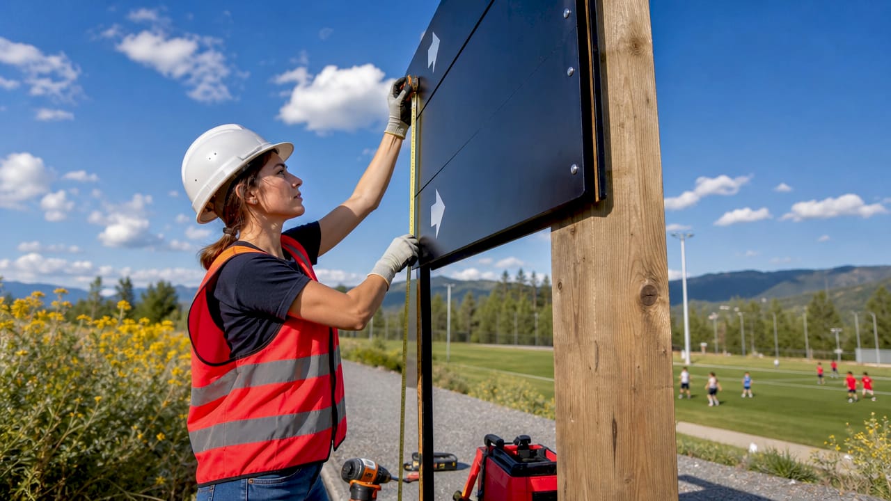
The 1-inch-per-10-feet guideline is a starting point, not a guarantee. Full-scale mock-ups tested at actual viewing distances and under real lighting conditions are the only reliable way to confirm readability before installation. Print the sign at full size, mount it temporarily, and check it at the intended viewing distance on a bright day and at dusk.
4. Design for accessibility and ADA compliance
Accessible signage is not a separate category. It is an integrated part of every signage system. ADA-compliant tactile signs require mounting heights between 48 and 60 inches, with tactile characters projecting at least 1/32 inch above the surface and Grade 2 Braille placed directly below the corresponding text. Signs must be mounted on the latch side of doors with clear approach space for touch reading.
The ADA Title III framework positions accessibility as effective communication through an integrated system of aids, not as isolated features bolted on after the fact. That means pairing tactile signs with large-print materials, audio guides, and staff training where appropriate.
Common mistakes to avoid:
- Mounting Braille signs too high or too low, making tactile reading physically awkward
- Adding Braille to temporary or promotional signs, where it is not required and creates confusion
- Using gloss finishes that cause glare and reduce legibility for visitors with low vision
- Failing to maintain clear floor space in front of tactile signs
Pro Tip: Reserve tactile and Braille features for permanent room identification signs only. Overuse of Braille signage on non-permanent signs dilutes its usefulness and can mislead visitors who rely on it.
| Requirement | Specification |
|---|---|
| Mounting height | 48–60 inches from finished floor |
| Tactile character projection | Minimum 1/32 inch above surface |
| Braille placement | Grade 2, directly below corresponding text |
| Door placement | Latch side, with clear approach space |
| Finish | Non-glare surface to reduce reflection |
5. Build a coherent branding and promotional signage system
A good signage strategy balances functional navigation with emotional brand connection, guiding visitors safely while reinforcing the venue’s identity. Branding signage works best when it uses a consistent typographic hierarchy and a controlled colour palette that matches the venue’s identity across every touchpoint, from exterior fascia signs to interior wall graphics.
Sponsor signage is a revenue source, but it must not override visitor sightlines. Treating signs as responses to specific decision points on visitor paths, rather than as sponsor placement opportunities, keeps the venue functional and the fan experience positive. Sponsors placed at natural pause points, such as concession areas and seating entrances, gain more dwell time and better recall than signs crammed into corridors.
Key principles for branding signage:
- Use no more than two primary typefaces across the entire venue
- Apply brand colours consistently, reserving high-contrast combinations for safety and directional signs
- Place mood-setting exterior signage at arrival points to establish identity before visitors enter
- Use digital signage for dynamic content such as match schedules, scores, and sponsor messages that change by event
6. Choose the right materials for each environment
Material choice determines how long a sign lasts and how well it performs under the conditions your venue creates. The table below compares the most common options for sports facility environments.
| Material or technology | Best environment | Durability | Maintenance | Cost level |
|---|---|---|---|---|
| Digital LED boards | Indoor and outdoor | High | Regular software updates | High upfront |
| Printed vinyl graphics | Indoor, sheltered outdoor | Medium | Replace when faded or damaged | Low |
| Aluminium composite panels | Outdoor, high-traffic | High | Minimal | Medium |
| Tactile acrylic panels | Indoor, permanent rooms | High | Low | Medium |
| Floor graphics and decals | Indoor concourses | Low to medium | Replace seasonally | Low |
High contrast typography with bold, simple sans-serif fonts maximises legibility across all these materials. Non-glare finishes are critical for indoor signs under artificial lighting, where reflective surfaces can make text unreadable from certain angles. For outdoor signs, UV-resistant inks and weatherproof substrates prevent fading within a single season.
Digital LED boards offer the greatest flexibility for event communication, allowing real-time updates without physical replacement. The trade-off is a higher upfront cost and the need for ongoing technical management. Printed graphics and aluminium panels suit permanent wayfinding where content does not change frequently.
7. Integrate all signage systems into one cohesive strategy
A cohesive signage strategy connects wayfinding, accessibility, and branding into a single visual system that visitors experience as effortless. The steps below create that integration:
- Conduct a full sightline and route survey covering every visitor journey from arrival to exit
- Map each sign to a specific decision point on the visitor route, assigning a clear purpose to every sign
- Establish a visual hierarchy: safety and directional signs take priority over branding and promotional signs in every conflict
- Coordinate physical signs with digital systems so that LED boards and printed signs carry consistent messaging
- Test the complete system with real visitors before a major event, noting where people pause, look confused, or ask for directions
- Iterate based on feedback, replacing or repositioning signs that fail in practice
Coordinated sightlines and integrated branding reduce clutter and improve the visitor experience measurably. A venue where every sign has a defined purpose and a consistent visual style feels professional and trustworthy, which directly supports the facility’s reputation.
Pro Tip: Run a timed navigation test before every major event. Ask a volunteer unfamiliar with the venue to find the toilets, first aid, and their seat using only the signage. Any hesitation longer than five seconds at a decision point identifies a gap.
Key takeaways
Effective sports venue signage requires a deliberate system that integrates wayfinding, accessibility, and branding into a single, consistent visual language across every zone.
| Point | Details |
|---|---|
| Start with a sightline survey | Map where visitors naturally look before placing any sign. |
| Place signs at decision points | Every junction, door, and level change needs a directional sign. |
| Apply the letter-height rule | Use 1 inch of letter height per 10 feet of viewing distance as your baseline. |
| Integrate accessibility from the start | ADA-compliant tactile signs require precise mounting heights and non-glare finishes. |
| Align branding with wayfinding | Consistent typography and colour across all sign types creates a coherent visitor experience. |
What we have learned from working on sports venue signage
The most common mistake facility managers make is treating signage as a finishing touch rather than a structural part of the venue. By the time a sign order arrives, the decision points have already been built, the sightlines are fixed, and the sponsor contracts are signed. That sequence produces cluttered, compromised signage every time.
The second mistake is confusing compliance with accessibility. Mounting a Braille sign at the correct height satisfies a regulation. Designing a system where a visitor with visual impairment can navigate the entire venue independently is a different and far more demanding goal. The ADA’s integrated approach to accessibility points in the right direction, but most venues stop at the minimum.
The insight that changes everything is this: signs are answers to questions visitors are already asking. “Where is the exit?” “Which stand is this?” “Where can I get food?” Design every sign as a direct answer to a specific question at a specific location, and the system becomes logical. Design signs as brand canvases or sponsor placements first, and the system fails visitors.
Typography is also underestimated. Typography for signage is a system requiring hierarchy, contrast, and environmental testing, not a single font choice. A typeface that looks clean on a screen can become illegible on a 3-metre banner under floodlights. Test everything at full scale, in real conditions, before committing to production.
— Pikpikpow
How Pikpikpow supports sports facility managers
Sports venues need signage that performs under pressure, from packed match days to quiet training mornings. Pikpikpow designs and manufactures bespoke signage systems for sports facilities across the UK, covering wayfinding, accessibility, branding, and digital integration in a single coordinated package.
Every project starts with a design consultation that maps your visitor routes and decision points before a single sign is specified. Pikpikpow’s manufacturing combines durable materials with precision print quality, producing signs built for high-traffic outdoor and indoor environments. Whether you need internal way finding signage for a complex multi-zone facility or a full exterior branding package, Pikpikpow delivers compliant, visually consistent results that work on match day and every day after.
FAQ
What is the most important rule for sports facility way finding?
Place directional signs at every decision point, including entryways, stairwells, and corridor junctions, using clear, concise language and universally recognised symbols.
How tall should letters be on outdoor sports facility signs?
The standard guideline is 1 inch of letter height per 10 feet of maximum viewing distance. Always test at full scale under real lighting conditions before final installation.
Which signs in a sports venue require Braille?
Braille is required on permanent room identification signs such as toilet doors, office doors, and accessible facility labels. Temporary, promotional, and directional signs do not require tactile or Braille features.
How do I balance sponsor signage with visitor navigation?
Position sponsor signs at natural pause points such as concession areas and seating entrances, where visitors have dwell time. Never place sponsor signs at active decision points where directional clarity takes priority.
What materials work best for outdoor sports facility signs?
Aluminium composite panels and UV-resistant printed vinyl on weatherproof substrates perform well in outdoor environments. Digital LED boards offer flexibility for event-specific content but require ongoing technical maintenance.