

TL;DR:
- In-store navigation signage guides customers effectively and influences shopping behavior positively. Digital signage enhances traditional signs by providing real-time, personalized content and measurable sales impact. Regular audits and strategic digital integration improve wayfinding, customer experience, and retail sales performance.
In-store navigation signage is defined as the system of directional, informational, and wayfinding signs that guide shoppers through a retail space from entry to purchase. The role of in-store navigation signage extends well beyond pointing customers to the right aisle. It shapes the entire shopping experience, reduces friction, and directly influences sales performance. A large-scale study analysing 30 million receipts and 237 campaigns found that digital signage lifts sales conversion by 8.1% on average. For retail managers and designers, that figure makes signage one of the highest-return investments on the shop floor.
How does in-store navigation signage influence customer behaviour and sales?
Signage influences shoppers both consciously and subconsciously. Research shows that visual consistency guides behaviour along a “golden path” that maximises product exposure without customers realising they are being directed. The result is a shopping journey that feels natural rather than engineered.
The sales impact is measurable and significant. The Stratacache study of 30 million receipts confirmed an average 8.1% conversion rate lift from in-store digital signage. That lift rises further when the advertised product is a popular brand or a hedonic purchase, such as confectionery or personal care items.
The same study found 22.1% higher conversion rates for in-store ads displayed later in the day, and 11.7% higher on weekends. Shopper fatigue and reduced decision-making energy later in the day appear to make customers more receptive to clear, direct signage prompts.
Timing is a factor most retail managers overlook entirely. Placing your most persuasive promotional signs near high-traffic zones during the late afternoon or on a Saturday morning is not guesswork. It is a data-backed decision. The impact of signage on sales is not uniform across all conditions, so understanding when and where your customers are most receptive gives you a genuine competitive edge.
Visual communication inside a store combines informational, navigational, and persuasive roles. These three functions must align visually and technically for maximum impact. A sign that directs customers to a department but uses inconsistent typography or clashing colours undermines brand trust at the same moment it attempts to build it.
What are the best design principles for effective navigation signage?
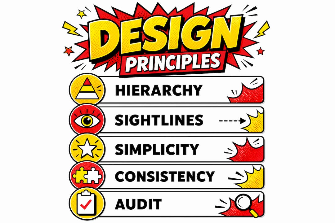
Well-designed navigation signage feels invisible. That is the core principle behind expert way-finding practice. When customers move through a store without hesitation or confusion, the signage system is doing its job correctly. Clear hierarchy and consistency reduce cognitive load and make the entire system feel intuitive rather than instructional.

Hierarchy means organising signs by importance: primary category signs at high level, secondary department signs at mid level, and product-level signs at eye level. Consistency means using the same typeface, colour palette, and icon set throughout the store. When these two principles are applied together, customers build a mental map of the space quickly and confidently.
Sightlines matter as much as the signs themselves. Signage should be integrated with the store layout from the planning stage, not added after the shelving and fixtures are in place. Integrating signage with store layout and sightliness from the outset produces a far more coherent result than retrofitting signs to an existing floor plan.
The most common design failure is over-signing. Too many signs create visual noise that causes shoppers to stop reading them altogether. Retail designers call this the “casino effect”: an environment so saturated with messages that customers disengage entirely.
Pro Tip: Reduce all visible signs to the critical few, then observe customer behaviour on the shop floor. Staff feedback and simple observation reveal which signs customers actually use. Remove the rest. Fewer, clearer signs consistently outperform dense signage systems.
Key design principles to apply across any retail environment:
- Use no more than three levels of sign hierarchy: primary, secondary, and product level.
- Maintain a single typeface family across all navigation signs.
- Position directional signs at decision points, not mid-aisle where no choice is required.
- Align sign colours with your brand palette but ensure sufficient contrast for readability.
- Review retail signage best practices annually to account for layout changes and new product categories.
How can digital signage enhance traditional navigation signage?
Physical and digital signage serve different but complementary functions. Static signs provide instant recognition at a glance. Digital screens add a layer of refinement, offering personalised directions, real-time updates, and promotional content that changes with context. Treating physical and digital as one layered experience is the approach that produces the best results for both navigation and sales.
Digital signage also opens the door to genuinely responsive retail environments. Advanced AI-powered screens can adjust content in real time based on detected age group, gender, and emotional response. A screen near the entrance can display different messaging at 9am on a Monday compared to 5pm on a Friday, without any manual intervention.
Omnichannel way-finding takes this further. Combining physical signs, digital kiosks, and mobile tools significantly improves accessibility and reduces the time customers spend searching for products. QR codes on static signs that link to a store map on a customer’s phone are a low-cost example of this integration working in practice.
| Attribute | Physical signage | Digital signage |
|---|---|---|
| Response to change | Requires reprint or replacement | Updates instantly |
| Cost per update | High | Low after initial install |
| Personalisation | None | Real-time by demographic |
| Wayfinding clarity | Immediate at a glance | Richer detail on demand |
| Maintenance | Low ongoing cost | Requires technical upkeep |
| Best use | Category and directional signs | Promotional and contextual content |
Treating in-store screens purely as background ambience misses their potential entirely. Data-driven testing and tracking reveal when digital signage boosts conversion most effectively. Without measurement, you cannot know whether your screens are contributing to sales or simply consuming electricity.
What practical steps can retail managers take to improve navigation signage?
A structured approach to signage implementation produces better results than ad hoc changes. The starting point is a store signage and way-finding checklist. A well-structured checklist covers sign clarity, location, readability, and alignment with customer flow to improve shopping convenience and dwell time.
Follow these steps to implement or improve your navigation signage system:
- Map customer flow. Walk the store as a first-time visitor and note every point where you hesitate or feel uncertain. These are your primary sign placement locations.
- Audit existing signs. Photograph every sign in the store and categorise each as essential, useful, or redundant. Remove the redundant category immediately.
- Apply hierarchy. Assign each remaining sign to a level: primary navigation, secondary department, or product-level information.
- Check readability. Test every sign from the distance at which a customer would first see it. If the text is not legible within two seconds, resize or reposition it.
- Align with brand identity. Confirm that typefaces, colours, and materials match your brand guidelines. Inconsistency at this level erodes customer confidence.
- Integrate digital where appropriate. Identify two or three high-traffic decision points where a digital screen would add genuine value, such as a store entrance or a category junction.
- Review the effective way-finding signage guide from Pikpikpow for detailed placement and design guidance tailored to retail environments.
Pro Tip: Schedule a signage audit every six months, not just when you refurbish. Customer flow changes with seasonal layouts, new product ranges, and promotional periods. A sign that was perfectly placed in january may be obstructed or irrelevant by july.
Aligning signage with the overall brand experience is the step most managers skip. Navigation signs are not purely functional. Every sign a customer reads is a brand touchpoint. The materials, finish, and typography of your internal way-finding signage communicate quality and care just as clearly as your window display does.
Key takeaways
Effective in-store navigation signage reduces shopper friction, guides purchasing behaviour, and delivers measurable sales lifts when designed with clear hierarchy, consistent branding, and well-timed digital integration.
| Point | Details |
|---|---|
| Signage drives measurable sales | Digital signage lifts conversion by 8.1% on average, rising further on weekends and later in the day. |
| Hierarchy and consistency are non-negotiable | Three-level sign hierarchy and a single typeface family make navigation feel intuitive and reduce cognitive load. |
| Over-signing reduces effectiveness | Removing redundant signs and keeping only critical ones improves way-finding clarity and shopper confidence. |
| Physical and digital signs work as a pair | Static signs provide instant recognition; digital screens add real-time, personalised content at decision points. |
| Regular audits maintain performance | A six-monthly signage checklist keeps placement, readability, and brand alignment current as store layouts evolve. |
Pikpikpow’s view: what we have learned from retail signage projects
The most consistent mistake we see in retail environments is treating navigation signage as a finishing touch rather than a structural element. Managers invest heavily in fixtures, lighting, and product display, then add signs as an afterthought. The result is a store that looks polished but leaves customers confused at every junction.
What actually works is designing the signage system at the same time as the floor plan. When you know where customers will stand and which direction they will face, you can position signs at exactly the right height and angle. That level of planning is what separates a store that customers navigate confidently from one where they ask staff for directions every few minutes.
The digital integration conversation has also shifted considerably. A few years ago, digital screens in smaller retail environments felt like an expensive luxury. Now, the evidence from large-scale studies makes the business case straightforward. The question is no longer whether to include digital signage, but where to place it and how to measure its effect. Retailers who treat their screens as a testable, data-driven channel will consistently outperform those who do not.
The future direction points clearly towards AI-enhanced content that responds to who is in the store at any given moment. That technology is already available. The retailers who will benefit most are those who have already built a disciplined, well-structured physical signage foundation to work alongside it.
— Pikpikpow
Pikpikpow’s signage solutions for retail managers
Pikpikpow works with retail managers and designers across the UK to create signage systems that combine navigational clarity with strong brand presence.
From internal way-finding and navigation signage to fully integrated digital signage solutions, Pikpikpow designs and manufactures every element in-house. The result is a consistent, durable system built specifically for your store layout and brand identity. Whether you are refitting an existing space or planning a new retail environment from scratch, the Pikpikpow signage systems range covers every stage of the customer journey, from shopfront to shelf.
FAQ
What is the role of in-store navigation signage?
In-store navigation signage guides customers through a retail space using directional, informational, and promotional signs. Its role is to reduce confusion, improve the shopping experience, and increase the likelihood of purchase.
How much does signage improve retail sales?
A large-scale study of 30 million receipts found that in-store digital signage increases sales conversion by 8.1% on average. Lifts are higher for popular brands, hedonic products, and during later hours or weekends.
What is the difference between way-finding and navigation signage?
Way-finding signage is the broader industry term for any system that helps people orient themselves and move through a space. Navigation signage is a subset focused specifically on directing customers to products, departments, or exits within a retail environment.
How often should retail signage be audited?
A signage audit every six months is the recommended minimum. Seasonal layout changes, new product ranges, and promotional periods all affect whether existing signs remain relevant and correctly positioned.
Can small retailers benefit from digital signage?
Yes. Even a single digital screen at a store entrance or key decision point can deliver measurable conversion lifts. The evidence shows the return is strongest later in the day and at weekends, making targeted placement practical for smaller retail budgets.