
Office signage shapes how clients and staff experience your workspace. Poorly designed signs create confusion, weaken brand presence, and fail to guide people effectively through your premises. Whether you manage a retail outlet, construction site office, or commercial interior, your signage must balance clear communication with strong visual identity whilst meeting legal accessibility requirements. This guide walks you through the essential steps to create office signage that enhances brand visibility, improves navigation, and maintains compliance with regulatory standards.
Table of Contents
- Understanding The Requirements For Effective Office Signage
- Preparing Materials And Tools For Your Signage Project
- Step-By-Step Guide To Designing And Implementing Office Signage
- Verifying And Maintaining Your Office Signage For Ongoing Effectiveness
- Explore Professional Signage Solutions To Enhance Your Workspace
Key takeaways
| Point | Details |
|---|---|
| Legal compliance protects your business | Following accessibility laws prevents penalties and ensures inclusive access for all visitors |
| Material selection affects longevity | Choosing durable, environment-appropriate materials reduces replacement costs and maintains professional appearance |
| Clear messaging improves user experience | Well-designed signage enhances navigation, reduces confusion, and strengthens brand recognition |
| Strategic placement maximises impact | Proper positioning ensures visibility at decision points and high-traffic areas |
Understanding the requirements for effective office signage
Before designing any signage, you must understand three core requirements: legal compliance, brand consistency, and communication objectives. ADA guidelines mandate specific font sizes, contrast ratios, and tactile elements for signage to ensure accessibility for people with disabilities. In the UK context, similar principles apply through the Equality Act 2010, requiring reasonable adjustments for visually impaired visitors. Non-compliance exposes your business to legal challenges and damages your reputation.
Brand guidelines form your second foundation. Your signage must reflect established brand colours, typography, and logo usage to create cohesive visual identity across all touchpoints. Document these specifications before starting design work. Inconsistent signage dilutes brand recognition and appears unprofessional to clients and partners.
Communication goals define what your signage must achieve. Directional signs guide visitors through your space, safety signs protect staff and comply with regulations, and branding signs reinforce your market position. Understanding office signage accessibility requirements helps you prioritise which signs need immediate attention based on legal obligations and business impact.
Consider your workplace environment carefully. High-traffic areas need durable materials resistant to wear, whilst reception areas benefit from premium finishes that impress visitors. Manufacturing facilities require safety-focused designs with high visibility, whereas creative agencies can experiment with unconventional formats that showcase brand personality.

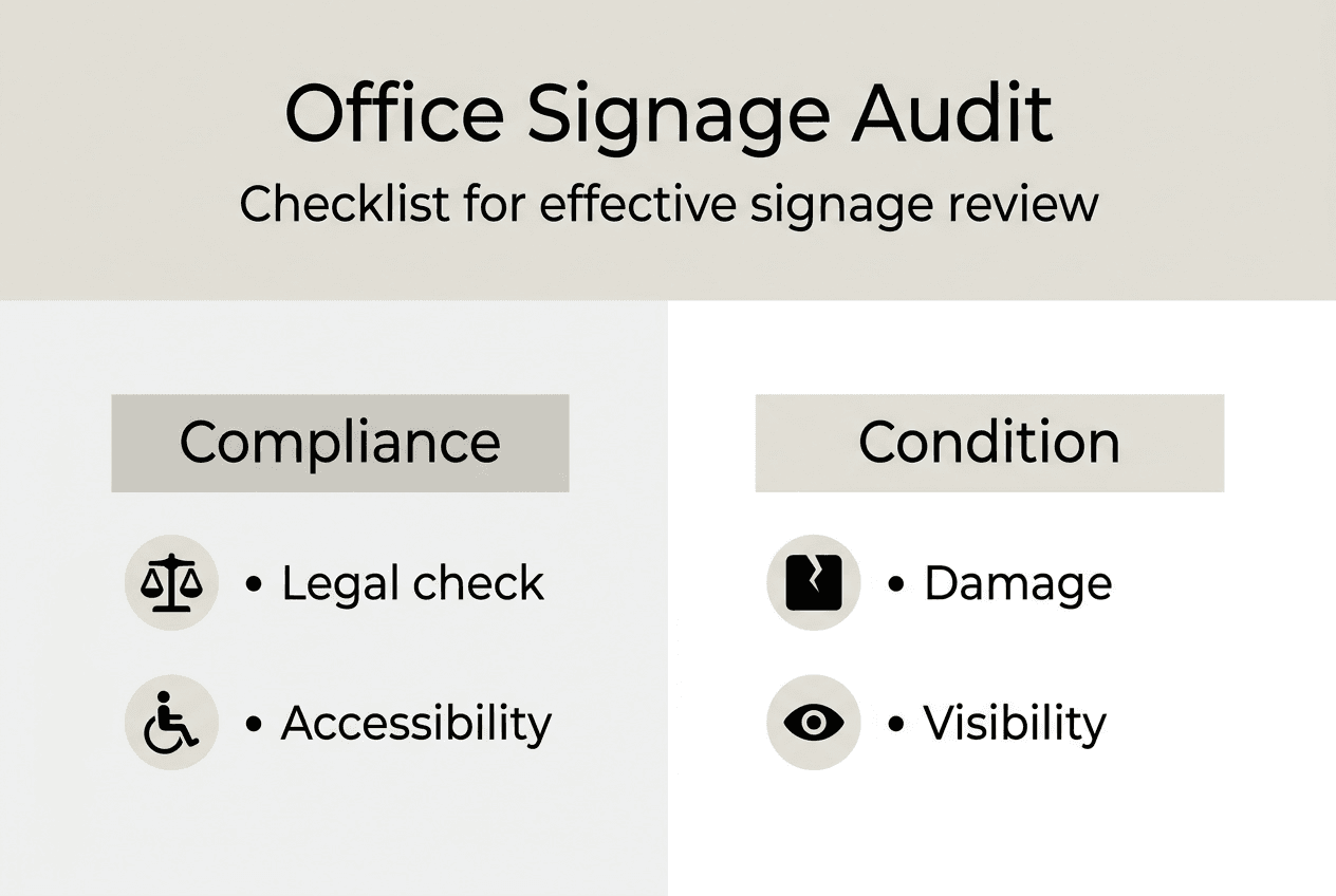
Pro Tip: Create a signage audit spreadsheet listing every current sign, its condition, compliance status, and replacement priority. This systematic approach prevents overlooking critical updates and helps budget allocation.
Preparing materials and tools for your signage project
Material selection directly impacts signage longevity, appearance, and cost effectiveness. Indoor signs typically use acrylic, aluminium composite, or vinyl graphics, whilst outdoor applications demand weather-resistant options like powder-coated aluminium or high-grade plastics. Using sustainable materials enhances environmental responsibility and meets modern business standards, appealing to eco-conscious clients and staff.
| Material | Best Use | Durability | Sustainability |
|---|---|---|---|
| Acrylic | Indoor directional signs | Medium (5-7 years) | Recyclable |
| Aluminium composite | Outdoor branding | High (10+ years) | Highly recyclable |
| Vinyl graphics | Temporary or budget signs | Low (2-3 years) | Limited recyclability |
| Bamboo or reclaimed wood | Feature walls, reception | Medium (5-8 years) | Excellent |
Your toolkit should include design software capable of vector graphics, colour management tools to ensure brand accuracy, and measurement equipment for precise placement planning. Digital mockup tools help visualise how signs appear in actual spaces before committing to production. For installation, you need appropriate fixings, spirit levels, and safety equipment depending on mounting heights.
Pro Tip: Request material samples from suppliers before finalising specifications. Colours and textures appear different in real conditions compared to screen representations, and physical samples reveal quality differences between suppliers.
Choosing signage materials requires balancing immediate budget constraints against long-term replacement costs. Premium materials cost more initially but reduce maintenance expenses and project professionalism that justifies the investment. Budget materials suit temporary applications or areas with planned refurbishment, but avoid them for client-facing spaces where quality perceptions matter.
Step-by-step guide to designing and implementing office signage
Effective signage implementation follows a structured process ensuring quality outcomes and efficient resource use. Begin with comprehensive planning that maps every signage requirement across your premises.
Conduct a thorough site survey identifying all locations requiring signage, noting viewing distances, lighting conditions, and mounting surfaces. Photograph each location for reference during design work.
Draft initial designs incorporating brand guidelines, accessibility requirements, and environmental factors. Use appropriate font sizes based on viewing distances: minimum 25mm letter height for every metre of viewing distance ensures readability.
Review designs with stakeholders including facilities managers, brand guardians, and accessibility advisors. Incorporate feedback systematically, documenting all changes and approval stages.
Produce prototypes for critical signs, particularly those in high-visibility locations or using new materials. Test these in actual conditions to verify readability, durability, and visual impact.
Finalise production specifications and place orders with clear timelines. Coordinate delivery with installation schedules to minimise disruption.
Install signs according to planned positions, verifying heights, alignments, and secure mounting. Clear signage design improves workplace navigation and enhances brand identity when executed properly.
Test installed signage by observing how visitors and staff interact with it. Make adjustments if people consistently miss signs or appear confused at decision points.
| Digital Signage | Traditional Signage |
|---|---|
| Easy content updates | Fixed messaging |
| Higher initial investment | Lower upfront costs |
| Requires power and maintenance | Minimal ongoing costs |
| Dynamic, attention-grabbing | Permanent, reliable |
| Best for changing information | Ideal for static directions |
Common pitfalls include placing signs too high or low for comfortable viewing, using insufficient contrast between text and backgrounds, and cluttering designs with excessive information. Each sign should communicate one primary message clearly. If you need to convey multiple points, use separate signs or hierarchical information design.
Placement strategy determines signage effectiveness. Position directional signs at decision points where people choose between routes, not after they have already committed to a direction. Mount signs perpendicular to traffic flow for maximum visibility, and ensure adequate lighting for 24-hour readability. Designing internal wayfinding signage requires understanding how people naturally navigate spaces and placing visual cues along their expected paths.
Pro Tip: Create a signage style guide documenting approved materials, colour specifications, typography, and installation standards. This ensures consistency when adding new signs or replacing damaged ones, and simplifies briefing new suppliers or designers.
Verifying and maintaining your office signage for ongoing effectiveness
Signage effectiveness degrades over time through physical wear, changing business needs, and evolving regulations. Establishing systematic verification and maintenance processes protects your investment and ensures continued compliance.
Schedule quarterly inspections examining each sign for damage, fading, dirt accumulation, and continued relevance. Check that safety signs remain clearly visible and meet current regulatory standards. Document findings systematically, prioritising repairs based on safety implications, legal requirements, and brand impact. Non-compliance with accessibility and safety signage standards can cause legal penalties and brand harm.
Update signage proactively when reorganising spaces, rebranding, or changing operational procedures. Outdated signs confuse visitors and suggest neglect, undermining the professional image you have worked to establish. Plan signage updates as integral components of any facilities changes, not afterthoughts once confusion has already occurred.
Cleaning requirements vary by material and environment. Acrylic signs need gentle cleaning with appropriate solutions to avoid scratching, whilst powder-coated metal tolerates more robust cleaning methods. Establish cleaning schedules based on exposure to dirt, handling, and visual importance. Reception area signs need more frequent attention than back-office directional signs.
Train facilities staff and receptionists to identify and report signage issues promptly. They interact with your space daily and notice problems before they escalate. Create simple reporting procedures encouraging quick communication about damaged, missing, or ineffective signs. Fast response to reported issues prevents minor problems becoming major expenses.
Pro Tip: Photograph all installed signage and maintain a digital archive with specifications, supplier details, and installation dates. This simplifies reordering exact replacements and provides evidence of compliance if questioned by regulators.
Maintaining safety signage requires particular diligence because these signs protect people from hazards. Faded fire exit signs or obscured warning labels create genuine risks and legal liabilities. Prioritise safety sign maintenance above aesthetic considerations, replacing any sign showing significant deterioration immediately.
Explore professional signage solutions to enhance your workspace
Designing and maintaining effective office signage demands expertise across design, materials, compliance, and installation. Pik Pik POW! delivers comprehensive signage systems tailored to your specific business requirements, combining strong design capabilities with precision manufacturing.
Our digital signage solutions provide dynamic communication platforms for modern offices, enabling instant content updates whilst maintaining brand consistency. For businesses requiring sophisticated navigation support, our internal wayfinding signage expertise ensures visitors and staff move confidently through complex environments. We work across retail, construction, and commercial interiors, understanding the unique signage challenges each sector faces and delivering durable, impactful solutions that elevate your brand presence whilst meeting all compliance requirements.
FAQ
What are the legal requirements for office signage?
Office signage must comply with accessibility legislation ensuring people with disabilities can navigate your premises safely. ADA guidelines mandate specific font sizes, contrast ratios, and tactile elements for signage to ensure accessibility for people with disabilities. In the UK, the Equality Act 2010 requires reasonable adjustments including appropriate signage. Safety signs must meet Health and Safety Executive standards, displaying correct symbols, colours, and information. Failure to comply risks legal penalties, compensation claims, and reputational damage that far exceeds signage investment costs.
How do I choose the right materials for my office signs?
Material selection depends on environmental conditions, durability requirements, and brand positioning. Indoor signs typically use acrylic or aluminium composite for professional appearance and reasonable longevity, whilst outdoor applications need weather-resistant materials like powder-coated aluminium. Consider sustainability credentials if environmental responsibility matters to your brand or clients. Budget constraints influence choices, but prioritise quality for client-facing areas where signage represents your business standards. Choosing office sign materials requires balancing immediate costs against long-term replacement expenses and brand impact.
What are common mistakes to avoid when designing office signage?
Poor contrast between text and backgrounds reduces readability, particularly for visually impaired visitors. Small fonts appear illegible from normal viewing distances, forcing people to approach uncomfortably close. Cluttered designs trying to communicate too much information overwhelm viewers who ignore the sign entirely. Ignoring accessibility requirements creates legal risks and excludes potential clients. Incorrect placement positions signs where people cannot see them at decision points or mounts them too high or low for comfortable viewing. Test designs with actual users before finalising production to identify these issues early.
How often should I update my office signage?
Update signage whenever business changes affect wayfinding, branding, or safety information. Rebranding exercises require comprehensive signage replacement to maintain visual consistency. Organisational restructures moving departments necessitate directional sign updates preventing confusion. Regulatory changes may mandate new safety signage or updated accessibility features. Even without major changes, inspect signage quarterly and replace any showing significant wear, fading, or damage. Outdated or shabby signage suggests neglect and undermines professional credibility regardless of how well other aspects of your business perform.