

Design a hierarchical, accessible wayfinding system that combines clear static signs with targeted digital displays, and build it into the architectural brief from day one. That single decision determines whether your signage programme succeeds or becomes an expensive retrofit.
Before you go further, run through this quick checklist:
- Map the full fan journey from car park or transport stop to seat, noting every decision point along the route.
- Confirm your legal obligations under the Equality Act 2010 and the relevant British Standards (BS 8300, BS EN ISO 7010).
- Mark high-visibility sign locations on your venue drawings before any structural work is finalised.
- Specify materials rated for your environment — outdoor UV and rain exposure, indoor abrasion and vandalism risk.
- Schedule a post-install audit on an actual event day, not during an empty-venue walkthrough.
On digital signage, ask three questions before committing budget: Does your venue host events with variable gate allocations? Do you need real-time crowd management messaging? Can you resource a content management system (CMS) on event days? If you answer yes to at least two, digital signage belongs in your current programme. If not, a well-specified static system is the right foundation.
Table of Contents
- Why does good signage matter so much in a sports venue?
- What are the core design principles for sports facility signs?
- How do you plan wayfinding from arrival to seat?
- What are your UK accessibility and safety obligations for venue signage?
- How do you choose materials and plan maintenance for venue signs?
- When should you use digital signage in a sports venue?
- How do you balance venue branding with wayfinding clarity?
- What does a sports venue signage procurement look like?
- How does Pikpikpow design and deliver sports facility signage?
- Key takeaways
- What most venues get wrong about signage
- Pikpikpow’s sports venue signage service
- Useful sources and standards
Why does good signage matter so much in a sports venue?
Good signage reduces congestion, accelerates ingress and egress, and protects spectator safety. Those are not soft benefits — they are measurable operational outcomes that affect staffing costs, incident rates, and commercial revenue in the same event window.
On the operational side, clear directional signs cut the number of spectators who stop to ask stewards for directions. That frees staff for genuine safety duties and speeds queue throughput at turnstiles, concessions, and toilets. A unified signage system with consistent typography, colour coding, and hierarchy has been shown to reduce congestion and clarify routes while preserving sponsor and brand integrity across the venue.
Safety is where signage becomes life-safety infrastructure. Emergency exit signs, evacuation route maps, and first-aid point markers are not optional extras — they are part of your compliance obligations under fire safety legislation and the Equality Act 2010. Treating them as an afterthought creates legal exposure and, more importantly, genuine risk to spectators.
The commercial case is equally strong. Sponsor panels, brand graphics, and experiential feature walls all depend on a legible wayfinding backbone. When wayfinding fails, spectators focus on finding their seats rather than engaging with commercial content. Perceived venue quality drops, and sponsor value erodes.
Statistic callout: Sport England’s accessible and inclusive sports facilities guidance covers external areas, internal areas, and a dedicated section on wayfinding and signage — confirming that signage strategy is an integral part of facility design rather than a finishing detail.
Pro Tip: Conduct your signage audit during a live event, not an empty-venue walkthrough. Crowd density, noise, and movement patterns reveal sightline failures and decision-point gaps that are invisible when the stands are empty.
What are the core design principles for sports facility signs?
The single principle that governs every other decision is legibility at speed and distance. A spectator moving through a concourse at walking pace, in a crowd, with ambient noise and visual competition from advertising, must read and act on a sign in under two seconds. Every design choice flows from that constraint.

Hierarchy: primary, secondary, and tertiary signs
A three-level hierarchy keeps the system coherent:
- Primary signs orient spectators at arrival and major decision points — car park exits, stadium entrances, and main concourse junctions. These carry the fewest destinations (typically two or three) in the largest type.
- Secondary signs confirm the route at intermediate points — concourse corridors, stairwells, and lift lobbies. They reinforce the primary decision and add detail (block letters, row numbers).
- Tertiary signs identify specific locations — seat row markers, toilet cubicle signs, first-aid points, and individual facility labels.
FIFA’s stadium signage guidelines define distinct treatment for safety, information, and commercial signage, and recommend that wayfinding signs are oriented perpendicular to spectator flow so they are readable from a distance rather than requiring a spectator to approach a wall.
Typography, contrast, and viewing distance
Character height should scale with viewing distance. A practical rule: allow a minimum of 25mm of letter height per 6 metres of viewing distance. At 30 metres — a typical concourse width — that means a minimum character height of approximately 125mm for primary signs. Sans-serif typefaces such as Helvetica, Arial, or Johnston (used on the London Underground) perform best in high-traffic environments because their open letterforms remain legible under poor lighting and at oblique angles.
Contrast is non-negotiable. The BS 8300 standard requires a minimum Light Reflectance Value (LRV) difference of 30 points between text and background. In practice, white text on a dark background or black text on a light background consistently outperforms mid-tone combinations.
Symbols and pictograms
Use BS EN ISO 7010 symbols for safety and emergency signage — these are legally recognised and universally understood. For wayfinding pictograms (toilets, first aid, accessible facilities), use the same symbol set throughout the venue. Mixing symbol families creates confusion and undermines the system’s authority.
Design checklist for sign concept drawings:
- Confirm viewing distance and calculate minimum character height.
- Specify typeface and verify LRV contrast ratio.
- Assign hierarchy level (primary, secondary, tertiary).
- Select BS EN ISO 7010 symbols where applicable.
- Define colour palette and confirm it does not conflict with safety sign colours (red, green, blue, yellow reserved by ISO 7010).
- Record mounting height and orientation (perpendicular or parallel to flow).
How do you plan wayfinding from arrival to seat?
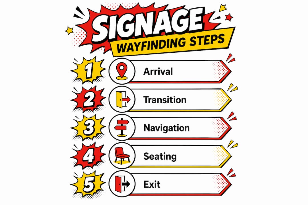
Plan wayfinding as a hierarchy that moves spectators from arrival to seat with the fewest decisions. Every additional decision point is a potential failure — a place where a spectator stops, turns back, or asks a steward.
Pro Tip: Involve your architect or structural engineer in wayfinding planning at concept stage, not after the building shell is fixed. Drop-down concourse signs can conceal cable runs and improve sightlines when they are designed into the ceiling structure from the outset — a detail the Tottenham Hotspur Stadium project demonstrated clearly.
Mapping user journeys
Start by identifying all arrival modes: car (including accessible parking), public transport (rail, bus, cycle), and pedestrian approaches from surrounding streets. Each mode has a different first decision point and a different information need. A driver needs car park direction and pedestrian routing from the car park. A rail passenger needs stadium entrance direction from the station exit.
Mark transition points — the moments where a spectator moves from one zone to another (car park to forecourt, forecourt to entrance, entrance to concourse, concourse to seating bowl). Each transition is a mandatory sign location. Then mark congestion pinch points: turnstile banks, concession queues, toilet approaches, and stairwell junctions. These need confirmation signs, not just directional signs.
Wayfinding integrated into architecture from the earliest design stages avoids the retrofitting problems that plague venues where signage was an afterthought — obscured sightlines, signs mounted at wrong heights, and cable management that compromises structural elements.
Sign families and placement
| Journey stage | Sign type | Placement guidance |
|---|---|---|
| Approach roads / car park | Totem / monument sign | Roadside, perpendicular to vehicle flow |
| Forecourt / pedestrian approach | Entry / gate sign | Above pedestrian flow, visible from 50m+ |
| Main entrance | Gate identification sign | Above each entrance gate, high-level |
| Concourse corridors | Drop-down directional sign | Perpendicular to flow, above head height |
| Stairwells / lifts | Secondary directional sign | At each landing, eye level and above |
| Seating bowl | Section / row marker | End of each row, consistent height |
| Toilets / concessions | Facility identification sign | Above facility entrance, with pictogram |
| Emergency exits | BS EN ISO 7010 exit sign | Above every exit, illuminated |
Positioning signs perpendicular to walls and walkways — rather than flat against them — is one of the most effective and underused techniques in venue wayfinding. A spectator in a crowd can read a perpendicular sign from 20–30 metres away; a wall-mounted sign requires them to be almost adjacent to it.
For variable events (different seating configurations, temporary stands, or multi-sport use), design a digital overlay layer for gate and destination changes rather than replacing static signs. Static signs carry the permanent hierarchy; digital elements carry the event-specific detail.
What are your UK accessibility and safety obligations for venue signage?
Signage in UK sports venues must meet Equality Act 2010 obligations and follow BS 8300 and BS EN ISO 7010 where relevant. These are not aspirational standards — they are legal requirements, and failure to meet them constitutes a failure to make reasonable adjustments for disabled spectators.
Required sign types and features
- Tactile text and Grade 2 Braille on signs at accessible facilities, lift call buttons, and refuge points. The Accessible Sports Stadia Design Guidelines specify that refuge signs must include embossed lettering and Braille.
- Correct mounting heights: accessible parking bay signs positioned with the underside at 1,000mm from ground level; lift floor-level signs with raised embossed numbers visible on exit; access control readers at 900–1,100mm above floor level.
- LRV contrast: a minimum 30-point LRV difference between sign text/symbols and background, as required by BS 8300.
- Pictograms and symbols: use the International Symbol of Access (ISA) consistently for accessible facilities; use BS EN ISO 7010 symbols for all safety and emergency signage.
- Glass safety markings: contrasting permanent markings on glazed doors at two levels — 850–1,000mm and 1,400–1,600mm from ground level.
Safety signage for sports venues
Emergency exit, evacuation route, and first-aid signs operate under different rules from wayfinding or commercial signage. They must use BS EN ISO 7010 symbols, be illuminated (or photoluminescent as a minimum), and must never be obscured by temporary branding, sponsor panels, or event dressing. Evacuation maps should be posted at each refuge point and at main concourse junctions, with embossed lettering and Braille on refuge signs.
Restricted-area signs (plant rooms, media areas, pitch perimeters) must be clearly differentiated from public wayfinding — typically using a distinct colour and symbol set so spectators do not mistake a restricted-area marker for a directional sign.
Statistic callout: Sport England’s guidance on accessible and inclusive sports facilities includes a dedicated section on wayfinding and signage, covering external areas, internal areas, and communications — confirming that accessibility compliance applies across the entire spectator journey, not solely within the building.
Compliance checklist for procurement and installation
- Confirm BS 8300 and BS EN ISO 7010 requirements are written into the design brief.
- Specify tactile text and Braille at all required locations before fabrication.
- Verify mounting heights against the Accessible Sports Stadia Design Guidelines during installation.
- Test with disabled spectators before the venue opens or the signage system is signed off.
- Retain documentation of reasonable adjustments made — this is your evidence in the event of a complaint or legal challenge.
Pro Tip: Run a disabled-spectator walk-through before sign-off and record findings in writing. This creates a documented evidence trail of reasonable adjustments, which is your primary defence under the Equality Act 2010 if a complaint is raised.
How do you choose materials and plan maintenance for venue signs?
Choose materials and fixings rated for the expected exposure — UV, rain, abrasion, and vandalism — and plan a maintenance lifecycle at the point of procurement, not after installation. A sign that fades, corrodes, or becomes illegible within three years costs more in the long run than a correctly specified substrate from the outset.
Material comparison: indoor vs outdoor under UK conditions
| Material | Best use | Expected lifespan (UK conditions) | Key considerations |
|---|---|---|---|
| Powder-coated aluminium | Outdoor totems, gate signs | — | Lightweight, corrosion-resistant, accepts digital print faces |
| Stainless steel | Entrance plaques, high-traffic indoor | 20+ years | Premium finish, heavy, higher fabrication cost |
| Aluminium composite (ACM) | Concourse panels, large-format faces | — | Flat, rigid, easy to reface; not suitable for high-impact zones |
| High-density urethane (HDU) | Carved / dimensional outdoor signs | — | Paintable, lightweight, vulnerable to repeated impact |
| Acrylic (cast) | Indoor identification signs, illuminated faces | — | Good colour retention indoors; UV-yellows outdoors without UV-stable grade |
| Printed vinyl on substrate | Temporary / event overlays, wall graphics | 3–7 years | Low cost, easy to update; not suitable as a permanent primary sign |
| LED modules | Digital and illuminated signs | — | Requires cable management, power resilience, and CMS |
For durable signage materials in UK outdoor environments, powder-coated aluminium is the most practical choice for the majority of primary and secondary signs. It handles the UK’s combination of UV exposure, rain, and temperature cycling better than most alternatives at a cost point that makes whole-venue programmes viable.
Fixing and installation considerations
- Use anti-tamper fixings (one-way screws or security bolts) on all externally accessible signs.
- Specify drainage for the bases of exterior totems to prevent water ingress and frost damage.
- Plan cable management routes for digital screens before structural work is complete — retrofitting conduit through finished walls is expensive and disruptive.
- Mount signs to avoid obscuration by doors, crowd barriers, or seasonal planting.
Maintenance schedule
A practical maintenance cadence for a UK sports venue:
- Pre-season inspection: check fixings, clean faces, replace any damaged or faded panels.
- Mid-season check: inspect high-traffic areas (turnstile banks, concourse junctions) for impact damage and graffiti.
- Post-season review: assess LED module performance, update any panels with changed information, and log items for the annual refresh budget.
- Annual refresh budget: plan for face replacements and LED upgrades rather than full sign replacement. A staged retrofit — updating faces and lighting before wholesale replacement — often delivers better lifecycle value. LED retrofits and refreshed graphics can extend service life at significantly lower cost than full replacement.
Keep a spare-parts inventory for your most common sign types: replacement faces, fixings, and LED drivers. A single damaged sign at a key decision point degrades the entire system.
When should you use digital signage in a sports venue?
Digital signage excels where messages must change quickly or respond to crowd dynamics. Use it as a layer on top of your static system, not as a replacement for it. Static signs carry the permanent wayfinding hierarchy; digital elements carry event-specific and real-time information.
Where digital signage adds genuine value
- Gate allocation changes: when seating configurations vary between events, digital signs at concourse junctions can redirect spectators without requiring physical sign changes.
- Queue management: real-time queue length indicators at concession stands and toilet banks reduce bunching and improve throughput.
- Dynamic evacuation messaging: digital screens can display evacuation instructions specific to the incident, supplementing static BS EN ISO 7010 exit signs.
- Sponsor rotations: digital panels in commercial zones allow sponsors to rotate content without physical reprinting.
- Live event updates: score updates, programme changes, and safety announcements can be pushed to screens across the venue simultaneously.
The Tottenham Hotspur Stadium hybrid system uses digital LED screens alongside analogue signboards, with perpendicular raised signs and drop-down concourse panels providing the permanent wayfinding backbone. Digital heads provide variable gate and destination information on top of that static structure.
Integration and operational checklist
- Network resilience: use a dedicated network for signage, separate from public Wi-Fi, with redundant connections at critical screen locations.
- Power resilience: specify uninterruptible power supply (UPS) for screens carrying safety-critical information.
- CMS requirements: your digital signage CMS must allow zone-by-zone content control, scheduled playlists, and emergency override from a single operator console.
- Accessibility of digital content: ensure on-screen text meets the same contrast and character-height standards as static signs; include audio output capability where required.
- Content ownership on event day: assign a named individual responsible for CMS updates during each event. Latency and reliability failures are most damaging when a gate change is announced 20 minutes before kick-off.
Pro Tip: Design your digital signage to display essential static wayfinding information if CMS connectivity fails. A screen showing a frozen “Gate 7 — North Stand” message is far better than a blank screen at a concourse junction. Build this fallback state into your CMS configuration from day one.
How do you balance venue branding with wayfinding clarity?
Branding should never compromise legibility or compliance. The practical approach is to use brand colour accents and reserved sponsor zones rather than mixing commercial graphics with safety or wayfinding signs.
Where branding works and where it does not
| Zone | Branding permitted | Notes |
|---|---|---|
| Entrance feature walls / fan zones | Yes — large-format graphics | Keep clear of primary directional signs |
| Concourse walls between sign locations | Yes — brand colour panels, sponsor graphics | Maintain clear zones around directional signs |
| Concourse drop-down directional signs | Colour accent only | Brand colour on sign frame or background band; no sponsor logos on sign face |
| Seating bowl fascias | Yes — large-format print | Ensure no conflict with section/row markers |
| Emergency exit and evacuation signs | No | BS EN ISO 7010 signs must remain unobscured and unmodified |
| Safety and restricted-area signs | No | Branding on or adjacent to safety signs creates confusion |
| Sponsor panels (dedicated locations) | Yes — full sponsor artwork | Size and placement agreed in advance; no overlap with wayfinding sightlines |
The key principle is separation. Spectators learn to read a venue’s wayfinding system by its consistent visual language — typeface, colour, symbol set, and mounting position. When sponsor graphics use the same colours or mounting positions as directional signs, spectators cannot distinguish navigation from advertising. That confusion is most acute for first-time visitors and spectators with cognitive disabilities.
For experiential graphics at entrance feature walls and fan zones, coordinate placement with your navigation strategy. A large graphic installation at a main entrance is an opportunity to reinforce arrival and create atmosphere — but only if it does not obscure the primary directional sign above the gate. Custom sports facility graphics work best when they are designed alongside the wayfinding system, not after it.
Sponsor panel sizing and placement should be agreed in the design brief, with sightline clearances written in as a constraint. A sponsor panel that blocks a primary directional sign is a liability, not an asset — it creates operational problems and potentially a safety issue.
What does a sports venue signage procurement look like?
A staged procurement approach — audit, design, approvals, fabrication, installation, commissioning — reduces risk and keeps statutory permissions on track. Skipping stages, particularly approvals, is the most common cause of programme delays.
Permissions checklist
Before ordering any fabrication, confirm:
- Planning permission: large external signs (totems, fascias above a certain size) may require advertisement consent under the Town and Country Planning (Control of Advertisements) (England) Regulations 2007.
- Highways authority consent: roadside totems and signs visible from the public highway may require separate highways authority approval.
- Landlord approval: for leased venues, written consent from the landlord is required before any permanent fixings are made.
- Listed building or conservation area consent: if the venue is in a conservation area or is a listed building, additional consents apply to external signage.
- Fire safety sign compliance: confirm with your responsible person (under the Regulatory Reform (Fire Safety) Order 2005) that all emergency exit and evacuation signs meet current requirements.
Typical timelines and cost drivers
| Programme type | Typical timeline | Key cost drivers |
|---|---|---|
| Small retrofit (30 signs) | 6 weeks | Design, fabrication, installation access on non-matchdays |
| Phased concourse rollout | 3–6 months | Material specification, phasing to maintain operations |
| Full venue programme | — | Permissions, digital infrastructure, structural integration |
| Digital signage installation | — | Network infrastructure, CMS licensing, screen specification |
Ballpark cost ranges vary significantly by material choice, digital content, site access constraints, and whether signage is permanent or temporary. Powder-coated aluminium primary signs for a mid-sized venue concourse rollout will cost considerably less than a full digital screen network with CMS and network infrastructure. Get itemised quotes that separate design, fabrication, installation, and commissioning — bundled quotes make it difficult to value-engineer specific elements.
Phase work to maintain operations on matchdays. Plan installation windows for off-season periods or midweek non-event days. For phased concourse rollouts, install one zone at a time and commission it before moving to the next, so spectators always have a functioning wayfinding system.
How does Pikpikpow design and deliver sports facility signage?
Pikpikpow’s workflow follows a collaborative brief, prototype signage family, manufacture, phased installation, and post-install audit sequence. Each stage has defined sign-off points so nothing proceeds to fabrication without client and compliance approval.
The process integrates with your existing team at the stages that matter most:
- Brief and audit stage: Pikpikpow reviews existing signage, maps the spectator journey, and identifies compliance gaps against Equality Act 2010, BS 8300, and BS EN ISO 7010 requirements.
- Design and prototype stage: a full signage family is developed — typography, colour, hierarchy, symbol set, and mounting specifications — with prototypes reviewed against sightlines in the actual venue before production begins.
- Architect and safety officer integration: Pikpikpow works alongside your architect and safety officer to confirm structural mounting points, cable routes for digital screens, and evacuation sign placement. This is the stage where architectural signage decisions are locked in before any structural work is finalised.
- Fabrication: signs are manufactured to specification, with quality checks against the approved prototype family.
- Phased installation: installation is sequenced to maintain venue operations, with each zone commissioned before the next begins.
- Post-install audit: Pikpikpow conducts a walkthrough audit — ideally on an event day — to verify sightlines, mounting heights, and legibility under real conditions. Findings are documented and any remedial work is completed before final sign-off.
Pikpikpow’s manager’s guide to sports facility signage and project case material provide practical checklists and examples from delivered programmes. If you want to start with a site audit or a pilot zone before committing to a full programme, that is a straightforward first engagement.
Key takeaways
Effective sports venue signage requires a hierarchical, accessible system built into the design process from the start, not retrofitted after construction.
| Point | Details |
|---|---|
| Start in the brief | Integrate wayfinding into the architectural brief before structural work begins to avoid costly retrofits and sightline failures. |
| Comply with UK standards | Meet Equality Act 2010, BS 8300, and BS EN ISO 7010 requirements — tactile text, Braille, correct mounting heights, and LRV contrast are legal obligations, not optional features. |
| Use a hybrid system | Static signs carry the permanent wayfinding hierarchy; digital signs handle event-specific changes and real-time crowd management. |
| Specify for durability | Choose materials rated for your exposure conditions and plan a maintenance lifecycle at procurement — powder-coated aluminium is the practical default for UK outdoor primary signs. |
| Pikpikpow delivers end-to-end | Pikpikpow designs, manufactures, and installs bespoke sports venue signage with compliance-checked prototypes and a post-install audit on event day. |
What most venues get wrong about signage
The conventional wisdom on sports venue signage is that it is a finishing detail — something you specify in the last few months before opening, after the architecture is fixed and the budget has been squeezed. That assumption is responsible for most of the wayfinding failures you encounter in UK venues: signs mounted behind structural columns, drop-down panels that clash with sprinkler heads, digital screens with no cable route, and Braille plaques installed at the wrong height because no one checked BS 8300 until the fit-out was complete.
The trade-off that catches most managers out is branding versus legibility at concourse level. There is real commercial pressure to maximise sponsor visibility in high-footfall areas, and concourse walls are prime real estate. The problem is that when sponsor graphics use the same colour palette as the wayfinding system, or when large-format prints are mounted at the same height as directional signs, spectators stop reading the signs. They cannot distinguish navigation from advertising. The fix is not to reduce branding — it is to establish a clear visual separation between the wayfinding system and the commercial layer, and to write that separation into the design brief as a constraint, not a preference.
Maintenance budgeting is the other consistent gap. Facilities teams will spend significant sums on a new signage programme and then allocate nothing for annual face replacements, LED driver servicing, or CMS licence renewals. A sign system that is not maintained degrades faster than the materials warrant. The lifecycle cost of a well-maintained aluminium sign system is substantially lower than the cost of emergency replacements when panels fail mid-season. Build the maintenance schedule into the procurement contract, not as an afterthought.
Pikpikpow’s sports venue signage service
Pikpikpow designs, manufactures, and installs bespoke signage for sports venues across the UK, covering everything from compliance-checked wayfinding systems to digital screen networks and experiential fan-zone graphics.

The service covers the full programme: site audit and compliance gap analysis, wayfinding design and prototype sign family, fabrication in durable materials specified for your environment, phased installation around your event calendar, and digital signage with CMS setup and training. Whether you need a concourse retrofit or a full venue programme, the process starts with an audit that maps your current system against Equality Act 2010 and BS 8300 requirements and identifies the highest-priority gaps.
To get a clear picture of what your venue needs and what it will cost, request a site audit or project quote through Pikpikpow’s signage systems page. If digital screens are part of your brief, the digital signage service covers screen specification, network resilience, and CMS selection.
Useful sources and standards
The following references are worth keeping to hand when specifying or procuring sports venue signage in the UK.
- Accessible Sports Stadia Design Guidelines (DSNI, 2023): the most detailed UK-specific guidance on accessible communications in sports stadia, covering wayfinding, signs, mounting heights, tactile requirements, and evacuation signage. Section 7 is directly relevant to signage specification.
- Sport England: Accessible and Inclusive Sports Facilities: covers Equality Act 2010 obligations and inclusive design across external and internal areas, with a dedicated wayfinding and signage section. Required reading before any UK sports facility signage brief is written.
- Sport England: Wayfinding and Signage for Sports Facilities (2013): good-practice guidance for community sports centres, covering strategy development, early design-process involvement, layout, and signage design with worked examples.
- FIFA Stadium Signage Guidelines: defines signage families, hierarchy levels, and visibility and readability guidance. Relevant for any venue hosting regulated football or large multi-sport events.
- Queen Elizabeth Olympic Park Wayfinding Strategy: a detailed real-world example of a large-scale UK wayfinding strategy, covering system naming, progressive disclosure, and multi-system integration. Useful as a benchmark for complex multi-venue sites.
- BS 8300: British Standard for the design of an accessible and inclusive built environment. Specifies contrast requirements, mounting heights, and tactile features for signs. Obtain the current edition from BSI.
- BS EN ISO 7010: the standard for safety signs used in workplaces and public buildings, including sports venues. All emergency exit, fire safety, and first-aid signs must use symbols from this set.
- Pikpikpow: types of sports facility signage: a practical breakdown of sign families used in sports venues, covering wayfinding, safety, and commercial categories.
“A wayfinding strategy should reduce clutter and incorporate the use of landmarks, landscape and venues into the creation of a legible environment — without relying exclusively on signs.” — Queen Elizabeth Olympic Park Wayfinding Strategy
Save a local copy of the Sport England guidance and the Accessible Sports Stadia Design Guidelines and reference them at every procurement stage. Standards are updated periodically; always confirm you are working from the current edition before finalising a specification.