Bharani Health Hub
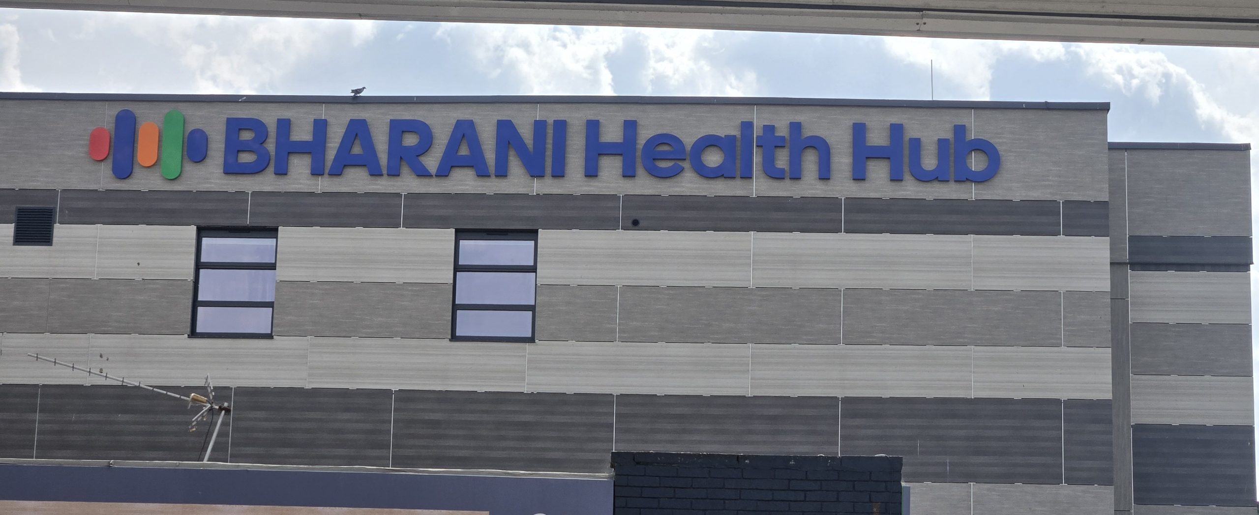
Three signs, three elevations — 12.6m, 8.6m and 3.5m of stainless steel, each sized to where it’s actually seen.
About Bharani Health Hub
Bharani Health Hub is a healthcare facility fronting the High Street, occupying a prominent building corner opposite a busy junction shared with an Esso forecourt. The building has two distinct faces — a grey cladding fascia wrapping the front corners, and a blue cladding panel to the rear — each demanding a different approach to signage.
The Brief: Three Signs, Three Elevations, One Building
Bharani needed to be visible from every direction people actually approach the building from: High Street traffic heading toward the Esso junction, traffic approaching from the opposite corner, and visitors arriving via the rear access. That meant three signs, each sized and positioned for its own audience and viewing distance — not a single design stretched across the site.
The Challenge: Before specifying a single letter, the site itself had to be assessed properly. The primary elevation, facing High Street, came with real obstructions that most sign briefs never have to account for.
Forecourt & Tree Obstruction
The Esso canopy, pump islands, price totem and Londis signage sit directly between High Street and the building, dominating the foreground from distance. A mature tree also grows in front of the centre of the facade, partially obscuring mid-sign content — particularly in leaf. Both push the same conclusion: the sign has to work despite the clutter in front of it, not around it.
Oblique Viewing Angles
No point on High Street gives a perpendicular view of the grey cladding elevation — every approach hits the facade at an angle. That compresses the apparent width of a sign, but letter height doesn’t compress the same way. On this elevation, height was the dimension that actually carried across the approach.
The Solution: Solid Face Stainless Steel Letters
Three signs, specified individually to their elevation, viewing distance and site conditions:
- Sign 1 — High Street / Esso corner: 12,600mm wide, 800mm cap height, blue powder-coated stainless steel on the grey cladding fascia. Sits on the building corner, catching both directions of High Street traffic simultaneously — one sign doing the work of two.
- Sign 2 — Opposite corner: 8,576mm wide, 544mm cap height, blue powder-coated stainless steel on the grey cladding fascia. Sized correctly for its shorter approach distances.
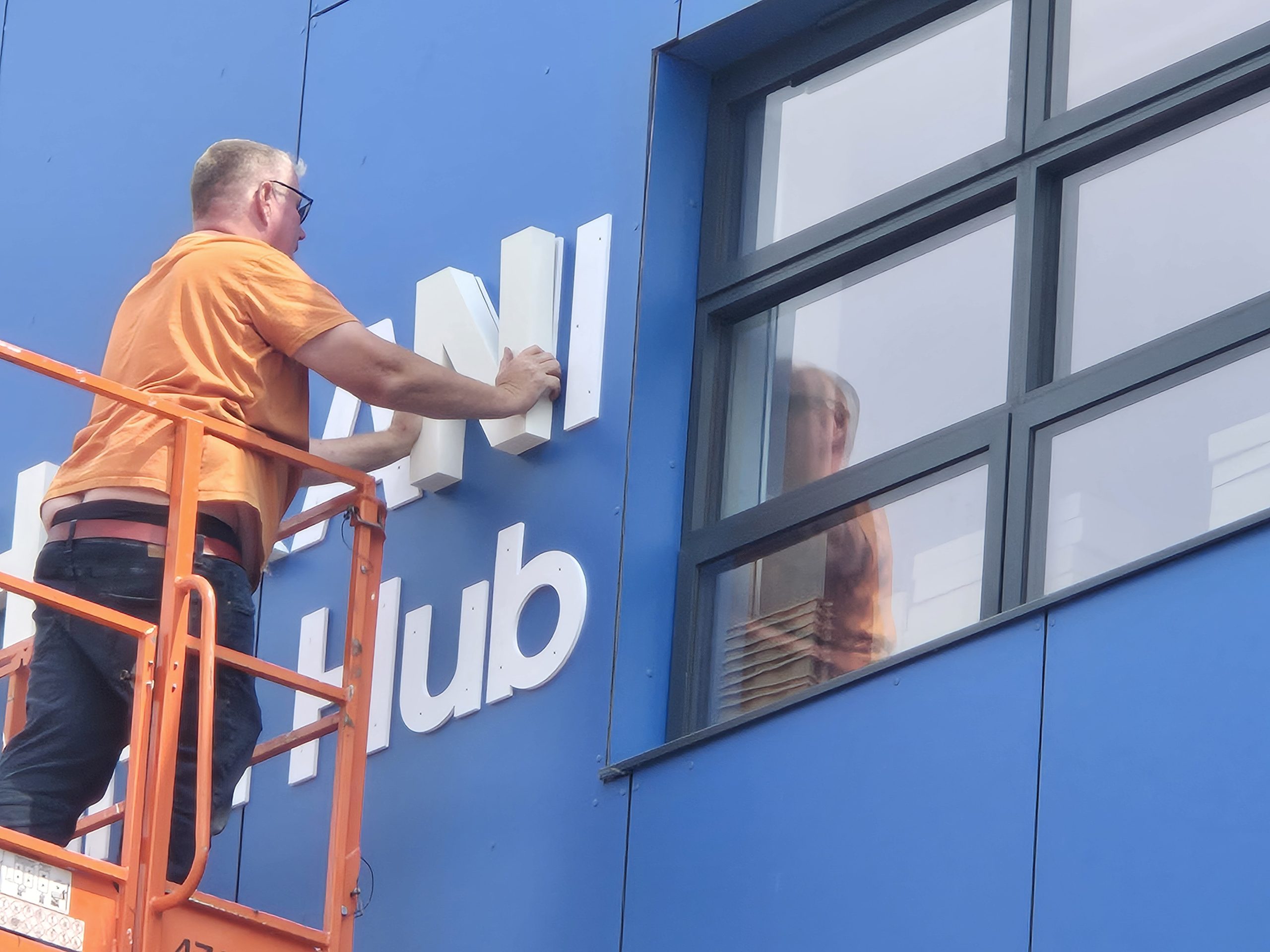
- Sign 3 — Rear elevation: approx. 3,500mm wide, white powder-coated stainless steel direct-fixed to the blue cladding panel, for close-range visibility from rear access.
- Construction: solid face stainless steel letters, powder coated, with 60mm returns and 10mm Foamex backing for a clean shadow gap. Direct fix to fascia, non-illuminated, built for long-term exterior durability.
The Result
Each sign now performs to the conditions of its own elevation rather than a one-size-fits-all spec. Sign 1’s 800mm letters hold their legibility across the oblique High Street approach and cut through the Esso forecourt clutter, with the corner position giving it visibility from both directions of travel. Sign 2 is fully legible at every realistic approach distance on the quieter side. Sign 3’s white lettering on deep blue cladding delivers maximum contrast and impact at close range from the rear.
The result is signage properly matched to a genuinely difficult site — not a compromise, but three specifications, each justified by the ground it actually has to be read from.