
Start with a journey audit. Before you commission a single sign, trace the route a first-time visitor takes from the street entrance to their destination and note every point where they hesitate. That single exercise, recommended in NHS wayfinding guidance as the foundation of any effective scheme, reveals more about what your building needs than any floor plan ever will. Once you know where confusion happens, you can build a visual hierarchy around it.
The core elements to plan from the outset are:
- Arrival and entrance signage — the first decision point for any visitor
- Primary directional signs — main routes and floor transitions
- Secondary directional signs — corridor-level guidance to specific zones
- Room identification panels — door-level confirmation of destination
- Floor and stair identification — critical for multi-storey buildings
- Accessibility markers — tactile, Braille and contrast-compliant elements
- Evacuation and escape signage — legally required and life-safety critical
The three-step action plan is straightforward: map every visitor journey and decision point, prototype signs at full scale in situ, then test with real first-time users before committing to full production.
Table of Contents
- Why good office wayfinding improves safety, productivity and experience
- How people form mental maps and why that shapes your sign placement
- What are the essential elements of an office wayfinding system?
- How do you meet UK accessibility and safety standards?
- Choosing materials and finishes that work in real office environments
- How do you plan and implement an office wayfinding project?
- When should you use digital wayfinding instead of physical signs?
- How do you create consistent naming conventions across your office?
- How do you keep a wayfinding system effective over time?
- How Pikpikpow handles an office wayfinding project from brief to install
- Key takeaways
- The part of office wayfinding most projects get wrong
- Pikpikpow’s wayfinding service: from survey to installation
- Useful UK standards and guidance
Why good office wayfinding improves safety, productivity and experience
Poor wayfinding costs organisations in ways that rarely appear on a budget sheet. Visitors who cannot find reception interrupt staff, create a poor first impression, and in some cases leave without completing their visit. Staff who have just moved floors or into a refurbished space lose time every day until the layout becomes instinctive.
The business outcomes of a well-designed wayfinding system are measurable:
- Fewer interruptions to reception and desk-based staff from lost visitors
- Faster visitor routing from entrance to meeting room, reducing wasted time
- Clearer evacuation routes, reducing risk during fire or emergency
- Stronger first impressions for clients and candidates visiting for the first time
- Reduced onboarding friction for new employees during their first weeks
The hidden cost of poor signage: Studies of commercial buildings consistently show that unclear wayfinding is one of the top sources of visitor frustration and staff interruption. A reception team fielding repeated “where is…” queries is a direct signal that the signage system is failing.
From a safety perspective, the stakes are higher still. Ambiguous or missing escape route signage can delay evacuation. For facility managers responsible for fire risk assessments, wayfinding and emergency signage are not separate concerns — they are part of the same system.
How people form mental maps and why that shapes your sign placement
People do not navigate by reading every sign in sequence. They build a rough mental map of a building on their first visit, anchored by a handful of memorable landmarks: a reception desk, a distinctive staircase, a colour-coded zone. Once that map is formed, they navigate by confirming it at decision points rather than following instructions step by step.
This has direct consequences for sign placement. A sign positioned ten metres past a junction is useless — the decision was already made at the junction. A sign that presents six options at once overloads the mental map before it has formed.
The core design principles that reduce wayfinding errors are:
- Simplify choices at decision points — present no more than three or four options at any single junction
- Use a consistent visual hierarchy — primary routes in larger, bolder type; secondary destinations in smaller type
- Create repeatable landmarks — a consistent colour or graphic treatment for lift cores, stairwells and main corridors
- Reduce cognitive load — strip out information that is not needed at that specific point in the journey
Pro Tip: During your journey audit, stand at every junction and count the number of decisions a visitor must make. If the answer is more than three, the layout or the sign needs simplifying. A common fix is to group destinations by zone rather than listing every room individually.
Architectural features that create ambiguity — a corridor that splits at an angle, a lobby that connects two buildings — are the points where signs alone rarely solve the problem. Journey audits often reveal that a small physical change, such as a planter or a change of floor finish, resolves a decision-point problem more cleanly than any sign could.
What are the essential elements of an office wayfinding system?
Treating wayfinding as a coherent system rather than a collection of individual signs is the single most important shift in thinking for any project. Each element has a specific role and a specific location in the building sequence.
Sign types and where they belong
Arrival and entrance signage sits at the building threshold — the point where a visitor transitions from outside to inside. It confirms they are in the right place and directs them to reception or the main lobby.

Directory signs belong in the entrance lobby or reception area. They give an overview of the whole building: floors, zones, and key destinations. Keep them scannable — a visitor looking for a specific meeting room should be able to find their floor in under ten seconds.
Primary directional signs guide visitors along main routes: main corridors, lift lobbies, stairwells. They carry the highest-level destinations (floors, wings, reception, car park) and use the largest type size in the hierarchy.
Secondary directional signs appear at corridor-level junctions, pointing to specific rooms or zones within a floor. They carry fewer destinations and smaller type.
Room identification panels sit at or beside the door. They confirm the destination and, where relevant, carry room-booking information or an accessibility symbol.
Floor and stair identification marks each landing and lift lobby with the floor number. This is a legal requirement in certain building types (see the accessibility section below) and a practical necessity in any multi-storey office.
Evacuation and escape signage must comply with BS 5499 and the relevant fire safety regulations. It operates as a parallel system to wayfinding but must be designed in coordination with it to avoid visual conflict.
Tactile and Braille markers are required for accessible compliance and belong on room ID panels, lift controls, and at key decision points.
Digital elements — room-booking panels, lobby directories, interactive kiosks — integrate with the physical system and require their own naming and maintenance governance.
Decision-point checklist for planning
- Building entrance (street-level or car park)
- Reception or main lobby
- Each lift lobby on every floor
- Each stairwell landing
- Primary corridor junctions
- Secondary corridor junctions
- Each individual room or suite entrance
- Welfare facilities (toilets, kitchen, first aid)
- Emergency exit routes and assembly points
How do you meet UK accessibility and safety standards?
Accessibility is not optional. The Equality Act 2010 places a duty on service providers and employers to make reasonable adjustments to physical features, which includes signage. For most office buildings, that means designing wayfinding that works for people with visual impairments, cognitive differences, and mobility limitations from the outset, not as a retrofit.
Approved Document M and BS 8300 set out the practical design requirements. The key practical requirements are:
- Contrast ratios — text and symbols must achieve a minimum luminance contrast of 70% against their background for legibility by people with low vision
- Mounting heights — room identification signs should be positioned so the centreline sits at approximately 1,500mm above finished floor level, within reach and sightline for both standing and wheelchair users
- Tactile surfaces — photopolymer tactile panels with Grade 1 Braille are required on room ID signs in buildings that must comply with Part M
- International Symbol of Access — use the current ISO 7001 symbol, not outdated variants
- Font choice — use a sans-serif typeface with consistent stroke width; avoid condensed or decorative fonts
- Low-light visibility — floor and flat numbering in stairwells must be legible in low-light conditions
For high-rise buildings and mixed-use developments that include residential elements, the Fire Safety (England) Regulations 2022 add a specific legal duty. Regulation 8 requires clear floor identification markings on each stairwell landing and in lift lobbies, designed to be visible in low-level lighting or when illuminated by a torch. This applies to the responsible person for the building and carries enforcement consequences if not met.
“Install wayfinding signage in all high-rise buildings which is visible in low light conditions.” — GOV.UK fact sheet on Regulation 8, Fire Safety (England) Regulations 2022
Compliance checklist for design and procurement
- Confirm contrast ratios meet the 70% luminance threshold before sign production
- Specify photopolymer tactile panels with Grade 1 Braille for all room ID signs
- Check mounting heights against BS 8300 and Approved Document M
- Verify floor identification signage meets Approved Document B (Volume 1, paragraphs 15.13–15.16) for any high-rise or mixed-use element
- Confirm evacuation signage complies with BS 5499 and is coordinated with the fire risk assessment
- Retain sign specifications and installation records for building control and fire officer review
Choosing materials and finishes that work in real office environments
Material choice affects legibility, durability, maintenance burden, and whether your signage looks as good in three years as it does on day one. The right choice depends on the specific location in the building and the level of traffic it receives.
| Material | Best use | Durability | Notes |
|---|---|---|---|
| Vinyl on aluminium composite | Primary directional, directories | High | Lightweight, easy to update vinyl face |
| Acrylic (flat or standoff) | Room ID, lobby directories | Medium–high | Premium appearance; prone to scratching in high-traffic areas |
| Photopolymer tactile panels | Accessible room ID, lift signage | High | Required for Braille compliance; UV-stable grades available |
| Laser-cut metal (aluminium or steel) | Architectural feature signs, reception | Very high | High cost; excellent longevity and brand impact |
| Magnetic or dry-erase panels | Temporary directories, hot-desk zones | Medium | Useful for frequently changing spaces; not suitable as primary wayfinding |
| Printed foamex or Dibond | Budget directional signs | Medium | Cost-effective for low-traffic back-of-house areas |
For high-traffic zones — main corridors, lift lobbies, reception areas — specify materials with anti-graffiti coatings and matt or satin finishes. Gloss finishes create reflective glare under fluorescent or LED lighting, which reduces legibility for all users and particularly for those with visual impairments. Matt laminates on vinyl and powder-coated aluminium frames are the most practical combination for most UK office environments.
Sustainability is an increasingly common client requirement. Aluminium is fully recyclable, and specifying recycled-content aluminium substrates adds no meaningful cost premium for most projects. For sustainable office design, choosing materials with long service lives reduces replacement frequency and total lifecycle waste. Avoid PVC-based substrates where alternatives exist — acrylic and aluminium composites are the cleaner choice for most applications.
For guidance on durable signage materials and how to match them to specific office environments, Pikpikpow’s material selection resources cover the trade-offs in detail.
How do you plan and implement an office wayfinding project?
A structured process prevents the most common failure mode: signs that are designed in isolation, installed without testing, and updated reactively when complaints arrive. The sequence below applies to projects of all sizes, though the time allocated to each phase scales with complexity.
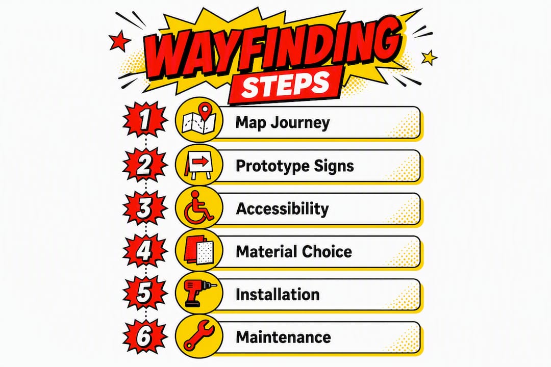
Step-by-step implementation sequence
Stakeholder brief and goals — define who uses the building (staff, visitors, contractors, emergency services), what the primary navigation challenges are, and what success looks like. Include facilities, HR, reception, and a representative sample of regular visitors.
Journey mapping and audit — walk every primary route as a first-time visitor. Document decision points, ambiguous junctions, and any architectural features that create confusion. Photograph each point. This is the foundation of the whole system.
Concept hierarchy and naming — establish the visual hierarchy (primary, secondary, room ID), agree on zone names and room names, and confirm alignment with room-booking systems and digital directories.
Prototyping and sightline testing — produce full-scale paper or foam-board prototypes of key sign types and install them temporarily at actual locations. Test with staff who have not been briefed on the layout and with genuine first-time visitors. Record where they hesitate.
Production — once prototypes are approved, commission final manufacture. For accessible signs, request a pre-production sample of tactile panels to confirm Braille accuracy before full production runs.
Phased installation — install floor by floor or zone by zone where possible. This allows the building to remain operational and gives you a chance to catch any placement errors before the whole scheme is complete.
Handover and maintenance schedule — document every sign location, specification, and supplier reference. Agree on a maintenance owner and a review schedule (see the monitoring section below).
Timeline and cost estimates
For a small office (up to 50 people, single floor), allow a few weeks from brief to installation. For a medium office (50–200 people, two to four floors), several weeks is realistic. Large, multi-site or complex mixed-use projects often require a longer timeline, particularly where accessible sign-off and building control review are required.
Rough cost ranges for UK projects in 2026:
- Small office — £1,500–£5,000 for a complete physical wayfinding scheme
- Medium office — £5,000–£20,000 depending on material specification and accessibility requirements
- Large or complex office — £20,000 upwards, with digital integration adding significantly to both capital and ongoing costs
These are indicative ranges only. A site survey and detailed brief will produce an accurate project cost. For a step-by-step breakdown of the design and testing process, Pikpikpow’s practical guide covers each phase in detail.
Pro Tip: Run your prototype test with at least three people who have never been to the building before. Ask them to find a specific meeting room without any verbal guidance. Note every hesitation point — those are your sign locations.
When should you use digital wayfinding instead of physical signs?
Digital wayfinding adds genuine value in specific situations. It is not a replacement for physical signage — it is a complement to it, and in some cases a dependency that introduces reliability risks you need to plan for.
The main digital options available for UK office environments are:
- Static digital displays — screens showing floor directories or zone maps, updated centrally
- Interactive kiosks — touchscreen directories at main entrances or reception, allowing visitors to search for a person or room
- Room-booking panels — door-mounted screens showing room availability and current booking, integrated with calendar systems such as Microsoft 365 or Google Workspace
- Smartphone wayfinding — QR codes linked to interactive floor plans, or dedicated apps for large campuses
- Beacon and Wi-Fi assisted navigation — Bluetooth Low Energy (BLE) beacons or Wi-Fi positioning that provide turn-by-turn guidance on a visitor’s phone, useful in large, complex buildings where printed maps are insufficient
Physical signs should always be the primary layer. Digital systems can go offline, screens can fail, and touchscreens are not accessible to all users. A wayfinding system that depends entirely on digital infrastructure is a system that fails entirely when the network drops.
Favour digital over print when spaces change frequently — hot-desking floors, flexible meeting suites, or buildings with regular tenant changes. A room-booking panel that updates in real time is far more practical than reprinting room ID signs every quarter. For complex, multi-floor buildings, an interactive kiosk at reception reduces the burden on reception staff and gives visitors confidence before they leave the lobby.
The critical integration requirement is a single source of truth for room names and zone labels. If the room-booking system calls a space “Meeting Room 3” and the physical sign says “MR-03-B”, visitors will be confused regardless of how good either system is individually. Agree on naming conventions before any system is configured or any sign is produced.
For projects that include digital signage integration, Pikpikpow’s digital signage service covers both the hardware specification and the content management setup.
How do you create consistent naming conventions across your office?
Naming is the part of wayfinding that most organisations get wrong, and it is almost always because the naming convention was set by IT or facilities in isolation, without reference to how people actually refer to spaces in conversation.
The rules for good naming are straightforward:
- Short and human-friendly — “Boardroom” beats “Conference Suite A (Level 3)” every time
- Unique within the building — no two spaces should share a name or a code that could be confused
- Floor or zone prefix where helpful — “3B Boardroom” works well in a large building; in a small office it is unnecessary clutter
- Consistent across all systems — the name on the door panel, in the room-booking system, on the printed directory, and in any digital display must be identical
Naming template examples
| Space type | Physical sign label | Room-booking system entry | Directory entry |
|---|---|---|---|
| Large meeting room | Boardroom | Boardroom (Floor 3) | Floor 3 — Boardroom |
| Small meeting room | Focus Room 1 | Focus Room 1 (Floor 2) | Floor 2 — Focus Room 1 |
| Open desk area | Zone B | Zone B — Hot Desks | Floor 1 — Zone B |
| Phone booth / pod | Pod 4 | Pod 4 (Floor 2) | Floor 2 — Pod 4 |
| Shared kitchen | Kitchen | N/A | Floor 1 — Kitchen |
| Accessible toilet | Accessible WC | N/A | Ground Floor — Accessible WC |
Avoid codes that only make sense to facilities teams. “RM-02-C-04” is logical in a database and meaningless to a visitor. If a code is required for asset management purposes, keep it off the public-facing sign and record it in your sign schedule instead.
When aligning with office layout design during a fit-out or refurbishment, agree on naming conventions at the concept stage — retrofitting names after room-booking systems are configured is time-consuming and error-prone.
How do you keep a wayfinding system effective over time?
A wayfinding system that is not maintained degrades quickly. Signs get damaged, spaces get renamed, new floors are added, and the original scheme becomes a patchwork of inconsistencies. Governance and a regular audit cycle prevent that.
Quarterly and annual audit checklist
- Check all signs for physical damage, fading, or delamination
- Confirm room names on physical signs match current room-booking system entries
- Verify that any new spaces added since the last audit have been signed
- Check that evacuation signs are undamaged and unobstructed
- Test digital displays and room panels for accuracy and functionality
- Confirm Braille panels are intact and legible
KPIs worth tracking
- Reduction in reception queries about directions (ask reception to log these for one week before and after installation)
- Time-to-destination in prototype and post-installation tests
- Number of maintenance issues logged per quarter
- User satisfaction scores from staff surveys or visitor feedback forms
Assign a named owner for wayfinding governance. Without one, updates get deferred indefinitely and the system drifts. In most organisations, this sits with the facilities manager or the workplace experience lead.
Fire safety responsibilities under the Fire Safety (England) Regulations 2022 include a duty to maintain wayfinding and identification signage in good condition throughout the building lifecycle. For responsible persons, that means maintenance checks are not discretionary — they are part of your legal obligations.
How Pikpikpow handles an office wayfinding project from brief to install
Understanding how a project actually runs in practice helps you plan your own programme and know what to expect from a specialist supplier. The workflow Pikpikpow follows for office wayfinding projects covers seven key stages.
Project milestones
Discovery and brief — initial consultation to understand the building, the users, the brand, and the compliance requirements. Outputs: a written brief and a site visit schedule.
Site survey and journey audit — a physical survey of the building, walking primary visitor routes and documenting decision points, architectural constraints, and existing signage. Outputs: a marked-up floor plan and a decision-point log.
Concept and hierarchy — design of the visual system: typeface, colour palette, sign family, hierarchy levels, and zone strategy. Outputs: a concept presentation for stakeholder review, including accessibility sign-off.
Prototype and sightline test — full-scale prototypes installed at key locations and tested with real users. Outputs: a test report noting hesitation points and any required design changes.
Manufacture — production of the approved sign set, including accessible tactile panels, directional signs, room ID panels, and any digital elements. Quality checks at this stage include Braille accuracy verification on tactile panels.
Installation — phased installation by zone or floor, with snagging checks at each phase. Coordination with building management to minimise disruption.
Handover — a complete sign schedule (location, specification, supplier reference), a maintenance guide, and a recommended review date. Clients receive a digital copy of all artwork files for future updates.
For more detail on Pikpikpow’s approach to wayfinding in large offices, the practical guide on the Pikpikpow site covers the rationale behind each stage and the common decisions that arise during concept and prototyping.
Key takeaways
A well-designed office wayfinding system starts with a journey audit, prioritises accessibility from the outset, and requires named governance to stay effective over time.
| Point | Details |
|---|---|
| Start with a journey audit | Map actual visitor routes and decision points before commissioning any signs. |
| Accessibility is a legal duty | BS 8300, Approved Document M, and the Equality Act 2010 set minimum requirements for contrast, mounting height, and tactile provision. |
| Prototype before production | Test full-scale signs in situ with real first-time users; hesitation points reveal placement errors before they are permanent. |
| Naming must be consistent | Room names on physical signs, room-booking systems, and digital directories must match exactly to avoid confusion. |
| Pikpikpow for bespoke projects | Pikpikpow handles the full workflow from site survey and journey audit through to manufacture, installation, and handover. |
The part of office wayfinding most projects get wrong
Most wayfinding projects fail at the same point: the gap between the design stage and the real building. A scheme that looks coherent on a floor plan often breaks down the moment you stand at an actual junction, because the plan cannot show you sightlines, ceiling heights, competing visual noise, or the way natural light changes through the day.
The fix is not complicated, but it requires discipline. Prototype everything at full scale before committing to production. A sheet of printed paper taped to a wall at the correct mounting height will tell you more about whether a sign works than three rounds of design review on screen. The hesitation test — asking someone who has never been to the building to find a specific room without help — is the most honest evaluation tool available, and it costs nothing.
The second common failure is treating accessibility as a compliance tick-box rather than a design constraint. Contrast ratios, mounting heights, and tactile panels are not afterthoughts to add at the end of the project. They shape the whole visual system from the first concept. A sign family designed with accessibility at its core tends to be cleaner, more legible, and more durable than one where accessibility was retrofitted.
Finally, governance. The best-designed system in the world degrades without a named owner and a maintenance schedule. Assign responsibility before the project completes, not after the first signs start to look dated.
Pikpikpow’s wayfinding service: from survey to installation
Getting a wayfinding scheme right the first time is significantly cheaper than correcting one that was designed without a proper audit or accessibility review. Pikpikpow offers a complete service for UK office projects: site survey and journey audit, bespoke design across the full sign family, manufacture of physical and digital elements, installation, and a handover pack that includes a maintenance schedule and full artwork files.

Projects range from single-floor refurbishments to multi-site rollouts. Whether you need a straightforward room ID and directional scheme or a hybrid system combining physical signs with room-booking panels and an interactive lobby directory, the process starts with a site survey and a written brief.
For physical and accessible signage, the internal wayfinding service covers the full range from arrival signage through to tactile room panels. For digital and hybrid projects, the digital signage service covers display specification, content management, and integration with room-booking platforms.
Get in touch with Pikpikpow to arrange a site survey or submit a brief for your project.
Useful UK standards and guidance
The documents below are the primary references for any UK office wayfinding project. Consult them directly when briefing designers, reviewing specifications, or preparing submissions for building control or fire officers.
Approved Document M (Volume 2, 2024 amendments) — sets out accessible design requirements for non-domestic buildings, including signage mounting, contrast, and route design. The primary reference for Part M compliance.
Fire Safety (England) Regulations 2022, Regulation 8 — the legal instrument requiring floor identification signage in high-rise buildings, visible in low-light conditions. Mandatory for responsible persons in qualifying buildings.
GOV.UK fact sheet: Wayfinding signage (Regulation 8) — plain-English summary of the Regulation 8 requirements, useful for briefing building management teams and fire officers.
Fire safety responsibilities under the Fire Safety (England) Regulations 2022 — GOV.UK guidance for responsible persons on maintenance obligations, including signage condition checks.
Equality Act 2010, Schedule 2 — the legislative basis for reasonable adjustment duties in relation to physical features, including signage, for service providers and employers.
BS 8300 — the British Standard for the design of an accessible and inclusive built environment. Available from BSI; the primary technical reference for contrast ratios, mounting heights, and tactile provision. Not freely available online but widely referenced in Approved Document M.
This article is general guidance for planning purposes. Confirm current regulatory requirements with your building control officer, fire risk assessor, or a qualified access consultant for your specific project.