

What do the best UK shopfront designs actually look like?
The strongest examples of shopfront designs in the UK share one quality: they make a clear statement without overwhelming the building they sit on. From hand-painted independent boutiques to illuminated fascias on national chains, the range of approaches is wide, but the underlying principle stays consistent. Your shopfront is your first and most persistent marketing asset, visible every hour the street is busy.
Here are seven standout UK examples worth studying closely.
BookBar, London. This North London bookshop and wine bar uses a deep forest-green painted timber frame with gold hand-lettered signage. The colour choice signals calm and quality before a customer reads a single word. The stallriser is painted to match, giving the whole frontage a unified, considered feel.
Know & Love, London. A natural beauty retailer that keeps its shopfront deliberately minimal: white-painted brickwork, clean sans-serif lettering, and uncluttered window displays. The restraint is the message. Customers immediately understand this is a considered, curated brand.
What Mother Made, Edinburgh. This independent gift shop uses a soft sage-green painted frontage with hand-illustrated window vinyl graphics. The illustrations change seasonally, which keeps the façade feeling alive and gives regulars a reason to look again.
Amoret, London. A cheese shop in Hammersmith with a classic Victorian-style timber shopfront painted in deep navy. The hanging sign above the door is hand-carved wood, adding a tactile, craft dimension that photographs well and reads clearly from across the street.
Forest and the Flowers, London. A florist that extends its brand identity directly onto the building: trailing botanical vinyl graphics wrap around the window frames, and the fascia sign uses a hand-script typeface. The design feels organic rather than applied.
Pandora, various UK locations. A useful counterpoint to the independents above. Pandora’s UK shopfronts use backlit channel lettering on a dark fascia, with full-height glazing and minimal window dressing. The approach prioritises brand recognition and visibility after dark over decorative detail.
Pik Pik POW! As a UK signage and print specialist, Pikpikpow’s own work demonstrates how bespoke shopfront signage can anchor a retail identity. Whether that means 3D lettering, illuminated fascias, or precision-cut vinyl graphics, the execution needs to match the brand’s character, not just fill the available space.
Pro Tip: Study the shopfronts above not just for aesthetics but for what each one communicates in under three seconds. That three-second read is what a passing customer gets. If your shopfront cannot pass that test, the design needs rethinking.
Table of Contents
- What types and styles of shopfront design are available to you?
- How do you design an effective shopfront for your business?
- What does a shopfront design actually cost?
- How do you make your shopfront stand out on a busy high street?
- What do urban design experts recommend for UK shopfronts?
- Pikpikpow designs shopfronts that get noticed and get approved
- Key takeaways
What types and styles of shopfront design are available to you?
Understanding the main categories helps you make a more informed decision before you brief a designer or supplier. UK shopfronts broadly fall into a handful of material and style types, each with different cost, planning, and maintenance implications.
By material:
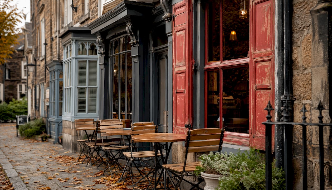
- Timber shopfronts are the traditional choice and remain preferred by most UK councils in conservation areas. Hardwood frames are durable, paintable, and sympathetic to Victorian and Georgian buildings. They require periodic maintenance but offer the best aesthetic flexibility.
- Aluminium shopfronts are the dominant choice for modern retail. Powder-coated aluminium is low-maintenance, available in any RAL colour, and suits contemporary minimalist designs. Slim-profile aluminium framing allows maximum glazing.
- Glass and frameless systems create a near-invisible boundary between interior and exterior, maximising visibility of window displays. These suit premium retailers and food and beverage operators where the interior itself is the draw.
- Mixed-material shopfronts combine, for example, a brick or tiled stallriser with a timber or aluminium frame above. This approach often produces the most architecturally coherent result on older buildings.
By style:
- Traditional shopfronts feature pilasters, corbels, a projecting cornice, and a fascia board between the cornice and the top of the glazing. Georgian and Victorian examples in Westminster and across the UK demonstrate how well-proportioned these elements can be.
- Modern minimalist shopfronts strip away ornament in favour of clean lines, large-format glazing, and a single well-designed fascia sign. The Reading Borough Council Shopfront Design SPD notes that high-quality modern shopfronts avoid ill-proportioned fascias and garish signage, achieving a clean appearance through simplicity.
- Painted and decorated shopfronts use colour, murals, or hand-lettering to personalise a façade economically. Custom painted vinyls and murals can articulate brand stories clearly along shopping streets.
- Seasonal and decorated shopfronts layer window vinyl stickers, hanging signs, and temporary decorations over a permanent base design. This keeps the frontage dynamic without requiring structural changes.
Common architectural elements you will encounter across all styles include the fascia (the horizontal sign board), the stallriser (the solid panel below the window), pilasters (vertical framing elements), and hanging signs (projecting signs fixed perpendicular to the building). Each plays a functional and visual role in the overall composition.
How do you design an effective shopfront for your business?
Effective shopfront design starts with a clear brief, not a mood board. Before choosing colours or materials, define what your brand needs to communicate and who it needs to attract. Everything else follows from that.
Key design principles to follow:
- Define your brand story first. Your shopfront should reflect your business’s character. A children’s toy shop and a law firm both need clear, professional frontages, but the visual language is entirely different. Decide on your tone before selecting typefaces, colours, or materials.
- Use lighting deliberately. Strategic internal and external lighting guides customers’ attention to key displays and keeps your shopfront visible and inviting after dark. Spotlights on fascia lettering, warm internal lighting visible through glazing, and illuminated hanging signs all contribute.
- Keep window displays uncluttered. Retail strategists consistently advise against overcrowded displays. A single strong focal point outperforms a window packed with products. Clarity sells.
- Respect the building’s proportions. Your fascia, stallriser, and glazing should work with the existing architecture, not fight it. The North Lincolnshire Council shopfront design guide recommends a maximum fascia depth of approximately 380mm to maintain architectural proportions. Oversized fascias are frequently refused planning permission.
- Choose materials appropriate to the building’s age and context. Traditional hardwood, brick, glass, and tile are preferred by most UK councils. uPVC is specifically discouraged in conservation areas due to aesthetic and planning constraints.
- Consider seasonal decoration as part of the design system. Plan for how your shopfront will accommodate seasonal changes, window vinyl updates, and rotating displays without looking ad hoc.
Pro Tip: If your premises are in a conservation area or on a listed building, check with your local planning authority before making any changes to the shopfront. Fascia sizes, materials, and even paint colours may be subject to restrictions. Getting this wrong can mean costly remedial work.
For a deeper look at how shopfront branding works in practice, Pikpikpow’s guide covers how to align your physical frontage with your wider brand identity.

What does a shopfront design actually cost?
Cost varies considerably depending on the scope of work, the materials chosen, and whether planning permission is required. There is no single figure that applies across the board, but understanding the main cost drivers helps you budget realistically.
Primary cost factors:
- Materials. Timber shopfronts typically cost more than aluminium due to the labour involved in joinery and finishing. Glass and frameless systems sit at the premium end. Mixed-material approaches can offer a middle ground.
- Design complexity. A simple painted fascia with applied lettering costs far less than a fully bespoke timber shopfront with carved details, cornices, and pilasters. 3D signage elements and illuminated channel letters add further cost.
- Lighting. Adding external spotlights, LED halo-lit lettering, or internally illuminated fascia signs increases both material and installation costs. The return, in terms of visibility after dark, is usually worth the investment for high-footfall locations.
- Vinyl graphics and window treatments. Printed window vinyls are one of the most cost-effective ways to personalise a shopfront. They can be replaced seasonally without structural work.
- Planning permission. If your proposed changes require advertisement consent or listed building consent, factor in both the application fee and the time it adds to the project. Designs that require revision after a planning refusal cost more overall.
- Refurbishment versus replacement. Retaining and refurbishing existing features, such as original pilasters, corbels, or timber frames, is often cheaper than full replacement and is less likely to trigger a planning application. The Waltham Forest shopfront design guide notes that re-using existing features is a cost-effective and sustainable approach.
The most budget-conscious upgrades tend to be new fascia lettering, window vinyl graphics, and a fresh coat of paint in a considered colour. These three changes alone can transform a shopfront’s impact without requiring structural work or planning consent.
How do you make your shopfront stand out on a busy high street?
Standing out does not mean being the loudest frontage on the street. It means being the most clearly defined. These practical steps make a measurable difference to foot traffic and first impressions.
- Invest in a well-designed hanging sign. Hanging signs are visible to pedestrians walking parallel to the building, not just those approaching head-on. A well-crafted hanging sign with 3D elements or illumination adds depth and visibility that a flat fascia alone cannot achieve. Explore shopfront signage ideas that work for different building types and street contexts.
- Keep windows and entrances clean and well-maintained. This sounds obvious, but a dirty window or peeling paint undermines even the best design. Maintenance is part of the design.
- Use colour psychology with intention. Deep greens and navies signal quality and calm. Bright yellows and reds create energy and urgency. Neither is inherently better; the right choice depends on what your business sells and who it sells to.
- Rotate window displays regularly. Seasonal shopfront decorations and rotating displays increase customer engagement and signal that the business is active and attentive. A window that never changes tells passing customers there is nothing new to see.
- Align your physical and digital presence. Your shopfront colours, typefaces, and logo should match your website and social media. Consistency builds recognition across every touchpoint.
- Add dimension with 3D signage elements. Flat fascia signs are the baseline. Built-up lettering, projecting signs, and dimensional logos add visual interest that photographs well and reads clearly at distance.
- Use window vinyls strategically. Frosted or printed vinyls can add privacy, reinforce brand graphics, and communicate opening hours or key messages without cluttering the window display itself.
What do urban design experts recommend for UK shopfronts?
The guidance from UK councils and retail design specialists converges on a consistent set of principles. These are not aesthetic preferences; they reflect what actually works in planning applications and in attracting customers.
Key expert recommendations:
- Respect the rhythm of the street. Urban design guides recommend incorporating subtle brand details rather than dominating the façade. A shopfront that disrupts the visual rhythm of a parade draws attention for the wrong reasons.
- Avoid over-branding. Corporate logos and colour schemes should be adapted to suit local characteristics. A modest logo on a well-proportioned fascia is more effective than a large-format brand graphic that overwhelms the building.
- Do not use external solid roller shutters. UK councils discourage or prohibit external solid roller shutters because of their negative impact on the streetscape. Internal or perforated security grilles maintain visibility and avoid creating hostile environments after hours.
- Preserve traditional architectural features where they exist. Original pilasters, corbels, cornices, and stallrisers give a shopfront character and identity. Removing them to fit a modern brand aesthetic usually produces a worse result, not a better one.
- Choose durable, quality materials. Traditional hardwood, brick, glass, and tile are preferred across most UK planning frameworks. Cheaper materials like uPVC age poorly and are routinely refused in conservation areas.
- Size fascias proportionately. The recommended maximum fascia depth of approximately 380mm applies across multiple UK council guidelines. A fascia that is too deep looks stuck on and is likely to be refused.
Pikpikpow works with these constraints every day, designing signage and shopfront graphics that meet planning requirements while still delivering strong brand impact. The combination of design expertise and knowledge of UK planning norms means fewer surprises during the approval process.
Pikpikpow designs shopfronts that get noticed and get approved
Getting a shopfront right means balancing creative ambition with planning reality. Pikpikpow is a UK-based signage and print specialist that works with retailers, commercial operators, and construction teams to deliver shopfronts that do both. From bespoke fascia signs and illuminated channel lettering to precision-cut window vinyls and 3D dimensional graphics, every element is designed and manufactured in-house.
What sets Pikpikpow apart is the combination of design capability and production quality. You are not briefing a designer who then hands off to a separate manufacturer. The design, print, and installation process runs through one team, which means tighter tolerances, faster turnaround, and a finished result that matches the original concept. Whether you need a single hanging sign or a complete shopfront identity across multiple locations, Pikpikpow has the capacity to deliver.
Ready to see what your shopfront could look like? Browse Pikpikpow’s signage systems or get in touch for a quote tailored to your premises and brand.
Key takeaways
The most effective UK shopfronts combine deliberate brand expression with respect for the building’s architecture and local planning requirements.
| Point | Details |
|---|---|
| Lead with clarity | A clear, uncluttered shopfront communicates your brand faster and more effectively than a busy, over-decorated one. |
| Fascia proportions matter | UK councils recommend a maximum fascia depth of approximately 380mm; oversized fascias are frequently refused planning permission. |
| Material choice affects planning | Traditional hardwood, brick, and glass are preferred; uPVC is discouraged or refused in conservation areas across the UK. |
| Lighting and vinyls add impact economically | Window vinyls and strategic lighting are among the most cost-effective ways to upgrade a shopfront without structural changes. |
| Pikpikpow for bespoke shopfront signage | Pikpikpow designs and manufactures fascia signs, 3D lettering, window graphics, and illuminated signage for UK retailers. |