
TL;DR:
- Footfall signage design creates visual communication to attract pedestrians, reduce entry friction, and boost sales. Effective signs are highly legible, strategically placed, and consistent with brand messaging to increase walk-in rates and build trust. Proper maintenance and environment-aware design ensure continued effectiveness and long-term asset value.
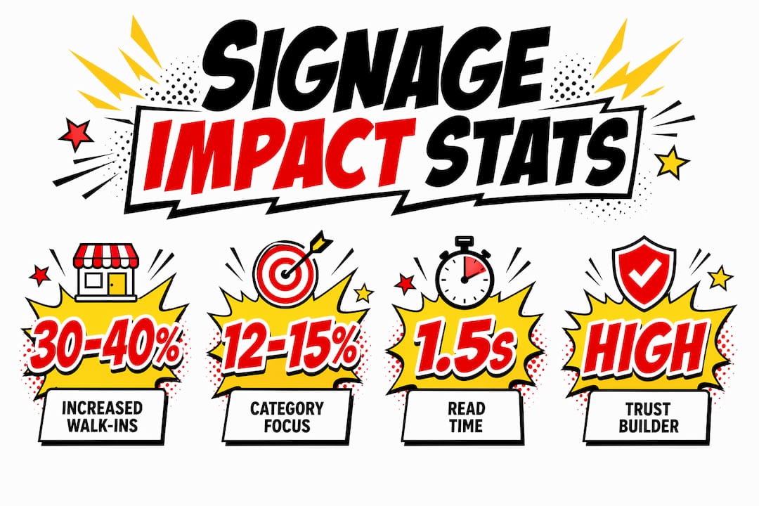
Footfall signage design is the practice of creating purpose-built visual communications that attract pedestrians, reduce entry friction, and convert passing traffic into paying customers. Strategic storefront signage can increase walk-ins by 30–40%, making it one of the highest-return investments a business can make without ongoing operational costs. In the industry, this discipline sits within the broader field of environmental graphic design, which covers every visual touchpoint from shopfront fascia signs to internal wayfinding. Understanding why footfall signage design matters is the first step to treating your signage as a business asset rather than a decorative afterthought.
Why footfall signage design matters: the core principles
Effective signage design is not about making something look attractive. It is about engineering a communication that works within the constraints of real human perception.
The most fundamental constraint is time. Retail signage must communicate within 1.5 seconds, which means every design decision, from font choice to colour contrast, must serve instant comprehension. That figure is not a guideline. It is the window you have before a pedestrian’s gaze moves on. Achieving it requires at least 60% negative space on the sign face to prevent visual crowding.
Legibility in motion
Legibility is the single most important quality in footfall signage. A sign that cannot be read at pace is a sign that does not work. Manual kerning and letter spacing adjustments are critical for distance readability, because software defaults frequently produce illegible letter pairs when viewed from more than a few metres away.
The industry standard is the Rule of 10: for every 10 feet of viewing distance, letter height should increase by one inch. A sign read from 30 feet requires letters at least three inches tall. This is not aesthetic preference. It is the minimum threshold for legibility in motion.
Key design principles for effective footfall signage include:
- High contrast between text and background. High-contrast signs boost noticeability by 18–22% compared to low-contrast alternatives.
- Simple, single-weight typefaces. Decorative fonts reduce reading speed under distracted conditions.
- Visual hierarchy with one dominant message. More than two competing graphic elements fragment attention and reduce gaze duration.
- Accessible colour combinations. Proactively incorporating accessibility benefits legibility in dynamic, distracted environments for all customers, not just those with visual impairments.
- Correct letter height per the Rule of 10. Apply this to every sign, not just the primary fascia.
Pro Tip: Before finalising any sign design, print it at full scale and view it from the intended reading distance. What looks clear on a screen at A4 size often fails completely at 20 metres.
How does placement and environment shape signage impact?
The best-designed sign in the wrong location produces no result. Placement is not a secondary consideration. It is part of the design brief.

A study of over 1,100 pedestrian paths confirms that well-placed signs function as behavioural triggers, physically slowing pedestrian movement and directing gaze toward a storefront. That slowing effect is commercially significant. A pedestrian moving at reduced pace has more time to process your message and make a decision to enter.
Environmental factors that determine placement effectiveness:
- Sight lines. A sign must be visible from the natural pedestrian approach angle, not just from directly in front. Oblique viewing angles are the norm on busy high streets.
- Mounting height. Signs mounted above natural eye level are frequently missed. The optimal zone for exterior signage is between 1.5 and 2.5 metres from ground level for pedestrian-facing messages.
- Lighting conditions. Poor illumination communicates low quality or instability to customers. A well-lit sign at dusk performs better than an unlit sign at midday.
- Competing visual noise. More than two competing graphics within a pedestrian’s field of view fragment attention. Avoid clustering multiple signs at the same entry point.
- Interior versus exterior roles. Exterior signage attracts and removes entry friction, while interior signage focuses on conversion, navigation, and building professional impression. Each has a distinct job.
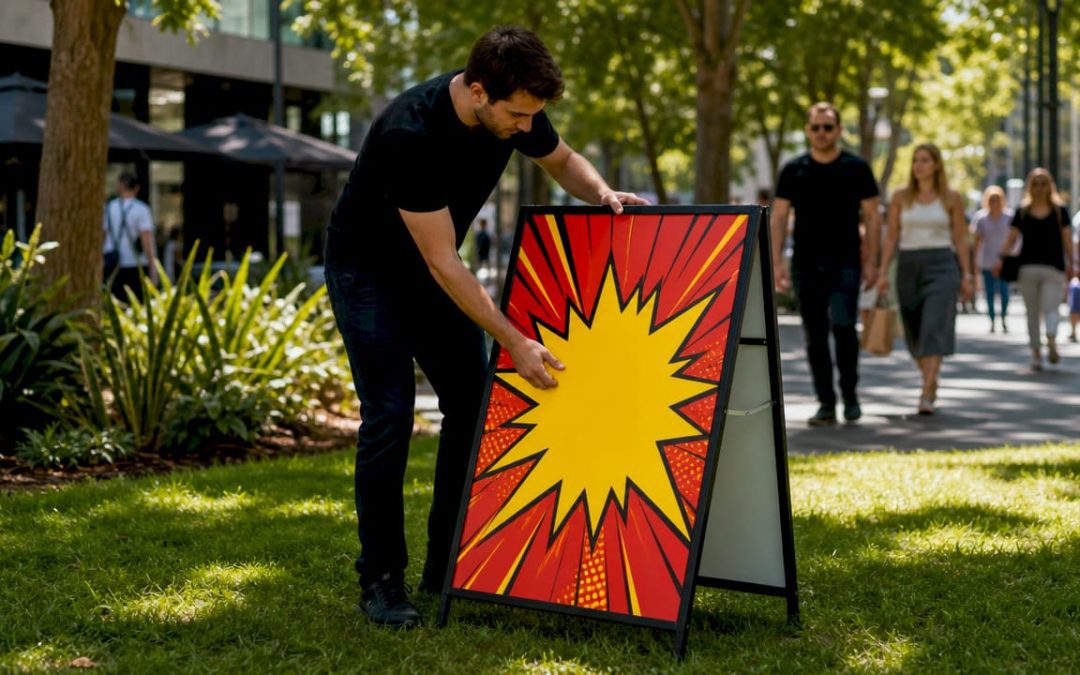
A retail business that repositioned its A-board from directly outside the door to 10 metres along the pedestrian approach path reported a measurable increase in customers pausing to read it. The sign itself was unchanged. The placement did the work. For businesses near construction zones or temporary barriers, signage placement principles apply equally to maintaining visibility when the physical environment changes.
What are the measurable benefits of well-designed footfall signage?
Well-designed footfall signage produces results that can be tracked, measured, and attributed directly to design decisions.
Category-focused signage yields 12–15% higher walk-in rates compared to generic branding-only signs. That difference comes from specificity. A sign that tells a pedestrian exactly what they will find inside removes the hesitation that prevents entry. Signage is also a passive yet continuous communication asset that improves customer experience without ongoing operational costs, unlike paid advertising which stops the moment the budget does.
The table below summarises the primary business benefits and their mechanisms.
| Benefit | Mechanism |
|---|---|
| Increased walk-in rate | Clear category messaging removes entry hesitation |
| Higher impulse purchases | Promotional signage at point of decision triggers unplanned buying |
| Stronger brand trust | Consistent visual language between exterior and interior builds credibility |
| Improved customer navigation | Wayfinding signage reduces decision friction and frustration |
| Long-term asset value | Durable, maintained signs preserve brand authority over years |
“Signage should be considered an engineered communication tool with specific, measurable design objectives. Failure to define clear sign objectives leads to noisy signage that fails to convert passersby into customers.” — How to design effective signs and visual displays
Visual language consistency between interior and exterior signage strongly influences customer trust and sales. A shopfront that promises one brand experience and delivers a different one inside creates cognitive dissonance. That dissonance erodes trust faster than poor signage alone. Neglecting sign maintenance leads to degradation within 2–3 years, harming brand trust more than the absence of signage entirely.
How to integrate signage design into your wider marketing strategy
Signage works hardest when it is planned as part of a marketing system, not commissioned as a standalone project.
Successful signage projects begin with operating conditions, not decoration. Before any design work starts, define what the sign must achieve. Is it attracting new customers who do not know you exist? Is it communicating a seasonal promotion? Is it guiding existing customers to a new entrance? Each objective produces a different design brief.
Practical steps for integrating signage into your marketing strategy:
- Define measurable objectives first. “Increase walk-ins from the north approach” is a testable objective. “Make the shopfront look better” is not.
- Audit your existing visual language. Your exterior signage, interior graphics, printed materials, and digital presence should share the same typefaces, colours, and tone. Inconsistency signals disorganisation.
- Involve operations as well as marketing. The team that manages the physical space knows where customers get confused, where they linger, and where they leave. That knowledge shapes effective wayfinding signage decisions.
- Plan signage as modular assets. Design systems that allow individual panels to be updated without replacing the entire installation. This reduces long-term cost and keeps messaging current.
- Choose materials for the environment. A sign that fades, warps, or peels within 18 months costs more than a durable alternative. Material choice is a marketing decision, not just a production one.
Pro Tip: Commission a full-scale mockup of any exterior sign before production. Testing signage in real conditions before manufacture avoids costly legibility failures that only become visible once the sign is installed.
For businesses managing multiple sites or complex brand environments, an architectural signage checklist provides a structured framework for maintaining consistency across locations.
Key takeaways
Footfall signage design increases walk-ins, builds brand trust, and drives sales when it combines legibility, strategic placement, and consistency with wider marketing objectives.
| Point | Details |
|---|---|
| Legibility is non-negotiable | Apply the Rule of 10 for letter height and use high contrast to meet the 1.5-second comprehension window. |
| Placement drives behaviour | Position signs within natural sight lines and at correct mounting height to slow pedestrian movement. |
| Category messaging converts | Specific, category-focused signs yield 12–15% higher walk-in rates than generic branding alone. |
| Consistency builds trust | Visual language must match across exterior and interior signage to avoid eroding customer confidence. |
| Maintenance protects value | Signs that degrade within 2–3 years harm brand authority more than having no signage at all. |
The signage mistakes we see most often at Pikpikpow
The most common mistake businesses make is treating logo size as the primary measure of signage quality. A large logo on a cluttered background is less visible than a smaller logo with generous whitespace. Overemphasis on logo scale at the expense of contrast and negative space is the single most frequent cause of signs that look impressive in a design file and disappear in the real environment.
The second mistake is skipping real-environment testing. Screens lie. A design that reads clearly at 100% zoom on a monitor can become illegible at 15 metres in overcast British daylight. We always recommend full-scale mockups before production, and we have seen this step save clients from expensive reprints more times than we can count.
Lighting is consistently underestimated. A sign that performs well in daylight can become invisible or actively unappealing after dark. Illuminated fascia signs and backlit panels are not a premium option for most retail and commercial premises. They are the baseline for maintaining brand presence across all trading hours.
The final point is coherence over time. Signage that starts well but is patched, partially replaced, or left to fade sends a message of neglect. The businesses that build the strongest signage-driven brand recognition are those that treat their sign systems as maintained assets, not one-off installations.
— PikPikPOW!
How Pikpikpow helps businesses get footfall signage right
Pikpikpow works with businesses across retail, commercial interiors, and construction to design and install signage that performs in the real world, not just on a mood board.
From bespoke signage systems built around your specific site conditions to digital signage solutions that allow dynamic content updates without reprinting, Pikpikpow covers the full range of footfall signage requirements. Every project starts with a brief that defines measurable objectives, and every installation is reviewed for placement, legibility, and environmental fit before sign-off. If you are ready to treat your signage as a business asset, speak to the Pikpikpow team about what a properly engineered sign system can do for your foot traffic.
FAQ
What is footfall signage design?
Footfall signage design is the practice of creating visual communications specifically engineered to attract pedestrians and convert passing traffic into customers. It covers exterior fascia signs, A-boards, window graphics, and any signage visible from a public approach route.
How much can good signage increase walk-ins?
Strategic storefront signage can increase walk-ins by 30–40%, with category-focused signs delivering 12–15% higher walk-in rates compared to generic branding-only alternatives.
What makes a sign legible from a distance?
High contrast between text and background, correct letter height based on the Rule of 10, and manual kerning adjustments are the three primary factors that determine legibility at distance.
Does interior signage affect sales?
Interior signage directly influences conversion by guiding customers, reducing decision friction, and reinforcing the brand promise made by exterior signage. Consistency between the two is a measurable driver of customer trust.
How often should business signage be replaced or updated?
Signs that are not properly maintained begin to degrade within 2–3 years, and degraded signage harms brand trust more than having no signage at all. A planned maintenance schedule and modular design system extend the useful life of any installation.