TL;DR:
- Effective retail signage relies on zone-based placement, clear design hierarchy, and consistent measurement.
- Design signs to communicate the primary message within two seconds, using high contrast and legible fonts.
- Treat signage as a coordinated system with specific rules, not as isolated creative projects, for optimal results.
Retail signage best practices are defined as the strategic combination of zone-based placement, clear visual hierarchy, and message pacing that guides shoppers and drives sales. Poor signage costs retailers far more than the price of a new display. Research from Neurons Inc. and Yodeck confirms that well-executed in-store signage directly influences purchase decisions, dwell time, and basket size. Whether you manage a single shopfront or a multi-site estate, the principles covered here apply equally to traditional printed signs and modern digital signage systems.
1. Retail signage best practices start with zone-based placement
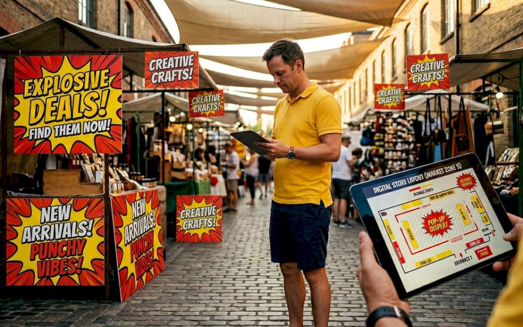
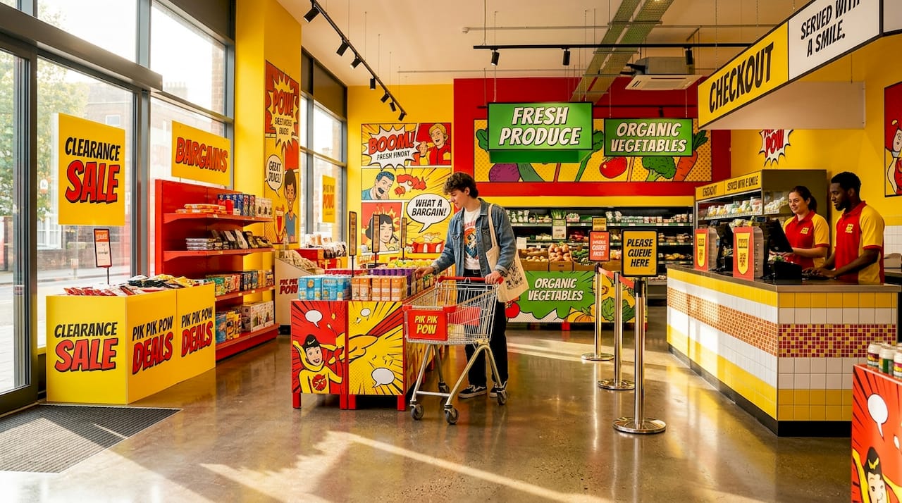
Every retail store contains distinct zones, and each zone demands a different signage strategy. Treating your entire store as one uniform signage canvas is the single most common mistake retail managers make.
The five core zones are:
- Storefront and window: Your first opportunity to attract passing footfall. Window displays require 3,000+ nits brightness for digital screens to remain legible in direct sunlight. Static fascia signs here must be bold, high-contrast, and readable within two seconds.
- Entrance: The transition zone where shoppers shift from street mode to shopping mode. Keep messaging brief and welcoming. A single promotional headline works far better than a cluttered board.
- Aisles and endcaps: Endcap screens perform best at 32 to 43 inches; aisle-facing displays suit 50 to 55 inches. Aisle brightness of 350 to 400 nits is sufficient for controlled interior lighting.
- Checkout and queue: High dwell time makes this zone ideal for loyalty programme messaging, upsell prompts, and QR codes.
- Fitting rooms: The highest dwell time in any fashion store. Longer-format content, styling suggestions, and social proof work well here.
Assigning a clear content mission to each zone means your signage works as a coordinated system rather than a collection of unrelated messages. This approach also makes content updates faster because each zone has its own brief.
Pro Tip: Build a zone-based content library with pre-approved templates for each location. When a promotion changes, your team updates the relevant zone without disrupting the rest of the store.
2. Design for a glance, not a read
Shoppers give a sign one to two seconds of attention on average. Your design must communicate the core message within that window, or it fails regardless of how attractive it looks.
The 80/20 rule applies directly here. Eighty per cent of your screen or sign face should carry the primary message. The remaining twenty per cent handles secondary information such as a price, a logo, or a call to action. Reversing this ratio is a design error that retail managers make repeatedly.
Contrast is non-negotiable. Light text on a dark background, or dark text on a light background, meets the WCAG 2.1 minimum contrast ratio and performs well across varied ambient lighting conditions. Avoid mid-tone combinations such as grey text on a beige background. They read clearly on a design monitor and fail completely on a shop floor.
Font choice matters as much as font size. Sans-serif typefaces such as Helvetica, Arial, and Roboto outperform decorative fonts in legibility at distance. The standard rule is one inch of letter height per ten feet of viewing distance. A sign read from thirty feet away needs letters at least three inches tall.
Pro Tip: Always proof your finished design under the actual ambient lighting conditions of the install location, not on a desktop monitor. A design that looks sharp on screen can wash out completely under fluorescent retail lighting.
3. Match content pacing to customer dwell time
Content pacing is the discipline of matching how long a message stays on screen to how long a customer actually stands in front of it. Getting this wrong means your best promotions are never fully seen.
- Entrance zones: Use fast, punchy messages of two to three seconds per slide. Shoppers are moving and will not stop to read.
- Aisle and endcap screens: A three-slide loop of eight to ten seconds per slide covers a welcome message, a promotional offer, and a loyalty or QR prompt without overstaying its welcome.
- Checkout and queue screens: Dwell time increases significantly here. Formats of 20 to 45 seconds per message work well for product demonstrations or loyalty sign-up prompts.
- Fitting rooms: Content of 45 to 90 seconds suits this zone. Styling guides, product origin stories, and social proof content all perform well when customers have time to engage.
Avoid changing content too frequently. Constant rotation confuses shoppers and makes it harder to measure what is actually working. Pick one primary metric per zone, such as QR code scans or basket size uplift, and review performance after 30 days before making adjustments.
4. Separate wayfinding signs from campaign signs
Wayfinding and promotional signage serve entirely different purposes, and placing them in competition with each other damages both. The Lowe’s Neurovision study by Neurons Inc. found that campaign signs placed directly beneath ceiling navigation signs distracted shoppers and led to significantly longer aisle-finding times. Optimising navigation sign salience reduced search times by 40 per cent.
The practical rule is spatial separation. Navigation signs belong at ceiling height and at aisle junctions, using consistent iconography and colour coding. Promotional signs belong at eye level and product level, using brand colours and campaign imagery. When these two categories share the same visual space, shoppers experience attention conflict and navigation suffers.
This separation also protects your promotional investment. A campaign sign that shoppers ignore because it is visually competing with a directional arrow delivers no return. Keeping the two systems distinct means each performs its intended function.
5. Choose the right materials for each environment
Signage materials are not interchangeable across retail environments. A printed foam board that performs well in a controlled interior will warp, fade, or delaminate in a window display exposed to direct sunlight and temperature fluctuation.
For high-traffic interior zones, durable signage materials such as aluminium composite, acrylic, and PVC foam board each offer different balances of weight, finish quality, and longevity. Aluminium composite suits permanent wayfinding and branded wall panels. Acrylic works well for illuminated signs and premium product displays. PVC foam board suits short-term promotional displays where cost efficiency matters more than longevity.
For storefront and exterior applications, material choice directly affects brand perception. UV-resistant vinyl, powder-coated aluminium, and dibond panels all withstand British weather conditions reliably. Choosing a material rated for exterior use is not optional. It is a baseline requirement for maintaining brand standards year-round.
6. Use commercial-grade hardware for digital displays
Consumer televisions are not designed for retail environments, and using them is a false economy. Consumer screens are rated for four to six hours of daily use. Retail environments demand 16 to 18 hours of continuous operation, often in direct sunlight or under high-output lighting.
Commercial-grade displays offer higher brightness ratings, longer operational lifespans, and remote management capabilities that consumer TVs cannot match. For storefront windows, the minimum specification is 3,000 nits. For interior aisles, 350 to 400 nits is appropriate. Running a consumer TV in a window display produces a washed-out, unreadable image that actively damages your brand presentation.
Portrait orientation at checkout and queue screens outperforms landscape for engagement. Portrait format mirrors the natural vertical orientation of a standing person and fills the visual field more effectively in narrow queue spaces. Landscape screens in portrait positions, mounted sideways, are a common and avoidable error.
7. Localise content for multi-site retailers
Running one global playlist uniformly across all locations is a missed opportunity and, in some cases, actively counterproductive. A promotion relevant to a city-centre flagship store may be irrelevant or confusing in a suburban retail park location.
The practical standard for multi-site retailers is the 70/30 content split. Seventy per cent of content is brand-level and consistent across all sites, covering core promotions, brand values, and seasonal campaigns. Thirty per cent is locally tailored, covering store-specific events, local product ranges, or community messaging. This balance maintains brand consistency while giving each location relevance to its specific customer base.
For multi-location rollouts, standardising hardware specifications and using a single content management system reduces both cost and operational complexity. Samsung MagicINFO and Yodeck are two widely used CMS platforms that support centralised scheduling with local override capabilities. This means your head office team can push a national campaign while individual store managers update their local thirty per cent independently.
8. Schedule brightness and content by time of day
A digital sign running at full brightness at 9pm in a quiet shopping centre is an irritant, not an asset. Scheduling brightness levels to match ambient conditions throughout the day is a straightforward operational improvement that most retailers overlook.
Morning and midday periods with high footfall and strong ambient light warrant higher brightness settings. Evening periods with lower footfall and dimmer ambient conditions call for reduced brightness. Most commercial CMS platforms support automated brightness scheduling, which removes the need for manual adjustment and protects screen longevity.
Content scheduling by time of day follows the same logic. A coffee promotion is relevant at 8am and irrelevant at 6pm. A loyalty programme sign-up prompt performs better during quieter periods when shoppers have time to engage. Aligning content to time-of-day patterns is one of the simplest ways to improve message relevance without producing additional creative assets.
9. Measure signage performance with a single clear metric
Measuring signage success requires choosing one primary metric before launch, not after. Common metrics include footfall change, basket size uplift, dwell time increase, and loyalty programme sign-ups. Attempting to measure all of these simultaneously at launch produces data that is difficult to interpret and act on.
The recommended approach is a 30 to 60 day baseline period followed by a 30 to 60 day test period with the new signage in place. This gives you a statistically meaningful comparison rather than a week’s worth of anecdotal impressions. Digital signage platforms with built-in analytics, such as Yodeck, simplify this process by logging content play counts and scheduling data that can be cross-referenced against your sales figures.
Queue wait time overlays on checkout screens are worth measuring separately. Displaying estimated wait times or engaging content during queues demonstrably reduces perceived wait time and improves customer satisfaction scores, even when actual wait times remain unchanged.
10. Treat signage as a system, not a collection of individual signs
The most effective retail signage programmes are designed as coordinated systems with consistent hierarchy, scheduling, and material standards across every touchpoint. Individual signs designed in isolation, without reference to the broader store environment, create visual inconsistency that undermines brand credibility.
A signage system defines the rules: which typefaces are used at which sizes, which colour combinations are approved, which zones carry which content categories, and which materials are specified for which applications. These rules make it faster to produce new content, easier to brief suppliers, and simpler to maintain standards across multiple locations.
Outdoor signage and interior signage should share the same design language. A shopper who sees your fascia sign on the street and then encounters completely different typography and colour inside your store experiences a disconnect that erodes brand trust. Consistency from shopfront to checkout is the mark of a well-managed signage programme.
Key takeaways
Effective retail signage is built on zone-based strategy, clear design hierarchy, and consistent measurement, not on individual creative decisions made in isolation.
| Point | Details |
|---|---|
| Zone-based placement | Assign a specific content mission to each store zone from window to checkout for maximum relevance. |
| Design for a glance | Apply the 80/20 rule and WCAG contrast standards so your message lands within two seconds. |
| Match pacing to dwell time | Use two to three second slides at entrances and 45 to 90 second formats in fitting rooms. |
| Separate wayfinding from campaigns | Keep navigation signs and promotional signs spatially distinct to avoid attention conflict. |
| Measure one metric at a time | Choose a single KPI before launch and review after 30 to 60 days for reliable results. |
What we have learned from years of retail signage work
At Pikpikpow, we have seen the same pattern repeat across retail clients of every size. The stores with the most visually impressive individual signs are not always the ones with the best-performing signage programmes. The stores that treat signage as a system, with clear rules and consistent execution, consistently outperform those that treat each sign as a standalone creative project.
The advice about choosing one success metric before launch sounds obvious, but it is rarely followed. Most retail managers launch new signage with a vague expectation that sales will improve, then struggle to attribute any change to the signage specifically. The retailers who set a baseline, define a metric, and review after 30 days are the ones who can make a genuine business case for their next signage investment.
One thing we would push back on is the assumption that digital signage is always the answer. Static, well-designed printed signs in the right material and the right location outperform poorly managed digital screens every time. The technology is only as good as the content strategy and operational discipline behind it. Start with the strategy. The hardware choice follows from that.
— PikPikPOW!
How Pikpikpow supports your retail signage strategy
Pikpikpow works with retail managers and marketers across the UK to design, manufacture, and install signage that performs in real store environments, not just on a mood board.
From bespoke fascia signs and wayfinding systems to digital signage solutions with commercial-grade hardware and content scheduling support, Pikpikpow covers every zone of your store. Our team handles design, material specification, and installation, so you get a finished result that meets your brand standards and your operational requirements. If you are planning a new store fit-out or refreshing an existing signage programme, explore our retail signage systems or get in touch to discuss your specific requirements.
FAQ
What is the most important factor in retail signage placement?
Zone-based placement is the most critical factor. Each store zone from window to checkout has a different customer behaviour pattern, and signage must be matched to that behaviour to be effective.
How bright should digital signs be in a shop window?
Storefront window screens require a minimum of 3,000 nits brightness to remain legible in direct sunlight. Consumer televisions, which typically output 250 to 400 nits, are not suitable for window installations.
How do you measure whether retail signage is working?
Choose one primary metric before launch, such as basket size uplift or QR code scans, and compare performance over a 30 to 60 day baseline period against a 30 to 60 day test period with the new signage in place.
Should wayfinding and promotional signs be in the same location?
No. Research from Neurons Inc. using Lowe’s stores found that placing campaign signs near navigation signs increased aisle-finding times. Keeping the two systems spatially separate improves both navigation efficiency and promotional impact.
What font types work best for retail signage?
Sans-serif typefaces such as Helvetica, Arial, and Roboto deliver the best legibility at distance. The standard sizing rule is one inch of letter height per ten feet of viewing distance.