Introduction: Why Typography Design is Crucial for Signage?
As far as signage is concerned, Typography design is an important element in effective communication of messages. The right typeface results in increasing legibility and visibility and enhances brand identity; conversely, the poor choice of typeface can render the sign ineffective.
In this article, we will delve into choosing the most appropriate typefaces so that signs achieve optimum legibility: that is, the way visual hierarchy plays its part, as well as best practices regarding the design of high-impact signage that grabs audiences’ attention.
1. Best Typography design for Signage
There is more to typography than only font selection; it also involves an immediate impact on perceptions and psychologies of people with respect to your signage. This is how it matters, highlighting:
- Increased Readability: clear, legible letters portray the message almost instantly.
- Improves Brand Recognition: Consistent typography strengthens brand identity.
- Influences Customer Perception: The right fonts evoke emotions and shape how customers perceive your business.
- Drives Action: Well-designed signage can guide customer decisions, increasing foot traffic and engagement.
2. Key Factors to Consider When Choosing Fonts for Signs
a) Readability Over Aesthetics
While decorative fonts may look attractive, they often compromise readability. Stick to fonts that are clear and legible from a distance.
Best Choices: Sans-serif fonts like Helvetica, Futura, and Arial work well.
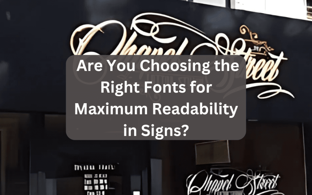
Avoid: Script or overly stylized fonts that are hard to read.

b) Font Size and Visibility
Font size controls how far your sign can be read. Use the following general guideline:
| Viewing Distance | Minimum Font Size |
| 10 feet | 1 inch |
| 50 feet | 5 inch |
| 100 feet | 10 inch |
The larger text makes sure that your message is readable even from a distance.
c) Visual Hierarchy: Structuring Text for Impact
Visual hierarchy refers to arranging text elements in a way that directs the reader’s eye. Consider:
- Headlines: Use bold, large fonts for main messages.
- Subheadings: Slightly smaller than headlines, providing additional details.
- Body Text: Simple, clean fonts that are easy to read.
d) Contrast and Color Choices
Typography design should contrast well with the background. Here are some high-contrast combinations:
- Black text on yellow background (high visibility)
- White text on dark blue background (easy to read)
- Avoid low-contrast colors like red on black
e) Spacing and Kerning
Proper letter spacing improves readability. Text that is too compressed or too spread out makes reading difficult. Aim for balanced spacing to maintain clarity.
3. Best Fonts for Maximum Readability in Signs
Here are some top-performing fonts for signage:
1. Helvetica – Clean, modern, highly readable.
2. Futura – Geometric, minimalistic, and easy on the eyes.
3. Arial – Simple, professional, and widely used.
4. Verdana – Designed for screen readability but also great for signs.
5. Roboto – Modern sans-serif font with excellent readability.
If branding requires a serif font, Times New Roman or Georgia can be good alternatives.

4. Common Typography design Mistakes to Avoid in Signage
- Using Too Many Fonts: Stick to a maximum of two fonts to maintain consistency.
- Overly Fancy Fonts: Decorative fonts reduce legibility.
- Poor Alignment: Keep text aligned for a clean look.
- Ignoring Contrast: Low-contrast text blends into the background, making it hard to read.
Conclusion: Create High-Impact Signs with the Right Typography design
Your signage communicates with your potential clients right before they walk into your space; therefore, choosing the right typography design is imperative for effective communication. Create signs that will be used to not only grab attention but also encourage engagement for effective messages through readability contrast and visual hierarchy.
Conduct feasibility tests on different fonts and appropriate spaces before you finalize your signage design.
(FAQs): Typography design
- What is the best font size for outdoor signs?
The general rule of thumb is that for every 10 feet of viewing distance, there should be at least 1 inch of letter height. Therefore, larger signs will require larger fonts for better visibility.
- What is the easiest font to read on a sign?
Arial, Futura, and Helvetica are a few of the sans-serif fonts that are easy to read.
- How many fonts should I use in a sign?
Therefore, the best is to use at least one, up to a maximum of two, fonts within the design—concise and beautiful.
- How difference differences affect the signage’s readability?
Highly contrasting color combinations with black letters on a white background fulfill the idea of improving visibility and reading distance.
- Why is Typography design important in branding?
As brand perception is swayed through the characters, so is emotional response, customer engagement, and the like. Hence, effective signage will also be relevant here in typography.
To Know about Signage Click Here!

